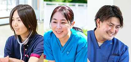
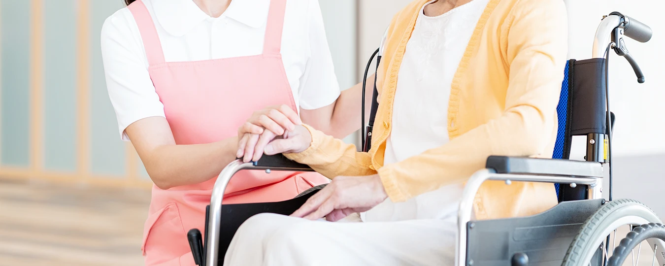
@charset "UTF-8"; /* ブレイクポイント参考 PC:インナーコンテンツサイズ以上 Laptop-HiDPI:1440 Laptop-MDPI :1280 iPad Pro(10.5inch):834 iPad Pro(12.9inch):1024 iPad:601 SP:600 */ /* レスポンシブサイト非表示 */ /* PCのみ */ @media screen and (max-width: 1025px) { .pc { display: none !important; } } /* 1500以上 */ @media screen and (max-width: 1500px) { .only1500 { display: none !important; } } /* 1400以上 */ @media screen and (max-width: 1400px) { .only1400 { display: none !important; } } /* タブレット・PC */ @media screen and (max-width: 599px) { .tbpc { display: none !important; } } /* タブレット・SP */ @media screen and (min-width: 1025px) { .tbsp { display: none !important; } } /* タブレットのみ */ @media screen and (max-width: 599px), (min-width: 1025px) { .tb { display: none !important; } } /* SPのみ */ @media screen and (min-width: 600px) { .sp { display: none !important; } } @media screen and (min-width: 1025px) { a[href^="tel:"] { pointer-events: none; cursor: auto; text-decoration: none; color: #345; } } /* html5doctor.com Reset Stylesheet v1.6.1 Last Updated: 2010-09-17 Author: Richard Clark - http://richclarkdesign.com Twitter: @rich_clark */ html, body, div, span, object, iframe, h1, h2, h3, h4, h5, h6, p, blockquote, pre, abbr, address, cite, code, del, dfn, em, img, ins, kbd, q, samp, small, strong, sub, sup, var, b, i, dl, dt, dd, ol, ul, li, fieldset, form, label, legend, article, aside, canvas, details, figcaption, figure, footer, header, hgroup, menu, nav, section, summary, time, mark, audio, video { margin: 0; padding: 0; border: 0; outline: 0; vertical-align: baseline; background: transparent; box-sizing: border-box; } article, aside, details, figcaption, figure, footer, header, hgroup, menu, nav, section { display: block; } nav ul { list-style: none; } blockquote, q { quotes: none; } blockquote:before, blockquote:after, q:before, q:after { content: ""; content: none; } a { margin: 0; padding: 0; vertical-align: baseline; background: transparent; } ins { background-color: #ff9; color: #000; text-decoration: none; } mark { background-color: #ff9; color: #000; font-style: italic; font-weight: bold; } del { text-decoration: line-through; } abbr[title], dfn[title] { border-bottom: 1px dotted; cursor: help; } hr { display: block; height: 1px; border: 0; border-top: 1px solid #cccccc; margin: 1em 0; padding: 0; } input, select { vertical-align: middle; } img { vertical-align: top; font-size: 0; line-height: 0; width: auto; max-width: 100%; image-rendering: -webkit-optimize-contrast; } li { list-style: none; } a, area, button, [role=button], input:not([type=range]), label, select, summary, textarea { touch-action: manipulation; } /*-------------------------------------------------------- body設定 ----------------------------------------------------------*/ html { font-size: 62.5%; } body { margin: 0; padding: 0; font-family: -apple-system, BlinkMacSystemFont, "Helvetica Neue", HelveticaNeue, YuGothic, "Yu Gothic", Verdana, Meiryo, sans-serif; color: #222; -webkit-text-size-adjust: none; -webkit-font-smoothing: antialiased; -moz-osx-font-smoothing: grayscale; background: #fff; line-height: 2; font-size: 1.8rem; overflow-x: hidden; font-weight: 500; /*font-feature-settings: "palt" 1;*/ } @media screen and (max-width: 599px) { body { font-size: 1.6rem; } } body.modal-scrooll-stop { overflow: hidden; } @media screen and (max-width: 1024px) { body { font-weight: 400; } } a { text-decoration: none; } * { max-height: 999999px; font-feature-settings: "palt"; letter-spacing: 0.06em; } /*クリアフィックス*/ .clearfix { *zoom: 1; } .clearfix:after { content: ""; display: block; clear: both; height: 0; line-height: 0; visibility: hidden; } a { text-decoration: none; transition: 0.2s; } p, h1, h2, h3, h4, h5, dt, dd, a { font-display: swap; } *, *::before, *::after { margin: 0; padding: 0; box-sizing: border-box; } .mlr-05 { margin-left: -0.5em; margin-right: -0.5em; } .ml-05 { margin-left: -0.5em; } .mr-05 { margin-right: -0.5em; } .mlr-02 { margin-left: -0.2em; margin-right: -0.2em; } .mb10 { margin-bottom: 10px; } @media screen and (max-width: 599px) { .mb10 { margin-bottom: 10px; } } .mb20 { margin-bottom: 20px; } @media screen and (max-width: 599px) { .mb20 { margin-bottom: 10px; } } .mb30 { margin-bottom: 30px; } @media screen and (max-width: 900px) { .mb30 { margin-bottom: 25px; } } @media screen and (max-width: 599px) { .mb30 { margin-bottom: 20px; } } .mb40 { margin-bottom: 40px; } @media screen and (max-width: 900px) { .mb40 { margin-bottom: 30px; } } @media screen and (max-width: 599px) { .mb40 { margin-bottom: 20px; } } .mb50 { margin-bottom: 50px; } @media screen and (max-width: 599px) { .mb50 { margin-bottom: 30px; } } .mb100 { margin-bottom: 100px !important; } @media screen and (max-width: 1024px) { .mb100 { margin-bottom: 70px !important; } } @media screen and (max-width: 900px) { .mb100 { margin-bottom: 60px !important; } } @media screen and (max-width: 599px) { .mb100 { margin-bottom: 40px !important; } } .pb00 { padding-bottom: 0 !important; } .anchor { margin-top: -110px; padding-top: 110px; } @media screen and (max-width: 900px) { .anchor { margin-top: -90px; padding-top: 90px; } } @media screen and (max-width: 599px) { .anchor { margin-top: -70px; padding-top: 70px; } } .scroll-hint-icon::before { background-image: url(../img/common/icon_scroll_hint_white_hand.svg) !important; background-size: 100% auto; } .scroll-hint-icon::after { background-image: url(../img/common/icon_scroll_hint_white_arrow.svg) !important; } @media print { .sp { display: none !important; } body { width: 1140px; -webkit-print-color-adjust: exact; } /* ------- ↓その他参考例 --------- .header { position: relative !important; //ヘッダー固定fixedを解除 } .header .header-inner { width: 100% !important; //サイト幅を解除 } .page-title { margin-top: 0px !important; //固定ヘッダー時のマージンTOP分を解除 width: 100% !important; //サイト幅を解除 } .breadcrumbs-list { width: 100% !important; //サイト幅を解除 } .global-nav { width: 100%; //サイト幅を解除 } ------- ↑その他参考 ---------*/ } @page { size: A4; margin: 12.7mm 9.7mm; } .header { padding: 0 225px 0 30px; width: 100%; height: 120px; background-color: #fff; position: fixed; top: 0; right: 0; z-index: 9; display: flex; justify-content: space-between; align-items: center; transition: 0.5s; } @media screen and (max-width: 1400px) { .header { padding: 0 215px 0 25px; } } @media screen and (max-width: 1300px) { .header { padding: 0 0 0 25px; height: 100px; } } @media screen and (max-width: 599px) { .header { padding: 0 0 0 3vw; height: 60px; } } .header__logo { width: 333px; line-height: 0.1; } @media screen and (max-width: 1400px) { .header__logo { width: 300px; } } @media screen and (max-width: 1300px) { .header__logo { width: 333px; } } @media screen and (max-width: 599px) { .header__logo { width: 58%; max-width: 240px; } } .header__logo__link { display: block; } @media screen and (min-width: 1025px) { .header__logo__link:hover { transform: translateY(3px); } } .header__nav { width: calc(100% - 350px); display: flex; justify-content: flex-end; align-items: flex-start; } @media screen and (max-width: 1400px) { .header__nav { width: calc(100% - 320px); } } @media screen and (max-width: 1300px) { .header__nav { display: none; } } .header__nav__global { height: 120px; display: flex; justify-content: flex-end; align-items: flex-end; flex-wrap: wrap; } .header__nav__global__sub { margin-right: 0.1em; margin-top: 17px; display: flex; justify-content: flex-end; align-items: flex-end; } .header__nav__global__sub__item { margin-left: 20px; } .header__nav__global__sub__item:first-child { margin-left: 0; } .header__nav__global__sub__item__link { padding-left: 14px; font-size: 14px; line-height: 1; color: #345; position: relative; display: block; } .header__nav__global__sub__item__link::before { content: ""; border-width: 4px 0 4px 8px; border-style: solid; border-color: transparent transparent transparent #88d344; position: absolute; left: 0; top: 3px; transition: 0.2s; } .header__nav__global__sub__item__link:hover { color: #00cca7; } .header__nav__global__sub__item__link:hover::before { border-color: transparent transparent transparent #00cca7; } .header__nav__global__inner { margin-top: 0; width: 100%; display: flex; justify-content: flex-end; align-items: stretch; } .header__nav__global__inner__item { margin-left: 32px; } @media screen and (max-width: 1500px) { .header__nav__global__inner__item { margin-left: 25px; } } @media screen and (max-width: 1400px) { .header__nav__global__inner__item { margin-left: 20px; } } .header__nav__global__inner__item:first-child { margin-left: 0; } .header__nav__global__inner__item__link { padding-left: 0.06em; padding-bottom: 38px; font-size: 18px; line-height: 1; font-weight: 700; color: #345; position: relative; display: block; overflow: hidden; } @media screen and (max-width: 1500px) { .header__nav__global__inner__item__link { padding-left: 0; letter-spacing: normal; } } @media screen and (max-width: 1400px) { .header__nav__global__inner__item__link { font-size: 17px; } } .header__nav__global__inner__item__link::before { content: ""; margin: 0 auto; width: 15px; height: 15px; background-image: url(../img/common/nav_dot.svg); background-repeat: no-repeat; background-size: 100% auto; background-position: 50% 50%; position: absolute; left: 0; right: 0; bottom: -15px; transition: 0.2s; } @media screen and (min-width: 1025px) { .header__nav__global__inner__item__link:hover { color: #00cca7; } .header__nav__global__inner__item__link:hover::before { bottom: 16px; } } .header__nav__global__inner__item__link.now::before { bottom: 16px; } .header .access-btn { padding-top: 54px; padding-left: 0.06em; width: 80px; height: 80px; font-size: 14px; line-height: 1; color: #fff; font-weight: 700; text-align: center; background-color: #88d344; background-image: url(../img/common/icon_access_white.svg); background-repeat: no-repeat; background-size: 37.5% auto; background-position: 50% 20px; display: block; position: fixed; top: 20px; right: 110px; } @media screen and (max-width: 1300px) { .header .access-btn { right: 100px; top: 10px; } } @media screen and (max-width: 599px) { .header .access-btn { padding-top: 40px; width: 60px; height: 60px; font-size: 11px; background-position: 50% 15px; right: 60px; top: 0; } } @media screen and (min-width: 1025px) { .header .access-btn:hover { opacity: 0.7; } } .menu-btn { padding-top: 54px; padding-left: 0.06em; width: 80px; height: 80px; font-size: 14px; line-height: 1; color: #fff; font-weight: 700; text-align: center; background-color: #44c3e3; border: none; display: block; position: fixed; right: 20px; top: 20px; transition: 0.2s; cursor: pointer; z-index: 100; } @media screen and (max-width: 1300px) { .menu-btn { right: 10px; top: 10px; } } .menu-btn::before { content: "メニュー"; width: 100%; position: absolute; top: 53px; left: 0; transition: 0.2s; } @media screen and (max-width: 599px) { .menu-btn { padding-top: 0; width: 60px; height: 60px; font-size: 11px; right: 0; top: 0; } .menu-btn::before { top: 40px; } } @media screen and (min-width: 1025px) { .menu-btn:hover { opacity: 0.7; } } .menu-btn.on::before { content: "閉じる"; } .menu-btn.on .menu-btn__line::before { width: 0; } .menu-btn.on .menu-btn__line::after { width: 0; } .menu-btn__line { margin: 0 auto; width: 30%; height: 2px; background-color: #fff; border-radius: 1px; position: absolute; top: 31px; left: 0; right: 0; transition: 0.2s; } .menu-btn__line::before { content: ""; width: 100%; height: 100%; border-radius: 1px; background-color: #fff; position: absolute; right: 0; top: -6px; transition: 0.2s; } .menu-btn__line::after { content: ""; width: 75%; height: 100%; border-radius: 1px; background-color: #fff; position: absolute; left: 0; bottom: -6px; transition: 0.2s; } @media screen and (max-width: 599px) { .menu-btn__line { margin: 0 auto; width: 30%; height: 2px; top: 23px; } .menu-btn__line::before { top: -5px; } .menu-btn__line::after { bottom: -5px; } } .menu { top: 0; left: 0; width: 100vw; height: 0; background-color: #ddd; transition: 0.4s; position: fixed; z-index: 10; overflow: hidden; } .menu.on { height: 100vh; } .menu__inner { width: 100%; display: flex; justify-content: space-between; align-items: stretch; position: relative; flex-wrap: wrap; overflow-y: auto; } @media screen and (max-width: 1200px) { .menu__inner { height: 100vh; overflow-y: scroll; } .menu__inner::-webkit-scrollbar { width: 6px; } .menu__inner::-webkit-scrollbar-track { background-color: rgba(68, 195, 227, 0.1); border: none; border-radius: 0; box-shadow: none; } .menu__inner::-webkit-scrollbar-thumb { background: rgba(68, 195, 227, 0.3); border-radius: 3px; box-shadow: none; } } .menu__inner__photo { width: 380px; background-image: url(../img/common/menu_photo.webp); background-repeat: no-repeat; background-size: cover; background-position: 50% 100%; } @media screen and (max-width: 1700px) { .menu__inner__photo { width: 320px; } } @media screen and (max-width: 1600px) { .menu__inner__photo { display: none; } } .menu__inner__sitemap { padding: 60px; width: calc(100% - 600px - 380px); height: 100vh; background: linear-gradient(90deg, #eefae8, #e5f9fc); overflow-y: scroll; } @media screen and (max-width: 1700px) { .menu__inner__sitemap { width: calc(100% - 600px - 320px); } } @media screen and (max-width: 1600px) { .menu__inner__sitemap { width: calc(100% - 600px); } } @media screen and (max-width: 1200px) { .menu__inner__sitemap { padding: 60px 60px 100px; width: 100%; height: auto; overflow-y: visible; } } @media screen and (max-width: 900px) { .menu__inner__sitemap { padding: 60px 60px 80px; } } @media screen and (max-width: 599px) { .menu__inner__sitemap { padding: 20px 25px 40px; } } .menu__inner__sitemap::-webkit-scrollbar { width: 6px; } .menu__inner__sitemap::-webkit-scrollbar-track { background: transparent; border: none; border-radius: 0; box-shadow: none; } .menu__inner__sitemap::-webkit-scrollbar-thumb { background: rgba(68, 195, 227, 0.1); border-radius: 3px; box-shadow: none; } .menu__inner__sitemap__inner { margin: 0 auto; width: 100%; max-width: 600px; } .menu__inner__sitemap__inner__nav__item { border-bottom: 1px solid #afeadf; position: relative; } .menu__inner__sitemap__inner__nav__item:first-child { border-top: 1px solid #afeadf; } @media screen and (max-width: 599px) { .menu__inner__sitemap__inner__nav__item:first-child { border-top: none; } } .menu__inner__sitemap__inner__nav__item__link { padding-left: 35px; height: 68px; font-size: 18px; line-height: 68px; color: #345; display: block; position: relative; } .menu__inner__sitemap__inner__nav__item__link::before { content: ""; width: 16px; height: 16px; background: linear-gradient(0deg, #88d344, #44c3e3); border-radius: 50%; position: absolute; left: 10px; top: calc(50% - 8px); transition: 0.2s; } .menu__inner__sitemap__inner__nav__item__link::after { content: ""; border-width: 3px 0 3px 6px; border-style: solid; border-color: transparent transparent transparent #fff; position: absolute; left: 16px; top: calc(50% - 3px); transition: 0.2s; } @media screen and (max-width: 599px) { .menu__inner__sitemap__inner__nav__item__link { padding-left: 35px; height: 60px; font-size: 17px; line-height: 60px; } .menu__inner__sitemap__inner__nav__item__link::before { content: ""; width: 16px; height: 16px; background: linear-gradient(0deg, #88d344, #44c3e3); border-radius: 50%; position: absolute; left: 10px; top: calc(50% - 8px); transition: 0.2s; } .menu__inner__sitemap__inner__nav__item__link::after { content: ""; border-width: 3px 0 3px 6px; border-style: solid; border-color: transparent transparent transparent #fff; position: absolute; left: 16px; top: calc(50% - 3px); transition: 0.2s; } } @media screen and (min-width: 1025px) { .menu__inner__sitemap__inner__nav__item__link:hover { color: #00cca7; transform: translateX(5px); } } .menu__inner__sitemap__inner__nav__item .open-btn { width: 40px; height: 40px; background-color: rgba(136, 211, 68, 0.2); border-radius: 5px; position: absolute; top: 14px; right: 0; z-index: 2; display: block; cursor: pointer; transition: 0.2s; } @media screen and (min-width: 1025px) { .menu__inner__sitemap__inner__nav__item .open-btn:hover { background-color: rgba(136, 211, 68, 0.3); } } .menu__inner__sitemap__inner__nav__item .open-btn::before { content: ""; margin: 0 auto; width: 40%; height: 2px; background-color: rgba(0, 204, 167, 0.7); border-radius: 1px; position: absolute; top: calc(50% - 1px); left: 0; right: 0; transition: 0.2s; } .menu__inner__sitemap__inner__nav__item .open-btn::after { content: ""; margin: 0 auto; width: 40%; height: 2px; background-color: rgba(0, 204, 167, 0.7); border-radius: 1px; position: absolute; top: calc(50% - 1px); left: 0; right: 0; } @media screen and (max-width: 599px) { .menu__inner__sitemap__inner__nav__item .open-btn { width: 36px; height: 36px; top: 12px; border-radius: 3px; } } .menu__inner__sitemap__inner__nav__item .open-btn.close::before { transform: rotate(90deg); } .menu__inner__sitemap__inner__nav__item .nav-sub-box { margin-bottom: 25px; padding: 25px 35px; background-color: rgba(255, 255, 255, 0.5); border-radius: 5px; } @media screen and (max-width: 599px) { .menu__inner__sitemap__inner__nav__item .nav-sub-box { margin-bottom: 20px; padding: 20px 30px; border-radius: 3px; } } .menu__inner__sitemap__inner__nav__item .nav-sub-box__title { margin-top: 10px; margin-bottom: 10px; padding: 12px 10px 10px 24px; font-size: 16px; line-height: 1; color: #345; background-color: #eefae7; position: relative; } .menu__inner__sitemap__inner__nav__item .nav-sub-box__title::before { content: ""; margin: auto 0; width: 3px; height: 16px; background-color: #88d344; position: absolute; left: 12px; top: 0; bottom: 0; } .menu__inner__sitemap__inner__nav__item .nav-sub-box__title::after { content: ""; margin: auto 0; width: 3px; height: 8px; background-color: #00cca7; position: absolute; left: 12px; top: 0; bottom: 0; transform: translateY(-50%); } .menu__inner__sitemap__inner__nav__item .nav-sub-box__list { display: flex; justify-content: space-between; align-items: flex-start; flex-wrap: wrap; } .menu__inner__sitemap__inner__nav__item .nav-sub-box__list__item { width: 50%; border-radius: 5px; } @media screen and (max-width: 599px) { .menu__inner__sitemap__inner__nav__item .nav-sub-box__list__item { width: 100%; } } .menu__inner__sitemap__inner__nav__item .nav-sub-box__list__item__link { padding-left: 13px; font-size: 16px; line-height: 2; color: #345; position: relative; display: block; } .menu__inner__sitemap__inner__nav__item .nav-sub-box__list__item__link::before { content: ""; border-width: 4px 0 4px 8px; border-style: solid; border-color: transparent transparent transparent #44c3e3; position: absolute; top: 11px; left: 0; } @media screen and (min-width: 1025px) { .menu__inner__sitemap__inner__nav__item .nav-sub-box__list__item__link:hover { color: #44c3e3; transform: translateX(3px); } } .menu__inner__sitemap__inner__nav02 { margin-top: 20px; margin-left: -25px; display: flex; justify-content: flex-start; align-items: flex-start; flex-wrap: wrap; } @media screen and (max-width: 599px) { .menu__inner__sitemap__inner__nav02 { margin-top: 10px; } } .menu__inner__sitemap__inner__nav02__item { margin-top: 10px; margin-left: 25px; } @media screen and (max-width: 599px) { .menu__inner__sitemap__inner__nav02__item { margin-top: 15px; } } .menu__inner__sitemap__inner__nav02__item__link { padding-left: 13px; font-size: 16px; line-height: 1; color: #00cca7; position: relative; display: block; } .menu__inner__sitemap__inner__nav02__item__link::before { content: ""; border-width: 4px 0 4px 8px; border-style: solid; border-color: transparent transparent transparent #00cca7; position: absolute; top: 3px; left: 0; transition: 0.2s; } @media screen and (min-width: 1025px) { .menu__inner__sitemap__inner__nav02__item__link:hover { color: #44c3e3; transform: translateX(5px); } .menu__inner__sitemap__inner__nav02__item__link:hover::before { border-color: transparent transparent transparent #44c3e3; } } .menu__inner__sitemap__inner__facilities { margin-top: 20px; display: flex; justify-content: space-between; align-items: stretch; flex-wrap: wrap; } .menu__inner__sitemap__inner__facilities__item { margin-top: 10px; width: calc((100% - 10px) / 2); } @media screen and (max-width: 599px) { .menu__inner__sitemap__inner__facilities__item { width: 100%; } } .menu__inner__sitemap__inner__facilities__item__link { padding-left: 20px; padding-top: 2px; width: 100%; height: 60px; color: #456; font-weight: 500; background-color: rgba(136, 211, 68, 0.1); border-radius: 5px; display: block; position: relative; display: flex; justify-content: flex-start; align-items: center; } .menu__inner__sitemap__inner__facilities__item__link::before { content: ""; width: 16px; height: 16px; background-color: #88d344; border-radius: 50%; position: absolute; right: 15px; top: calc(50% - 8px); transition: 0.2s; } .menu__inner__sitemap__inner__facilities__item__link::after { content: ""; border-width: 3px 0 3px 6px; border-style: solid; border-color: transparent transparent transparent #fff; position: absolute; right: 19px; top: calc(50% - 3px); transition: 0.2s; } @media screen and (min-width: 1025px) { .menu__inner__sitemap__inner__facilities__item__link:hover { color: #00cca7; background-color: rgba(136, 211, 68, 0.2); transform: translateX(5px); } } .menu__inner__sitemap__inner__facilities__item__link__text { font-size: 16px; line-height: 1; } .menu__inner__sitemap__inner__facilities__item__link__text__sub { margin-bottom: 4px; font-size: 12px; display: block; } .menu__inner__hard { padding: 120px 60px 60px; width: 600px; height: 100vh; background-color: #fff; overflow-y: scroll; } @media screen and (max-width: 1200px) { .menu__inner__hard { padding: 80px 60px 100px; width: 100%; height: auto; overflow-y: visible; } } @media screen and (max-width: 900px) { .menu__inner__hard { padding: 60px 60px 80px; } } @media screen and (max-width: 599px) { .menu__inner__hard { padding: 40px 25px 100px; } } .menu__inner__hard::-webkit-scrollbar { width: 6px; } .menu__inner__hard::-webkit-scrollbar-track { background: #fff; border: none; border-radius: 0; box-shadow: none; } .menu__inner__hard::-webkit-scrollbar-thumb { background: #000; border-radius: 3px; box-shadow: none; } .menu__inner__hard__inner { margin: 0 auto; width: 470px; } @media screen and (max-width: 1200px) { .menu__inner__hard__inner { width: 100%; max-width: 600px; } } .menu__inner__hard__inner__time { margin-bottom: 20px; } .menu__inner__hard__inner__time__item { padding: 15px 0; border-bottom: 1px dotted #bbb; display: flex; justify-content: space-between; align-items: stretch; flex-wrap: wrap; } .menu__inner__hard__inner__time__item:first-child { border-top: 1px dotted #bbb; } .menu__inner__hard__inner__time__item__title { width: 75px; font-size: 14px; line-height: 1; color: #fff; letter-spacing: normal; background-color: #0ad; display: flex; justify-content: center; align-items: center; } @media screen and (max-width: 599px) { .menu__inner__hard__inner__time__item__title { margin-bottom: 10px; width: 100%; height: 40px; line-height: 41px; text-align: center; } } .menu__inner__hard__inner__time__item__title.off { background-color: #00cca7; } .menu__inner__hard__inner__time__item__text { padding: 2px 0 1px 15px; width: calc(100% - 75px); font-size: 16px; line-height: 1.625; color: #345; } .menu__inner__hard__inner__time__item__text br { display: none; } .menu__inner__hard__inner__time__item__text .br-on { display: inline !important; } @media screen and (max-width: 599px) { .menu__inner__hard__inner__time__item__text { padding: 0 0 0 0.06em; width: 100%; font-size: 15px; text-align: center; } } @media screen and (max-width: 320px) { .menu__inner__hard__inner__time__item__text br { display: inline; } } .menu__inner__hard__inner__text { font-size: 17px; line-height: 1.75; color: #345; text-align: justify; } @media screen and (max-width: 599px) { .menu__inner__hard__inner__text { font-size: 15px; } .menu__inner__hard__inner__text br { display: none; } } .menu__inner__hard__inner__tel { margin-top: 7px; margin-bottom: 7px; font-size: 36px; line-height: 1; color: #00cca7; font-family: "Arial", sans-serif !important; font-weight: 700; letter-spacing: 0.02em; display: block; cursor: auto; } @media screen and (max-width: 599px) { .menu__inner__hard__inner__tel { margin-top: 9px; font-size: 9vw; } } .menu__inner__hard__inner__btns { margin-top: 20px; display: flex; justify-content: space-between; align-items: stretch; flex-wrap: wrap; } @media screen and (max-width: 599px) { .menu__inner__hard__inner__btns { margin-top: 18px; } } .menu__inner__hard__inner__btns__item { width: calc((100% - 10px) / 2); } @media screen and (max-width: 599px) { .menu__inner__hard__inner__btns__item { width: calc((100% - 4px) / 2); } } @media screen and (max-width: 320px) { .menu__inner__hard__inner__btns__item { width: 100%; } .menu__inner__hard__inner__btns__item:first-child { margin-bottom: 5px; } } .menu__inner__hard__inner__btns__item:nth-child(3) { margin-top: 20px; width: 100%; } @media screen and (max-width: 599px) { .menu__inner__hard__inner__btns__item:nth-child(3) { margin-top: 5px; } } .menu__inner__hard__inner__btns__item .btn-access { width: 100%; height: 80px; background-color: #88d344; text-align: center; position: relative; display: block; } .menu__inner__hard__inner__btns__item .btn-access::before { content: ""; border-width: 10px 10px 0 0; border-style: solid; border-color: transparent #fff transparent transparent; position: absolute; bottom: 5px; right: 5px; } @media screen and (max-width: 599px) { .menu__inner__hard__inner__btns__item .btn-access { height: 60px; } .menu__inner__hard__inner__btns__item .btn-access::before { border-width: 10px 10px 0 0; bottom: 5px; right: 5px; } } @media screen and (min-width: 1025px) { .menu__inner__hard__inner__btns__item .btn-access:hover { opacity: 0.7; box-shadow: 5px 5px 3px rgba(51, 68, 85, 0.2); transform: translateY(-5px); } } .menu__inner__hard__inner__btns__item .btn-access__inner { padding-left: 38px; font-size: 17px; line-height: 81px; color: #fff; font-weight: 700; background-image: url(../img/common/icon_access_white.svg); background-repeat: no-repeat; background-size: 30px auto; background-position: 0 48%; display: inline-block; } @media screen and (max-width: 599px) { .menu__inner__hard__inner__btns__item .btn-access__inner { padding-right: 5px; padding-left: 30.4px; font-size: 15px; line-height: 61px; background-size: 24px auto; } } .menu__inner__hard__inner__btns__item .btn-doctor { width: 100%; height: 80px; background-color: #44c3e3; text-align: center; position: relative; display: block; } @media screen and (max-width: 599px) { .menu__inner__hard__inner__btns__item .btn-doctor { height: 60px; } .menu__inner__hard__inner__btns__item .btn-doctor::before { border-width: 10px 10px 0 0; bottom: 5px; right: 5px; } } .menu__inner__hard__inner__btns__item .btn-doctor::before { content: ""; border-width: 10px 10px 0 0; border-style: solid; border-color: transparent #fff transparent transparent; position: absolute; bottom: 5px; right: 5px; } @media screen and (min-width: 1025px) { .menu__inner__hard__inner__btns__item .btn-doctor:hover { opacity: 0.7; box-shadow: 5px 5px 3px rgba(51, 68, 85, 0.2); transform: translateY(-5px); } } .menu__inner__hard__inner__btns__item .btn-doctor__inner { padding-left: 35px; font-size: 17px; line-height: 81px; color: #fff; font-weight: 700; background-image: url(../img/common/icon_doctor_white.svg); background-repeat: no-repeat; background-size: 25px auto; background-position: 0 50%; display: inline-block; } @media screen and (max-width: 599px) { .menu__inner__hard__inner__btns__item .btn-doctor__inner { padding-right: 5px; padding-left: 28px; font-size: 15px; line-height: 61px; background-size: 20px auto; } } .menu__inner__hard__inner__btns__item .btn-recruit { width: 100%; height: 100px; background-color: #00cca7; display: flex; justify-content: space-between; align-items: stretch; flex-wrap: wrap; } @media screen and (max-width: 599px) { .menu__inner__hard__inner__btns__item .btn-recruit { height: auto; } } @media screen and (min-width: 1025px) { .menu__inner__hard__inner__btns__item .btn-recruit:hover { opacity: 0.7; box-shadow: 5px 5px 3px rgba(51, 68, 85, 0.2); transform: translateY(-5px); } } .menu__inner__hard__inner__btns__item .btn-recruit__inner { padding-left: 25px; width: calc(100% - 210px - 20px); display: flex; align-items: center; position: relative; } @media screen and (max-width: 599px) { .menu__inner__hard__inner__btns__item .btn-recruit__inner { padding-left: 20px; width: calc(100% - (100% - 4px) / 2); } } @media screen and (max-width: 320px) { .menu__inner__hard__inner__btns__item .btn-recruit__inner { padding-left: 10px; } } .menu__inner__hard__inner__btns__item .btn-recruit__inner::before { content: ""; width: 16px; height: 16px; background-color: #fff; border-radius: 50%; position: absolute; right: 0; top: calc(50% - 8px); transition: 0.2s; } @media screen and (max-width: 599px) { .menu__inner__hard__inner__btns__item .btn-recruit__inner::before { right: 15px; } } .menu__inner__hard__inner__btns__item .btn-recruit__inner::after { content: ""; border-width: 3px 0 3px 6px; border-style: solid; border-color: transparent transparent transparent #00cca7; position: absolute; right: 4px; top: calc(50% - 3px); transition: 0.2s; } @media screen and (max-width: 599px) { .menu__inner__hard__inner__btns__item .btn-recruit__inner::after { right: 19px; } } .menu__inner__hard__inner__btns__item .btn-recruit__inner__text { font-size: 24px; line-height: 1; color: #fff; font-weight: 500; letter-spacing: 0.08em; } @media screen and (max-width: 599px) { .menu__inner__hard__inner__btns__item .btn-recruit__inner__text { font-size: 20px; } } @media screen and (max-width: 320px) { .menu__inner__hard__inner__btns__item .btn-recruit__inner__text { font-size: 18px; letter-spacing: 0.02em; } } .menu__inner__hard__inner__btns__item .btn-recruit__inner__text__en { margin-left: 7px; font-size: 11px; line-height: 1; color: #fff; font-family: "Arial", sans-serif !important; font-weight: 700; letter-spacing: 0.1em; display: inline-block; vertical-align: 35%; } @media screen and (max-width: 599px) { .menu__inner__hard__inner__btns__item .btn-recruit__inner__text__en { margin-top: 5px; margin-left: 0; display: block; } } .menu__inner__hard__inner__btns__item .btn-recruit__photo { width: 210px; } @media screen and (max-width: 599px) { .menu__inner__hard__inner__btns__item .btn-recruit__photo { width: calc((100% - 4px) / 2); } } .menu__inner__hard__inner__links { margin-top: 15px; margin-left: -25px; display: flex; justify-content: flex-start; flex-wrap: wrap; } .menu__inner__hard__inner__links__item { margin-top: 15px; margin-left: 25px; } .menu__inner__hard__inner__links__item__link { padding-left: 12px; font-size: 16px; line-height: 1; color: #345; position: relative; display: block; } .menu__inner__hard__inner__links__item__link::before { content: ""; border-width: 4px 0 4px 7px; border-style: solid; border-color: transparent transparent transparent #88d344; position: absolute; top: 3px; left: 0; } @media screen and (min-width: 1025px) { .menu__inner__hard__inner__links__item__link:hover { color: #88d344; transform: translateX(5px); } } .footer { padding: 40px 30px; width: 100%; background-color: #345; display: flex; justify-content: space-between; align-items: center; flex-wrap: wrap; } @media screen and (max-width: 599px) { .footer { padding: 35px 25px 40px; } } .footer__inner { display: flex; justify-content: flex-start; align-items: center; flex-wrap: wrap; } .footer__inner__title { font-size: 16px; line-height: 1; color: #fff; font-weight: 700; } @media screen and (max-width: 900px) { .footer__inner__title { width: 100%; } } .footer__inner__text { margin-left: 11px; padding-left: 16px; font-size: 16px; line-height: 1; color: #fff; position: relative; } .footer__inner__text::before { content: ""; width: 6px; height: 6px; background: linear-gradient(0deg, #88d344, #44c3e3); border-radius: 50%; position: absolute; left: 0; top: 4px; } @media screen and (max-width: 900px) { .footer__inner__text { margin-top: 15px; margin-left: 0; padding-left: 0; width: 100%; } .footer__inner__text::before { display: none; } } @media screen and (max-width: 599px) { .footer__inner__text { font-size: 15px; line-height: 1.6; } } .footer__inner__text .tel-link { color: #fff; cursor: auto; } .footer__copyright { font-size: 14px; line-height: 1; color: #fff; text-align: right; } @media screen and (max-width: 1200px) { .footer__copyright { margin-top: 15px; width: 100%; } } @media screen and (max-width: 900px) { .footer__copyright { text-align: left; } } @media screen and (max-width: 599px) { .footer__copyright { font-size: 14px; } } @media screen and (max-width: 320px) { .footer__copyright { font-size: 12px; } } .breadcrumbs { margin: 25px 25px 0; z-index: 2; display: flex; justify-content: flex-end; align-items: stretch; flex-wrap: wrap; } @media screen and (max-width: 900px) { .breadcrumbs { margin: 15px 15px 0; } } @media screen and (max-width: 599px) { .breadcrumbs { margin: 10px 10px 0; } } .breadcrumbs__item { padding-left: 19px; max-width: 30em; font-size: 16px; line-height: 1; color: #345; letter-spacing: 0; white-space: nowrap; text-overflow: ellipsis; -webkit-text-overflow: ellipsis; -o-text-overflow: ellipsis; overflow: hidden; position: relative; } @media screen and (max-width: 900px) { .breadcrumbs__item { max-width: 20em; font-size: 14px; } } @media screen and (max-width: 599px) { .breadcrumbs__item { padding-left: 16px; max-width: 12em; font-size: 11px; } } @media screen and (max-width: 320px) { .breadcrumbs__item { max-width: 10em; font-size: 10px; } } .breadcrumbs__item::before { content: ""; width: 6px; height: 6px; background: linear-gradient(to right, #88d344, #44c3e3); border-radius: 50%; position: absolute; left: 6px; top: 4px; } @media screen and (max-width: 900px) { .breadcrumbs__item::before { left: 7px; top: 3px; } } @media screen and (max-width: 599px) { .breadcrumbs__item::before { width: 5px; height: 5px; left: 6px; top: 3px; } } .breadcrumbs__item:first-child { margin-left: 0; } .breadcrumbs__item:first-child::before { display: none; } .breadcrumbs__item__link { color: #345; } @media screen and (min-width: 1025px) { .breadcrumbs__item__link:hover { color: #44c3e3; } } .layout { margin-top: 100px; display: flex; justify-content: space-between; align-items: stretch; flex-wrap: wrap; } @media screen and (max-width: 1300px) { .layout { padding: 0 60px 150px; } } @media screen and (max-width: 1024px) { .layout { margin-top: 60px; padding: 0 60px 100px; } } @media screen and (max-width: 900px) { .layout { padding: 0 40px 60px; } } @media screen and (max-width: 599px) { .layout { margin-top: 40px; padding: 0 25px 0; } } .layout__contents { margin: 0 auto; width: calc(100% - 360px); padding: 0 50px 200px; } @media screen and (max-width: 1500px) { .layout__contents { width: calc(100% - 320px); } } @media screen and (max-width: 1300px) { .layout__contents { width: 100%; padding: 0 0 100px; } } @media screen and (max-width: 1024px) { .layout__contents { padding: 0 0 80px; } } @media screen and (max-width: 900px) { .layout__contents { padding: 0 0 60px; } } .layout__contents__inner { margin: 0 auto; width: 100%; max-width: 1000px; } .layout__sidenav { width: 360px; background-color: #eefae7; position: relative; z-index: 2; } @media screen and (max-width: 1500px) { .layout__sidenav { width: 320px; } } @media screen and (max-width: 1300px) { .layout__sidenav { margin: 0 auto; max-width: 1000px; width: 100%; position: relative; top: auto; background-color: transparent; } } @media screen and (max-width: 599px) { .layout__sidenav { margin: 0 -25px; width: calc(100% + 50px); } } .sidenav { width: auto; background-color: #eefae7; height: 100%; } @media screen and (max-width: 1300px) { .sidenav { height: auto; border-radius: 5px; overflow: hidden; } } @media screen and (max-width: 599px) { .sidenav { border-radius: 0; } } .sidenav__title { background-color: #88d344; } .sidenav__title__link { padding: 22px 30px 22px 50px; font-size: 24px; line-height: 1; color: #fff; font-weight: 500; display: block; position: relative; } .sidenav__title__link::before { content: ""; margin: auto 0; width: 8px; height: calc(100% - 44px); background-color: #fff; border-radius: 4px; position: absolute; top: 0; bottom: 0; left: 30px; } .sidenav__title__link::after { content: ""; border-width: 15px 15px 0 0; border-style: solid; border-color: transparent #fff transparent transparent; position: absolute; bottom: 10px; right: 10px; } @media screen and (max-width: 599px) { .sidenav__title__link { padding: 25px 25px 25px 45px; font-size: 22px; } .sidenav__title__link::before { width: 6px; height: calc(100% - 48px); border-radius: 3px; left: 25px; } .sidenav__title__link::after { border-width: 10px 10px 0 0; bottom: 10px; right: 10px; } } @media screen and (min-width: 1025px) { .sidenav__title__link:hover { background-color: #00cca7; } } .sidenav__title__link__en { margin-top: 4px; padding-left: 0.2em; font-size: 12px; line-height: 1; color: #fff; font-family: "Arial", sans-serif !important; font-weight: 700; letter-spacing: 0.1em; display: block; } @media screen and (max-width: 599px) { .sidenav__title__link__en { margin-top: 5px; font-size: 10px; } } .sidenav__list__item { border-bottom: 1px dotted #bbb; } @media screen and (max-width: 1300px) { .sidenav__list__item:last-child { border-bottom: none; } } .sidenav__list__item__link { padding: 23px 30px 23px 55px; font-size: 18px; line-height: 1.3; color: #345; position: relative; display: block; } .sidenav__list__item__link::before { content: ""; width: 16px; height: 16px; background: linear-gradient(0deg, #88d344, #44c3e3); border-radius: 50%; position: absolute; left: 30px; top: calc(50% - 8px); transition: 0.2s; } .sidenav__list__item__link::after { content: ""; border-width: 3px 0 3px 6px; border-style: solid; border-color: transparent transparent transparent #fff; position: absolute; left: 36px; top: calc(50% - 3px); transition: 0.2s; } @media screen and (max-width: 599px) { .sidenav__list__item__link { padding: 25px 25px 25px 50px; font-size: 17px; } .sidenav__list__item__link::before { left: 25px; } .sidenav__list__item__link::after { left: 31px; } } @media screen and (min-width: 1025px) { .sidenav__list__item__link:hover { color: #44c3e3; transform: translateX(5px); } } .sidenav__list__item__link.now .sidenav__list__item__link__text { font-weight: 700; background: linear-gradient(to right, rgba(136, 211, 68, 0.5), rgba(68, 195, 227, 0.5)); background-repeat: no-repeat; background-position: left bottom; background-size: 100% 26%; } .pagetitle { margin-top: 120px; width: 100%; display: flex; justify-content: space-between; align-items: stretch; flex-wrap: wrap; } @media screen and (max-width: 1300px) { .pagetitle { margin-top: 100px; } } @media screen and (max-width: 599px) { .pagetitle { margin-top: 60px; } } .pagetitle__recruit-inner { padding: 5vw 5vw 6vw; width: 50%; background: linear-gradient(90deg, #88d344, #44c3e3); display: flex; justify-content: flex-start; align-items: center; position: relative; overflow: hidden; } .pagetitle__recruit-inner::before { content: ""; width: 33.3vw; height: 33.3vw; border: 9.45vw solid rgba(255, 255, 255, 0.3); border-radius: 50%; position: absolute; right: -28%; bottom: -32%; } @media screen and (max-width: 900px) { .pagetitle__recruit-inner { padding: 7vw 6vw 7.3vw; } } @media screen and (max-width: 599px) { .pagetitle__recruit-inner { padding: 11vw 11vw 11.4vw; width: 100%; } .pagetitle__recruit-inner::before { content: ""; width: 70vw; height: 70vw; border: 22vw solid rgba(255, 255, 255, 0.3); right: -25%; bottom: -28%; } } .pagetitle__recruit-inner__box { width: 100%; position: relative; z-index: 2; } .pagetitle__recruit-inner__box__copy { margin-bottom: 5%; width: 60%; line-height: 0.1; } @media screen and (max-width: 1300px) { .pagetitle__recruit-inner__box__copy { width: 70%; } } @media screen and (max-width: 1024px) { .pagetitle__recruit-inner__box__copy { width: 80%; } } @media screen and (max-width: 900px) { .pagetitle__recruit-inner__box__copy { width: 90%; } } @media screen and (max-width: 599px) { .pagetitle__recruit-inner__box__copy { margin-bottom: 8%; width: 90%; } } @media screen and (max-width: 1024px) { .pagetitle__recruit-inner__box .btn-base { padding: 15px 40px 15px 35px; min-width: 240px; max-width: 100%; font-size: 18px; } } .pagetitle__recruit-photos { width: 50%; display: flex; justify-content: space-between; align-items: stretch; } @media screen and (max-width: 599px) { .pagetitle__recruit-photos { width: 100%; } } .pagetitle__recruit-photos__item { width: 33.3333333333%; height: 100%; overflow: hidden; } .pagetitle__recruit-photos__item img { width: 100%; height: 100%; -o-object-fit: cover; object-fit: cover; } .pagetitle__inner { width: 50%; background: linear-gradient(to right, #eefae8 15%, #e5f9fc 85%); display: flex; justify-content: flex-start; align-items: center; } @media screen and (max-width: 599px) { .pagetitle__inner { width: 100%; height: 36vw; } } .pagetitle__inner__text { padding-left: 80px; padding-bottom: 2%; font-size: 44px; line-height: 1; color: #345; font-weight: 400; letter-spacing: 0.1em; position: relative; } .pagetitle__inner__text::before { content: ""; width: 60px; height: 2px; background: linear-gradient(to right, #88d344, #44c3e3); position: absolute; left: 0; top: 34px; } @media screen and (max-width: 1500px) { .pagetitle__inner__text { padding-left: 70px; font-size: 40px; } .pagetitle__inner__text::before { width: 54px; top: 30px; } } @media screen and (max-width: 1300px) { .pagetitle__inner__text { padding-left: 60px; font-size: 36px; } .pagetitle__inner__text::before { width: 45px; top: 25px; } } @media screen and (max-width: 900px) { .pagetitle__inner__text { padding-left: 42px; font-size: 30px; } .pagetitle__inner__text::before { width: 30px; height: 1px; top: 22px; } } @media screen and (max-width: 599px) { .pagetitle__inner__text { padding-left: 35px; font-size: 7.6vw; letter-spacing: 0.06em; } .pagetitle__inner__text::before { width: 24px; height: 1px; top: 5.9vw; } } .pagetitle__inner__text__en { margin-top: 10px; padding-left: 0.5em; font-size: 13px; line-height: 1; color: #44c3e3; font-family: "Arial", sans-serif !important; font-weight: 700; display: block; } @media screen and (max-width: 900px) { .pagetitle__inner__text__en { margin-top: 6px; font-size: 11px; } } @media screen and (max-width: 599px) { .pagetitle__inner__text__en { margin-top: 5px; font-size: 10px; } } .pagetitle__photo { width: 50%; height: 360px; overflow: hidden; background-image: url(../img/common/pagetitle.webp); background-repeat: no-repeat; background-position: center center; background-size: cover; } @media screen and (max-width: 1500px) { .pagetitle__photo { height: 320px; } } @media screen and (max-width: 1300px) { .pagetitle__photo { height: 300px; } } @media screen and (max-width: 1100px) { .pagetitle__photo { height: 260px; } } @media screen and (max-width: 900px) { .pagetitle__photo { height: 200px; } } @media screen and (max-width: 599px) { .pagetitle__photo { width: 100%; height: 40vw; } } .pagetitle__photo img { width: 100%; height: 100%; -o-object-fit: cover; object-fit: cover; } .pagetitle__photo:has(img) { background-image: none; } .title-large { margin-bottom: 40px; border-top: 4px solid #f3f9fa; } @media screen and (max-width: 1200px) { .title-large { margin-bottom: 35px; } } @media screen and (max-width: 900px) { .title-large { margin-bottom: 26px; border-top: 3px solid #f3f9fa; } } @media screen and (max-width: 599px) { .title-large { margin-bottom: 20px; } } .title-large__text { padding-top: 35px; font-size: 32px; line-height: 1.3; color: #345; font-weight: 500; display: inline-block; position: relative; } @media screen and (max-width: 1200px) { .title-large__text { padding-top: 30px; font-size: 28px; } } .title-large__text::before { content: ""; width: calc(100% - 0.06em); height: 4px; background: linear-gradient(90deg, #88d344, #44c3e3); position: absolute; top: -4px; left: 0; } @media screen and (max-width: 900px) { .title-large__text { padding-top: 26px; font-size: 24px; } .title-large__text::before { height: 3px; top: -3px; } } @media screen and (max-width: 599px) { .title-large__text { padding-top: 18px; font-size: 20px; } } .title-circle { margin-bottom: 20px; padding-left: 37px; font-size: 26px; line-height: 1.3; color: #345; font-weight: 500; background-image: url(../img/common/nav_dot.svg); background-repeat: no-repeat; background-size: 27px auto; background-position: 0 2px; } @media screen and (max-width: 900px) { .title-circle { margin-bottom: 15px; padding-left: 32px; font-size: 22px; background-size: 22px auto; } } @media screen and (max-width: 599px) { .title-circle { margin-bottom: 12px; padding-left: 28px; font-size: 20px; background-size: 20px auto; } } .title-sec01 { border-top: 4px solid #f3f9fa; } @media screen and (max-width: 900px) { .title-sec01 { border-top: 3px solid #f3f9fa; } } .title-sec01__text { padding-top: 35px; font-size: 32px; line-height: 1.3; color: #345; font-weight: 500; display: inline-block; position: relative; } @media screen and (max-width: 1200px) { .title-sec01__text { padding-top: 30px; font-size: 28px; } } .title-sec01__text::before { content: ""; width: calc(100% - 0.06em); height: 4px; background: linear-gradient(90deg, #88d344, #44c3e3); position: absolute; top: -4px; left: 0; } @media screen and (max-width: 900px) { .title-sec01__text { padding-top: 26px; font-size: 24px; } .title-sec01__text::before { height: 3px; top: -3px; } } @media screen and (max-width: 599px) { .title-sec01__text { padding-top: 18px; font-size: 20px; } } .title-sec02 { padding-left: 37px; padding-bottom: 10px; font-size: 26px; line-height: 1.3; color: #345; font-weight: 500; background-image: url(../img/common/nav_dot.svg); background-repeat: no-repeat; background-size: 27px auto; background-position: 0 2px; border-bottom: 1px dotted #abc; } @media screen and (max-width: 900px) { .title-sec02 { padding-left: 32px; font-size: 22px; background-size: 22px auto; } } @media screen and (max-width: 599px) { .title-sec02 { padding-left: 28px; font-size: 20px; background-size: 20px auto; } } .title-sec02.no-line { margin-bottom: -3px; } @media screen and (max-width: 900px) { .title-sec02.no-line { margin-bottom: -2px; } } .title-sec03 { padding-left: 32px; padding-bottom: 15px; font-size: 20px; line-height: 1.3; color: #345; font-weight: 700; border-bottom: 1px solid #dde3e7; position: relative; } .title-sec03::before { content: ""; width: 20px; height: 4px; background-color: #44c3e3; position: absolute; top: 10px; left: 0; } .title-sec03::after { content: ""; width: 10px; height: 4px; background-color: #88d344; position: absolute; top: 10px; left: 0; } @media screen and (max-width: 900px) { .title-sec03 { padding-left: 28px; padding-bottom: 13px; font-size: 18px; } .title-sec03::before { width: 16px; height: 3px; top: 10px; left: 0; } .title-sec03::after { width: 8px; height: 3px; top: 10px; } } @media screen and (max-width: 599px) { .title-sec03 { padding-left: 24px; padding-bottom: 10px; font-size: 17px; } .title-sec03::before { width: 14px; height: 3px; top: 10px; left: 0; } .title-sec03::after { width: 7px; height: 3px; top: 10px; } } .title-sec03.no-line { margin-bottom: -3px; } @media screen and (max-width: 599px) { .title-sec03.no-line { margin-bottom: -2px; } } .title-sec04 { margin-bottom: 25px; padding: 12px 130px 12px 37px; font-size: 20px; line-height: 1.3; color: #fff; font-weight: 500; background: linear-gradient(90deg, #88d344, #44c3e3); position: relative; } .title-sec04::before { content: ""; width: 12px; height: 12px; border: 4px solid #fff; position: absolute; top: 19px; left: 15px; } .title-sec04::after { content: ""; width: 100px; height: 100%; background-image: url(../img/common/title_dot.png); background-repeat: repeat; background-size: 3px auto; position: absolute; top: 0; right: 0; } @media screen and (max-width: 900px) { .title-sec04 { padding: 10px 90px 10px 35px; font-size: 18px; } .title-sec04::before { width: 10px; height: 10px; border: 3px solid #fff; top: 16px; left: 15px; } .title-sec04::after { width: 60px; } } @media screen and (max-width: 599px) { .title-sec04 { margin-bottom: 20px; padding: 12px 50px 9px 30px; font-size: 16px; } .title-sec04::before { top: 16px; left: 12px; } .title-sec04::after { width: 40px; } } .title-sec04.light { color: #345; background: linear-gradient(90deg, #eefae8, #e5f9fc); } .title-sec04.light::before { border-color: #88d344; } .title-sec05 { margin-bottom: -15px; font-size: 19px; line-height: 1.3; color: #00cca7; font-weight: 700; } @media screen and (max-width: 900px) { .title-sec05 { margin-bottom: -10px; font-size: 18px; } } @media screen and (max-width: 599px) { .title-sec05 { font-size: 17px; } } .no-line { padding-bottom: 0; border-bottom: none; } .btn-base { margin: 0 auto; padding: 19px 50px 17px 40px; min-width: 300px; max-width: 100%; font-size: 19px; line-height: 1.3; color: #fff; text-align: center; border-radius: 100px; background-color: #44c3e3; position: relative; display: flex; justify-content: center; align-items: center; display: inline-block; } .btn-base::before { content: ""; width: 16px; height: 16px; background-color: #fff; border-radius: 50%; position: absolute; right: 22px; top: calc(50% - 8px); transition: 0.2s; } .btn-base::after { content: ""; border-width: 3px 0 3px 6px; border-style: solid; border-color: transparent transparent transparent #44c3e3; position: absolute; right: 26px; top: calc(50% - 3px); transition: 0.2s; } @media screen and (max-width: 599px) { .btn-base { padding: 16px 40px 14px 35px; min-width: 260px; max-width: 100%; font-size: 18px; } } @media screen and (max-width: 320px) { .btn-base { font-size: 16px; } } .btn-base--green { background-color: #88d344; } .btn-base--green::after { border-color: transparent transparent transparent #88d344; } @media screen and (min-width: 1025px) { .btn-base:hover { background-color: #00cca7; transform: translateX(5px); } .btn-base:hover::after { border-color: transparent transparent transparent #00cca7; } } .btn-base--white { color: #88d344; background-color: #fff; } .btn-base--white::before { background-color: #88d344; } .btn-base--white::after { border-color: transparent transparent transparent #fff; } @media screen and (min-width: 1025px) { .btn-base--white:hover { background-color: #345; } .btn-base--white:hover::after { border-color: transparent transparent transparent #345; } } .btn-base--back { padding: 18px 40px 18px 60px; } .btn-base--back::before { right: auto; left: 22px; } .btn-base--back::after { border-width: 3px 6px 3px 0; border-color: transparent #44c3e3 transparent transparent; right: auto; left: 26px; } .btn-base--back.btn-base--green::after { border-color: transparent #88d344 transparent transparent; } @media screen and (min-width: 1025px) { .btn-base--back:hover { transform: translateX(-5px); } .btn-base--back:hover::after { border-color: transparent #00cca7 transparent transparent; } } .btn-box { padding: 20px 30px 19px 25px; width: 100%; font-size: 16px; line-height: 1.3; color: #345; background-color: #fff; border-radius: 5px; box-shadow: 0 0 5px rgba(51, 68, 85, 0.2); display: block; position: relative; } @media screen and (max-width: 1700px) { .btn-box { font-size: 15px; } } @media screen and (max-width: 1600px) { .btn-box { padding-left: 20px; font-size: 14px; } } @media screen and (min-width: 1025px) { .btn-box:hover { color: #44c3e3; transform: translateX(3px); } .btn-box:hover::before { transform: scale(1.2); } } .btn-box::before { content: ""; width: 16px; height: 16px; background-color: #44c3e3; border-radius: 50%; position: absolute; right: 15px; top: calc(50% - 8px); transition: 0.2s; } .btn-box::after { content: ""; border-width: 3px 0 3px 6px; border-style: solid; border-color: transparent transparent transparent #fff; position: absolute; right: 19px; top: calc(50% - 3px); transition: 0.2s; } .btn-box--green::before { background-color: #88d344; } @media screen and (min-width: 1025px) { .btn-box--green:hover { color: #88d344; } } .btn-icon { padding-bottom: 17px; font-size: 18px; line-height: 1; color: #345; font-weight: 500; letter-spacing: normal; position: relative; display: inline-block; background-repeat: no-repeat; background-position: 0 0; } .btn-icon::before { content: ""; width: 100%; height: 3px; background: linear-gradient(90deg, #88d344, #44c3e3); position: absolute; left: 0; bottom: 0; } @media screen and (min-width: 1025px) { .btn-icon:hover { color: #88d344; transform: translateY(3px); } } @media screen and (max-width: 900px) { .btn-icon { padding-bottom: 15px; font-size: 17px; } } @media screen and (max-width: 599px) { .btn-icon { padding-bottom: 13px; font-size: 16px; } } .btn-icon.news { padding-top: 6px; padding-left: 30px; background-image: url(../img/common/icon_news.svg); background-size: 20px auto; } @media screen and (max-width: 599px) { .btn-icon.news { padding-top: 4.8px; padding-left: 24px; background-size: 16px auto; } } @media screen and (min-width: 1025px) { .btn-icon.news:hover { background-image: url(../img/common/icon_news_green.svg); } } .btn-icon.benefit { padding-top: 10px; padding-left: 35px; padding-bottom: 15px; background-image: url(../img/common/icon_benefit.svg); background-size: 26px auto; } @media screen and (max-width: 599px) { .btn-icon.benefit { padding-top: 4.8px; padding-left: 28px; background-size: 20.8px auto; } } @media screen and (min-width: 1025px) { .btn-icon.benefit:hover { background-image: url(../img/common/icon_benefit_green.svg); } } .btn-icon.data { padding-top: 7px; padding-left: 35px; padding-bottom: 13px; background-image: url(../img/common/icon_data02.svg); background-size: 26px auto; } @media screen and (max-width: 599px) { .btn-icon.data { padding-top: 5.6px; padding-left: 28px; background-size: 20.8px auto; } } @media screen and (min-width: 1025px) { .btn-icon.data:hover { background-image: url(../img/common/icon_data02_green.svg); } } .pager { margin: 60px auto 0; display: flex; justify-content: center; align-items: center; } @media screen and (max-width: 1024px) { .pager { margin-top: 50px; } } @media screen and (max-width: 900px) { .pager { margin-top: 40px; } } @media screen and (max-width: 599px) { .pager { margin-top: 25px; } } @media screen and (max-width: 320px) { .pager { margin-top: 20px; } } .pager__item { margin-left: 10px; font-size: 21px; line-height: 1; color: #789; letter-spacing: normal; } @media screen and (max-width: 900px) { .pager__item { margin-left: 5px; } } @media screen and (max-width: 599px) { .pager__item { margin-left: 2px; font-size: 16px; } } .pager__item:first-child { margin-left: 0; } .pager__item__link { width: 60px; height: 60px; font-size: 21px; color: #789; font-family: "Arial", sans-serif !important; font-weight: 400; letter-spacing: normal; text-align: center; background-color: #f3f9fa; border-radius: 50%; display: flex; justify-content: center; align-items: center; } @media screen and (max-width: 599px) { .pager__item__link { width: 50px; height: 50px; font-size: 16px; } } @media screen and (max-width: 320px) { .pager__item__link { width: 40px; height: 40px; font-size: 14px; } } @media screen and (min-width: 1025px) { .pager__item__link:hover { background-color: #e3f3f7; transform: translateY(-5px); } } .pager__item__link.now { color: #fff; background: linear-gradient(0deg, #88d344, #44c3e3); } .pager-btn { margin: 50px auto 0; display: flex; justify-content: center; align-items: center; } @media screen and (max-width: 1024px) { .pager-btn { margin-top: 50px; } } @media screen and (max-width: 900px) { .pager-btn { margin-top: 40px; } } @media screen and (max-width: 599px) { .pager-btn { margin-top: 20px; } } @media screen and (max-width: 320px) { .pager-btn { margin-top: 15px; } } .pager-btn__item.prev { margin-right: 10px; } @media screen and (max-width: 599px) { .pager-btn__item.prev { margin-right: 4px; } } .pager-btn__item.prev .pager-btn__item__link { padding-right: 0; padding-left: 15px; } .pager-btn__item.prev .pager-btn__item__link::before { right: auto; left: 12px; } .pager-btn__item.prev .pager-btn__item__link::after { border-width: 3px 6px 3px 0; border-style: solid; border-color: transparent #00cca7 transparent transparent; right: auto; left: 16px; } @media screen and (min-width: 1025px) { .pager-btn__item.prev .pager-btn__item__link:hover { transform: translateX(-5px); } .pager-btn__item.prev .pager-btn__item__link:hover::after { border-color: transparent #88d344 transparent transparent; } } @media screen and (max-width: 599px) { .pager-btn__item.prev .pager-btn__item__link::before { left: 10px; } .pager-btn__item.prev .pager-btn__item__link::after { left: 14px; } } .pager-btn__item__link { padding-right: 10px; width: 180px; height: 40px; font-size: 17px; line-height: 41px; color: #fff; font-weight: 700; text-align: center; background-color: #00cca7; border-radius: 20px; position: relative; display: block; } .pager-btn__item__link::before { content: ""; width: 16px; height: 16px; background-color: #fff; border-radius: 50%; position: absolute; right: 12px; top: calc(50% - 8px); transition: 0.2s; } .pager-btn__item__link::after { content: ""; border-width: 3px 0 3px 6px; border-style: solid; border-color: transparent transparent transparent #00cca7; position: absolute; right: 16px; top: calc(50% - 3px); transition: 0.2s; } @media screen and (max-width: 599px) { .pager-btn__item__link { width: 140px; height: 36px; font-size: 15px; line-height: 37px; border-radius: 18px; } .pager-btn__item__link::before { right: 10px; } .pager-btn__item__link::after { right: 14px; } } @media screen and (min-width: 1025px) { .pager-btn__item__link:hover { background-color: #88d344; transform: translateX(5px); } .pager-btn__item__link:hover::after { border-color: transparent transparent transparent #88d344; } } .index-list { display: flex; justify-content: flex-start; align-items: stretch; flex-wrap: wrap; } @media screen and (max-width: 900px) { .index-list { justify-content: space-between; } } .index-list.cl01 .index-list__item { width: 100%; margin-left: 0; } .index-list.cl02 { justify-content: space-between; } .index-list.cl02 .index-list__item { width: calc((100% - 15px) / 2); margin-left: 0; } @media screen and (max-width: 1024px) { .index-list.cl02 .index-list__item { width: calc((100% - 10px) / 2); } } @media screen and (max-width: 599px) { .index-list.cl02 .index-list__item { width: 100%; } } .index-list__item { margin-bottom: 15px; margin-left: 15px; width: calc((100% - 30px) / 3); } @media screen and (max-width: 1024px) { .index-list__item { margin-bottom: 10px; margin-left: 10px; width: calc((100% - 20px) / 3); } } .index-list__item:nth-child(3n-2) { margin-left: 0; } @media screen and (max-width: 900px) { .index-list__item { margin-bottom: 10px; margin-left: 0; width: calc((100% - 10px) / 2); } } @media screen and (max-width: 599px) { .index-list__item { margin-bottom: 5px; width: 100%; } } .index-list__item a { padding: 23px 50px 23px 30px; height: 100%; font-size: 18px; line-height: 1.3; color: #345 !important; text-decoration: none !important; letter-spacing: 0.02em; background-color: #f3f9fa; border-radius: 5px; display: flex; justify-content: flex-start; align-items: center; position: relative; } @media screen and (max-width: 1024px) { .index-list__item a { padding: 23px 50px 23px 25px; font-size: 17px; } } .index-list__item a::before { content: ""; margin: auto 0; width: 16px; height: 16px; background: linear-gradient(90deg, #88d344, #44c3e3); border-radius: 50%; position: absolute; right: 20px; top: 0; bottom: 0; transition: 0.2s; } .index-list__item a::after { content: ""; margin: auto 0; width: 0; height: 0; border-width: 3px 0 3px 6px; border-style: solid; border-color: transparent transparent transparent #fff; position: absolute; right: 24px; top: 0; bottom: 0; transition: 0.2s; } @media screen and (max-width: 599px) { .index-list__item a { padding: 20px 50px 19px 20px; font-size: 16px; border-radius: 3px; } .index-list__item a::before { right: 15px; } .index-list__item a::after { right: 19px; } } @media screen and (min-width: 1025px) { .index-list__item a:hover { background-color: #e3f3f7; transform: translateX(5px); } .index-list__item a:hover::before { transform: scale(1.2); } } .index-list + .pagetitle-block { margin-top: 100px; } @media screen and (max-width: 1024px) { .index-list + .pagetitle-block { margin-top: 80px; } } @media screen and (max-width: 900px) { .index-list + .pagetitle-block { margin-top: 70px; } } @media screen and (max-width: 599px) { .index-list + .pagetitle-block { margin-top: 50px; } } .index-photo-list { margin-top: -35px; display: flex; justify-content: flex-start; align-items: stretch; flex-wrap: wrap; } @media screen and (max-width: 1024px) { .index-photo-list { margin-top: -20px; } } @media screen and (max-width: 900px) { .index-photo-list { margin-top: -30px; justify-content: space-between; } } @media screen and (max-width: 599px) { .index-photo-list { margin: -2px 0 0; } } @media screen and (max-width: 350px) { .index-photo-list { margin: -10px 0 0; } } .index-photo-list__item { margin-top: 35px; margin-left: 35px; width: calc((100% - 70px) / 3); } @media screen and (max-width: 1024px) { .index-photo-list__item { margin-top: 20px; margin-left: 20px; width: calc((100% - 40px) / 3); } } @media screen and (max-width: 900px) { .index-photo-list__item { margin-top: 30px; margin-left: 0; width: calc((100% - 30px) / 2); } } @media screen and (max-width: 599px) { .index-photo-list__item { margin-top: 2px; width: calc((100% - 2px) / 2); } } @media screen and (max-width: 350px) { .index-photo-list__item { margin-top: 10px; width: 100%; } } .index-photo-list__item:nth-child(3n-2) { margin-left: 0; } .index-photo-list__item__link { background-color: #00cca7; display: block; } @media screen and (min-width: 1025px) { .index-photo-list__item__link:hover { box-shadow: 5px 5px 10px rgba(51, 68, 85, 0.15); transform: translateY(-10px); background-color: #88d344; } .index-photo-list__item__link:hover .index-photo-list__item__link__text::after { border-color: transparent transparent transparent #88d344; } } .index-photo-list__item__link__photo { width: 100%; aspect-ratio: 310/180; overflow: hidden; } .index-photo-list__item__link__photo img { width: 100%; height: 100%; -o-object-fit: cover; object-fit: cover; transition: 0.2s; } .index-photo-list__item__link__text { padding: 20px 55px 20px 20px; font-size: 19px; line-height: 1.3; color: #fff; font-weight: 700; position: relative; } .index-photo-list__item__link__text::before { content: ""; width: 16px; height: 16px; background-color: #fff; border-radius: 50%; position: absolute; right: 20px; top: calc(50% - 8px); transition: 0.2s; } .index-photo-list__item__link__text::after { content: ""; border-width: 3px 0 3px 6px; border-style: solid; border-color: transparent transparent transparent #00cca7; position: absolute; right: 24px; top: calc(50% - 3px); transition: 0.2s; } @media screen and (max-width: 599px) { .index-photo-list__item__link__text { padding: 15px 25px 15px 15px; font-size: 3.6vw; } .index-photo-list__item__link__text::before { right: 10px; } .index-photo-list__item__link__text::after { right: 14px; } } @media screen and (max-width: 350px) { .index-photo-list__item__link__text { font-size: 5vw; } } .btn-wrapper { text-align: center; } .text { font-size: 18px; line-height: 2.1; color: #345; text-align: justify; word-break: break-all; text-justify: inter-character; } @media screen and (max-width: 900px) { .text { font-size: 17px; line-height: 2; } } @media screen and (max-width: 599px) { .text { font-size: 16px; line-height: 1.9; } } .caption { margin-top: 10px; font-size: 1.6rem; line-height: 1.3em; text-align: center; display: block; } @media screen and (max-width: 599px) { .caption { margin-top: 5px; font-size: 1.4rem; } } .copy-gothic { margin-bottom: -40px; font-size: 26px; line-height: 1.7; color: #44c3e3; font-weight: 700; } @media screen and (max-width: 1024px) { .copy-gothic { font-size: 22px; margin-bottom: -15px; } } @media screen and (max-width: 599px) { .copy-gothic { font-size: 19px; margin-bottom: -10px; } } .copy-mincho { margin-bottom: -40px; font-size: 26px; line-height: 1.7; color: #44c3e3; font-family: "游明朝体", "Yu Mincho", "YuMincho", serif !important; font-weight: 600; } @media screen and (max-width: 1024px) { .copy-mincho { margin-bottom: -30px; font-size: 22px; } } @media screen and (max-width: 599px) { .copy-mincho { margin-bottom: -20px; font-size: 19px; } } .text-link { color: #44c3e3; text-decoration: underline; } .text-link:hover { color: #88d344; text-decoration: none; } .box-bg01 { padding: 30px 35px; background-color: rgba(238, 250, 231, 0.5); } @media screen and (max-width: 599px) { .box-bg01 { padding: 22px 25px; } } .box-bg02 { padding: 30px 35px; background-color: #f3f9fa; } @media screen and (max-width: 599px) { .box-bg02 { padding: 22px 25px; } } .box-bg03 { padding: 30px 35px; background-color: #fdf1f1; } @media screen and (max-width: 599px) { .box-bg03 { padding: 22px 25px; } } .box-bg03 .list-wrapper li::before { background: linear-gradient(0deg, #f75577, #f97799); } .box-bg03 ol.list-wrapper li::marker { color: #f77799; } .img-right { margin: 12px 0 40px 50px; width: auto; max-width: 33%; float: right; display: inline-block; } @media screen and (max-width: 1024px) { .img-right { margin: 11px 0 30px 40px; } } @media screen and (max-width: 900px) { .img-right { margin: 10px 0 20px 30px; } } @media screen and (max-width: 599px) { .img-right { margin: 0 auto 15px auto; width: auto; max-width: 100%; float: none; text-align: center; display: block; } } .img-left { margin: 12px 50px 40px 0; width: auto; max-width: 33%; float: left; display: inline-block; } @media screen and (max-width: 1024px) { .img-left { margin: 11px 40px 30px 0; } } @media screen and (max-width: 900px) { .img-left { margin: 10px 30px 20px 0; } } @media screen and (max-width: 599px) { .img-left { margin: 0 auto 15px auto; width: auto; max-width: 100%; float: none; text-align: center; display: block; } } .text-right { width: calc(67% - 50px); float: right; } @media screen and (max-width: 1024px) { .text-right { width: calc(67% - 40px); } } @media screen and (max-width: 900px) { .text-right { width: calc(67% - 30px); } } @media screen and (max-width: 599px) { .text-right { width: auto; float: none; } } .text-left { width: calc(67% - 50px); float: left; } @media screen and (max-width: 1024px) { .text-left { width: calc(67% - 40px); } } @media screen and (max-width: 900px) { .text-left { width: calc(67% - 30px); } } @media screen and (max-width: 599px) { .text-left { width: auto; float: none; } } .photo-3 { padding: 0 !important; list-style: none; display: flex; flex-wrap: wrap; } .photo-3 li { list-style: none !important; width: calc((100% - 60px) / 3); text-align: center; margin-bottom: 15px; } .photo-3 li:not(:nth-child(3n)) { margin-right: 30px; } @media screen and (max-width: 900px) { .photo-3 li { width: calc((100% - 40px) / 3); margin-bottom: 10px; } .photo-3 li:not(:nth-child(3n)) { margin-right: 20px; } } @media screen and (max-width: 599px) { .photo-3 li { width: calc((100% - 4px) / 3); margin-bottom: 10px; } .photo-3 li:not(:nth-child(3n)) { margin-right: 2px; } } .photo-2 { padding: 0 !important; list-style: none; } .photo-2 li { list-style: none !important; width: calc((100% - 30px) / 2); text-align: center; float: left; margin-bottom: 15px; } .photo-2 li:not(:nth-child(2n)) { margin-right: 30px; } @media screen and (max-width: 900px) { .photo-2 li { width: calc((100% - 20px) / 2); margin-bottom: 10px; } .photo-2 li:not(:nth-child(2n)) { margin-right: 20px; } } @media screen and (max-width: 599px) { .photo-2 li { width: calc((100% - 5px) / 2); margin-bottom: 10px; } .photo-2 li:not(:nth-child(2n)) { margin-right: 5px; } } .photo-1 { width: 100%; text-align: center; } .photo-column2 { display: flex; flex-wrap: wrap; } .photo-column2__item { width: 50%; } @media screen and (max-width: 599px) { .photo-column2__item { width: 100%; } } .photo-auto { padding: 0 !important; list-style: none; display: flex; justify-content: center; margin-right: -10px; } @media screen and (max-width: 599px) { .photo-auto { display: block; margin-right: 0; } } .photo-auto li { list-style: none !important; text-align: center; margin-bottom: 15px; margin-right: 10px; } .photo-auto li img { max-width: auto; } @media screen and (max-width: 599px) { .photo-auto li { width: 100%; margin-bottom: 10px; margin-right: 0; } } .photo-box { margin-top: -30px; display: flex; justify-content: flex-start; align-items: stretch; flex-wrap: wrap; } @media screen and (max-width: 1400px) { .photo-box { margin-top: -20px; } } @media screen and (max-width: 900px) { .photo-box { margin-top: -10px; } } .photo-box__item { margin-top: 30px; background-color: #eefae7; } @media screen and (max-width: 1400px) { .photo-box__item { margin-top: 20px; } } @media screen and (max-width: 900px) { .photo-box__item { margin-top: 10px; } } .photo-box__item__photo { width: 100%; } .photo-box__item__inner { padding: 25px 35px 35px; } @media screen and (max-width: 1024px) { .photo-box__item__inner { padding: 20px 30px 30px; } } .photo-box__item__inner__title { margin-top: 5px; font-size: 18px; line-height: 1.3; color: #00cca7; font-weight: 700; } @media screen and (max-width: 1024px) { .photo-box__item__inner__title { font-size: 17px; } } .photo-box__item__inner__text { margin-top: 5px; font-size: 15px; line-height: 1.8; color: #345; text-align: justify; } @media screen and (max-width: 1024px) { .photo-box__item__inner__text { line-height: 1.6; } } .photo-box.column-3 li { margin-left: 30px; width: calc((100% - 60px) / 3); } @media screen and (max-width: 1400px) { .photo-box.column-3 li { margin-left: 20px; width: calc((100% - 40px) / 3); } } @media screen and (max-width: 900px) { .photo-box.column-3 li { margin-left: 10px; width: calc((100% - 20px) / 3); } } @media screen and (max-width: 599px) { .photo-box.column-3 li { margin-left: 0; width: 100%; } } .photo-box.column-3 li:nth-child(3n-2) { margin-left: 0; } .photo-box.column-2 li { margin-left: 30px; width: calc((100% - 30px) / 2); } @media screen and (max-width: 1400px) { .photo-box.column-2 li { margin-left: 20px; width: calc((100% - 20px) / 2); } } @media screen and (max-width: 900px) { .photo-box.column-2 li { margin-left: 10px; width: calc((100% - 10px) / 2); } } @media screen and (max-width: 599px) { .photo-box.column-2 li { margin-left: 0; width: 100%; } } .photo-box.column-2 li:nth-child(2n-1) { margin-left: 0; } .list-wrapper li { margin-top: 10px; padding-left: 1em; font-size: 18px; line-height: 1.7; color: #345; position: relative; } .list-wrapper li::before { content: ""; width: 8px; height: 8px; background: linear-gradient(0deg, #88d344, #44c3e3); border-radius: 50%; position: absolute; top: 10px; left: 0; } .list-wrapper li:first-child { margin-top: 0; } @media screen and (max-width: 900px) { .list-wrapper li { margin-top: 10px; font-size: 17px; } .list-wrapper li::before { width: 6px; height: 6px; top: 11px; } } @media screen and (max-width: 599px) { .list-wrapper li { font-size: 16px; } .list-wrapper li::before { top: 10px; } } .list-wrapper.cl02 { display: flex; justify-content: space-between; align-items: flex-start; flex-wrap: wrap; } .list-wrapper.cl02 li { width: calc((100% - 30px) / 2); } .list-wrapper.cl02 li:first-child { margin-top: 0; } .list-wrapper.cl02 li:nth-child(2) { margin-top: 0; } @media screen and (max-width: 900px) { .list-wrapper.cl02 li { width: 100%; } .list-wrapper.cl02 li:nth-child(2) { margin-top: 10px; } } .list-wrapper.cl03 { display: flex; justify-content: flex-start; align-items: flex-start; flex-wrap: wrap; } .list-wrapper.cl03 li { margin-left: 30px; width: calc((100% - 60px) / 3); } .list-wrapper.cl03 li:first-child { margin-top: 0; } .list-wrapper.cl03 li:nth-child(2) { margin-top: 0; } .list-wrapper.cl03 li:nth-child(3) { margin-top: 0; } .list-wrapper.cl03 li:nth-child(3n-2) { margin-left: 0; } @media screen and (max-width: 900px) { .list-wrapper.cl03 li { margin-left: 0; width: 100%; } .list-wrapper.cl03 li:nth-child(2) { margin-top: 10px; } .list-wrapper.cl03 li:nth-child(3) { margin-top: 10px; } } .link-list li { margin-top: 10px; font-size: 18px; line-height: 1.7; color: #345; position: relative; } .link-list li:first-child { margin-top: 0; } @media screen and (max-width: 900px) { .link-list li { margin-top: 10px; font-size: 17px; } .link-list li::before { width: 6px; height: 6px; top: 9px; } } @media screen and (max-width: 599px) { .link-list li { font-size: 16px; } .link-list li::before { top: 9px; } } .link-list li > a { padding-left: 22px; font-size: 18px; line-height: 1.3; color: #345 !important; font-weight: 500; text-decoration: none !important; position: relative; display: inline-block; } .link-list li > a::before { content: ""; width: 16px; height: 16px; background: linear-gradient(0deg, #88d344, #44c3e3); border-radius: 50%; position: absolute; left: 0; top: 4px; transition: 0.2s; } .link-list li > a::after { content: ""; border-width: 3px 0 3px 6px; border-style: solid; border-color: transparent transparent transparent #fff; position: absolute; left: 6px; top: 9px; transition: 0.2s; } @media screen and (max-width: 900px) { .link-list li > a { font-size: 17px; } .link-list li > a::before { top: 3px; } .link-list li > a::after { top: 8px; } } @media screen and (max-width: 599px) { .link-list li > a { font-size: 16px; } .link-list li > a::before { top: 1px; } .link-list li > a::after { top: 6px; } } @media screen and (min-width: 1025px) { .link-list li > a:hover { color: #44c3e3 !important; transform: translateX(5px); } .link-list li > a:hover::before { transform: scale(1.3); } } .link-list li > a.other { padding-right: 1em; background-image: url(../img/common/icon_other.svg); background-repeat: no-repeat; background-size: auto 0.7em; background-position: 100% 60%; } @media screen and (max-width: 900px) { .link-list li > a.other { background-position: 100% 55%; } } @media screen and (max-width: 599px) { .link-list li > a.other { background-position: 100% 45%; } } @media screen and (min-width: 1025px) { .link-list li > a.other:hover { background-image: url(../img/common/icon_other_blue.svg); } } .file-link-list li { margin-top: 10px; font-size: 18px; line-height: 1.7; color: #345; position: relative; } .file-link-list li:first-child { margin-top: 0; } @media screen and (max-width: 900px) { .file-link-list li { margin-top: 10px; font-size: 17px; } .file-link-list li::before { width: 6px; height: 6px; top: 9px; } } @media screen and (max-width: 599px) { .file-link-list li { font-size: 16px; } .file-link-list li::before { top: 9px; } } .file-link-list li > a { padding-left: 26px; font-size: 18px; line-height: 1.3; color: #345 !important; font-weight: 500; text-decoration: none !important; position: relative; display: inline-block; background-image: url(../img/common/icon_data.svg); background-repeat: no-repeat !important; background-size: 18px auto; background-position: 0 0; } @media screen and (max-width: 900px) { .file-link-list li > a { padding-left: 24px; font-size: 17px; background-size: 17px auto; } } @media screen and (max-width: 599px) { .file-link-list li > a { padding-left: 21px; font-size: 16px; background-size: 16px auto; } } @media screen and (min-width: 1025px) { .file-link-list li > a:hover { color: #44c3e3 !important; transform: translateX(5px); } .file-link-list li > a:hover::before { transform: scale(1.3); } } .file-link-list li.li-pdf a { background-image: url(../img/common/icon_pdf.svg); } .file-link-list li.li-xls a { background-image: url(../img/common/icon_xls.svg); } .file-link-list li.li-doc a { background-image: url(../img/common/icon_word.svg); } ol.list-wrapper { padding: 0 !important; list-style: none; margin-left: 1.4em; } @media screen and (max-width: 1024px) { ol.list-wrapper { margin-left: 1.8em; } } ol.list-wrapper li { padding-left: 0; position: relative; list-style-type: decimal !important; list-style-position: outside !important; list-style: none; } ol.list-wrapper li:first-child { margin-top: 0; } ol.list-wrapper li::marker { color: #00cca7; font-weight: 700; } ol.list-wrapper li::before { display: none; } ol.list-wrapper.cl02 li { width: calc((100% - 50px - 1.2em) / 2); } ol.list-wrapper.cl02 li:first-child { margin-top: 0; } ol.list-wrapper.cl02 li:nth-child(2) { margin-top: 0; } @media screen and (max-width: 1024px) { ol.list-wrapper.cl02 li { width: calc((100% - 50px - 1em) / 2); } } @media screen and (max-width: 900px) { ol.list-wrapper.cl02 li { width: 100%; } ol.list-wrapper.cl02 li:nth-child(2) { margin-top: 10px; } } ol.list-wrapper.cl03 li { margin-left: 50px; width: calc((100% - 100px - 1.2em) / 3); } ol.list-wrapper.cl03 li:first-child { margin-top: 0; } ol.list-wrapper.cl03 li:nth-child(2) { margin-top: 0; } ol.list-wrapper.cl03 li:nth-child(3) { margin-top: 0; } ol.list-wrapper.cl03 li:nth-child(3n-2) { margin-left: 1.2em; } @media screen and (max-width: 1024px) { ol.list-wrapper.cl03 li { width: calc((100% - 100px - 1em) / 3); } ol.list-wrapper.cl03 li:nth-child(3n-2) { margin-left: 1em; } } @media screen and (max-width: 900px) { ol.list-wrapper.cl03 li { margin-left: 1em; width: 100%; } ol.list-wrapper.cl03 li:nth-child(2) { margin-top: 10px; } ol.list-wrapper.cl03 li:nth-child(3) { margin-top: 10px; } } .list-file { padding-left: 0 !important; } .list-file li { margin-top: 20px; } .list-file li:first-child { margin-top: 0; } .list-file li.li-pdf a { background-image: url(../img/common/icon_pdf.svg); } .list-file li.li-xls a { background-image: url(../img/common/icon_xls.svg); } .list-file li.li-doc a { background-image: url(../img/common/icon_word.svg); } .list-file li.li-data a { background-image: url(../img/common/icon_data.svg); } .list-file li a { padding: 31px 50px 29px 80px; font-size: 18px; line-height: 1.3; color: #345 !important; text-decoration: none !important; background-color: #f3f9fa; display: block; position: relative; background-repeat: no-repeat !important; background-size: 36px !important; background-position: 25px 50% !important; border-radius: 5px !important; } .list-file li a::before { content: ""; width: 16px; height: 16px; background-color: #bdd; border-radius: 50%; position: absolute; right: 30px; top: calc(50% - 8px); transition: 0.2s; } @media screen and (max-width: 599px) { .list-file li a::before { right: 15px; } } .list-file li a::after { content: ""; border-width: 3px 0 3px 6px; border-style: solid; border-color: transparent transparent transparent #fff; position: absolute; right: 34px; top: calc(50% - 3px); transition: 0.2s; } @media screen and (max-width: 599px) { .list-file li a::after { right: 19px; } } @media screen and (max-width: 900px) { .list-file li a { padding: 26px 50px 24px 65px; font-size: 17px; background-size: 30px !important; background-position: 20px 50% !important; } } @media screen and (max-width: 599px) { .list-file li a { padding: 21px 40px 19px 50px; font-size: 16px; background-size: 24px !important; background-position: 13px 50% !important; border-radius: 2px !important; } } @media screen and (min-width: 1025px) { .list-file li a:hover { color: #fff !important; background-color: #88d344; transform: translateX(5px); } } .list-file li p { margin-top: 15px; font-size: 18px; line-height: 1.9; } @media screen and (max-width: 900px) { .list-file li p { margin-top: 10px; font-size: 16px; line-height: 1.8; } } @media screen and (max-width: 599px) { .list-file li p { margin-top: 10px; font-size: 16px; line-height: 1.7; } } .list-file.cl02 { margin-top: -30px; display: flex; justify-content: space-between; align-items: stretch; flex-wrap: wrap; } @media screen and (max-width: 900px) { .list-file.cl02 { margin-top: -20px; } } @media screen and (max-width: 599px) { .list-file.cl02 { margin-top: -15px; } } .list-file.cl02 > li { margin-top: 30px; width: calc((100% - 30px) / 2); } @media screen and (max-width: 900px) { .list-file.cl02 > li { margin-top: 20px; width: calc((100% - 20px) / 2); } } @media screen and (max-width: 599px) { .list-file.cl02 > li { margin-top: 15px; width: 100%; } } .list-file.cl03 { margin-top: -30px; display: flex; justify-content: flex-start; align-items: stretch; flex-wrap: wrap; } @media screen and (max-width: 1024px) { .list-file.cl03 { justify-content: space-between; } } @media screen and (max-width: 900px) { .list-file.cl03 { margin-top: -20px; } } @media screen and (max-width: 599px) { .list-file.cl03 { margin-top: -15px; } } .list-file.cl03 > li { margin-top: 30px; margin-left: 20px; width: calc((100% - 40px) / 3); } .list-file.cl03 > li:nth-child(3n-2) { margin-left: 0; } @media screen and (max-width: 1024px) { .list-file.cl03 > li { margin-left: 0; width: calc((100% - 30px) / 2); } } @media screen and (max-width: 900px) { .list-file.cl03 > li { margin-top: 20px; width: calc((100% - 20px) / 2); } } @media screen and (max-width: 599px) { .list-file.cl03 > li { margin-top: 15px; width: 100%; } } .page-nav { padding: 30px 10px 30px 35px; background-color: #f3f9fa; display: flex; justify-content: flex-start; align-items: flex-start; flex-wrap: wrap; } @media screen and (max-width: 900px) { .page-nav { padding: 25px 10px 25px 30px; } } @media screen and (max-width: 599px) { .page-nav { padding: 22px 10px 22px 25px; } } .page-nav__item { margin-right: 25px; } @media screen and (max-width: 900px) { .page-nav__item { margin-right: 20px; } } @media screen and (max-width: 599px) { .page-nav__item { margin-right: 15px; } } .page-nav__item > a, .page-nav__item span { padding-left: 22px; font-size: 18px; line-height: 1.3; color: #345 !important; font-weight: 500; text-decoration: none !important; position: relative; } .page-nav__item > a::before, .page-nav__item span::before { content: ""; width: 16px; height: 16px; background: linear-gradient(0deg, #88d344, #44c3e3); border-radius: 50%; position: absolute; left: 0; top: calc(50% - 8px); transition: 0.2s; } .page-nav__item > a::after, .page-nav__item span::after { content: ""; border-width: 3px 0 3px 6px; border-style: solid; border-color: transparent transparent transparent #fff; position: absolute; left: 6px; top: calc(50% - 3px); transition: 0.2s; } @media screen and (max-width: 900px) { .page-nav__item > a, .page-nav__item span { font-size: 17px; } } @media screen and (max-width: 599px) { .page-nav__item > a, .page-nav__item span { font-size: 16px; } .page-nav__item > a::before, .page-nav__item span::before { top: calc(50% - 9px); } .page-nav__item > a::after, .page-nav__item span::after { top: calc(50% - 4px); } } @media screen and (min-width: 1025px) { .page-nav__item > a:hover { color: #44c3e3 !important; } .page-nav__item > a:hover::before { transform: scale(1.3); } } .page-nav__item.anchor-link a::after, .page-nav__item.anchor-link span::after { transform: rotate(90deg); left: 5px; top: calc(50% - 2px); } @media screen and (max-width: 599px) { .page-nav__item.anchor-link a::after, .page-nav__item.anchor-link span::after { top: calc(50% - 3px); } } .page-nav__item.active a, .page-nav__item.active span { font-weight: 700; } .table { width: 100%; border: 1px solid #bcd; border-collapse: collapse; vertical-align: baseline; } .table thead th { padding: 15px 10px; font-size: 18px; line-height: 1.3; color: #fff; font-weight: 500; text-align: center; vertical-align: middle; background-color: #0a7; border: 1px solid #bcd; } @media screen and (max-width: 1024px) { .table thead th { padding: 7px 2px; font-size: 16px; } } @media screen and (max-width: 599px) { .table thead th { padding: 6px; font-size: 15px; } } .table tbody th, .table tbody td { padding: 20px 15px 18px; font-size: 18px; line-height: 1.5; color: #345; font-weight: 500; background-color: #fff; border: 1px solid #bcd; vertical-align: middle; text-align: left; overflow-wrap: break-word; word-break: break-all; } @media screen and (max-width: 1024px) { .table tbody th, .table tbody td { padding: 15px 15px 14px; font-size: 16px; } } @media screen and (max-width: 599px) { .table tbody th, .table tbody td { padding: 11px 10px 10px; font-size: 15px; font-weight: 400; } } .table tbody th { text-align: center; vertical-align: middle; background-color: rgba(238, 250, 231, 0.5); } @media screen and (max-width: 599px) { .tbl-sp-scroll table { width: 700px; } } @media screen and (max-width: 599px) { .doctor { margin: 0 -25px; } } .doctor__item { margin-top: 40px; display: flex; justify-content: flex-start; align-items: stretch; } .doctor__item:first-child { margin-top: 0; } @media screen and (max-width: 599px) { .doctor__item { flex-wrap: wrap; } } .doctor__item__photo { margin-left: 50px; min-width: 210px !important; max-width: 210px; } @media screen and (max-width: 900px) { .doctor__item__photo { margin-left: 20px; min-width: 180px !important; max-width: 180px; } } @media screen and (max-width: 599px) { .doctor__item__photo { margin: 0 auto; min-width: 180px !important; max-width: 100%; width: 60%; } } .doctor__item__profile { width: 100%; border-top: 1px solid #88d344; display: flex; justify-content: space-between; align-items: stretch; } @media screen and (max-width: 900px) { .doctor__item__profile { flex-wrap: wrap; } } .doctor__item__profile__name { padding: 35px; width: 340px; background-color: #f3f9fa; } @media screen and (max-width: 900px) { .doctor__item__profile__name { padding: 22px 25px 20px; width: 100%; display: flex; justify-content: flex-start; align-items: center; flex-wrap: wrap; } } @media screen and (max-width: 599px) { .doctor__item__profile__name { padding: 25px 25px 22px; } } .doctor__item__profile__name__position { margin-bottom: 10px; font-size: 15px; line-height: 1.3; color: #345; } @media screen and (max-width: 900px) { .doctor__item__profile__name__position { width: 100%; } } @media screen and (max-width: 599px) { .doctor__item__profile__name__position { margin-bottom: 5px; font-size: 14px; } } .doctor__item__profile__name__name { margin-bottom: 8px; font-size: 24px; line-height: 1; color: #345; font-family: "游明朝体", "Yu Mincho", "YuMincho", serif !important; font-weight: 600; letter-spacing: 0.2em; } @media screen and (max-width: 900px) { .doctor__item__profile__name__name { margin-bottom: 0; font-size: 22px; } } @media screen and (max-width: 599px) { .doctor__item__profile__name__name { font-size: 20px; } } .doctor__item__profile__name__rubi { font-size: 13px; line-height: 1; color: #345; font-family: "游明朝体", "Yu Mincho", "YuMincho", serif !important; font-weight: 600; } @media screen and (max-width: 900px) { .doctor__item__profile__name__rubi { margin-left: 5px; } } @media screen and (max-width: 599px) { .doctor__item__profile__name__rubi { font-size: 12px; } } .doctor__item__profile__detail { width: calc(100% - 340px); padding: 35px 40px; } @media screen and (max-width: 900px) { .doctor__item__profile__detail { padding: 20px 25px 0; width: 100%; } } @media screen and (max-width: 599px) { .doctor__item__profile__detail { padding: 20px 25px 25px; width: 100%; } } .doctor__item__profile__detail__item { margin-top: 10px; } .doctor__item__profile__detail__item:first-child { margin-top: 0; } .doctor__item__profile__detail__item__title { margin-bottom: 3px; font-size: 15px; line-height: 1.7; color: #00cca7; font-weight: 700; } @media screen and (max-width: 599px) { .doctor__item__profile__detail__item__title { margin-bottom: 0; } } .doctor__item__profile__detail__item__text { font-size: 16px; line-height: 1.7; color: #345; } @media screen and (max-width: 900px) { .doctor__item__profile__detail__item__text { font-size: 15px; } } .pagetitle-block { margin-bottom: 40px; } @media screen and (max-width: 1200px) { .pagetitle-block { margin-bottom: 35px; } } @media screen and (max-width: 900px) { .pagetitle-block { margin-bottom: 25px; } } @media screen and (max-width: 599px) { .pagetitle-block { margin-bottom: 15px; } } .title-block { margin-bottom: 20px; } @media screen and (max-width: 900px) { .title-block { margin-bottom: 20px; } } @media screen and (max-width: 599px) { .title-block { margin-bottom: 15px; } } .block-cms { margin-bottom: 50px; } .block-cms:before, .block-cms:after { content: ""; display: table; } .block-cms:after { clear: both; } @media screen and (max-width: 1024px) { .block-cms { margin-bottom: 40px; } } @media screen and (max-width: 599px) { .block-cms { margin-bottom: 30px; } } .block-cms .block__wysiwyg .box:last-child { margin-bottom: 0 !important; } .block-cms a:not([class]) { color: #44c3e3; text-decoration: underline; } .block-cms a:not([class]):hover { color: #88d344; text-decoration: none; } .block-cms img:not([class]) { width: auto; max-width: 100%; height: auto; } .block-flow { display: flex; } @media screen and (max-width: 599px) { .block-flow { display: block; } } .block-flow .img-right { order: 2; float: none; margin-bottom: 0; } @media screen and (max-width: 599px) { .block-flow .img-right { margin-bottom: 20px; } } .block-flow .img-left { float: none; margin-bottom: 0; } @media screen and (max-width: 599px) { .block-flow .img-left { margin-bottom: 20px; } } .block-flow .text-left, .block-flow .text-right { width: 100%; float: none; } .qa-list__title::before, .qa-list__title::after, .qa-list__data::before, .qa-list__data::after { content: ""; display: inline-block; position: absolute; top: 0; margin: auto; } .qa-list__title::before, .qa-list__data::before { width: 32px; height: 32px; border-radius: 100%; } @media screen and (max-width: 599px) { .qa-list__title::before, .qa-list__data::before { width: 26px; height: 26px; } } .qa-list__title::after, .qa-list__data::after { font-size: 2rem; font-family: "Arial", sans-serif !important; font-weight: 500; } @media screen and (max-width: 599px) { .qa-list__title::after, .qa-list__data::after { font-size: 1.6rem; } } .qa-list__title { background-color: #f3f9fa; padding: 12px 20px 12px 70px; color: #44c3e3; font-weight: bold; margin-bottom: 20px; position: relative; font-size: 1.8rem; } @media screen and (max-width: 599px) { .qa-list__title { font-size: 1.5rem; line-height: 1.4; padding: 10px 10px 10px 46px; margin-bottom: 15px; } } .qa-list__title::before { background-color: #44c3e3; left: 15px; top: 14px; } @media screen and (max-width: 599px) { .qa-list__title::before { left: 8px; top: 8px; } } .qa-list__title::after { content: "Q"; color: #fff; top: 9px; left: 23px; } @media screen and (max-width: 599px) { .qa-list__title::after { top: 10px; left: 15px; } } .qa-list__data { padding: 0 20px 0px 70px; margin-bottom: 30px; position: relative; } @media screen and (max-width: 599px) { .qa-list__data { padding: 0px 10px 0px 46px; } } .qa-list__data::before { background-color: #88d344; left: 15px; top: 3px; } @media screen and (max-width: 599px) { .qa-list__data::before { left: 8px; top: 4px; } } .qa-list__data::after { content: "A"; color: #fff; top: -2px; left: 24px; } @media screen and (max-width: 599px) { .qa-list__data::after { left: 16px; top: 2px; } } /*-------------------------------------------------------- _wysiwyg ----------------------------------------------------------*/ .block__wysiwyg { font-size: 18px; line-height: 2.1; color: #345; text-align: justify; word-break: break-all; text-justify: inter-character; /*本文テキスト・写真回り込み処理*/ /*区切り線*/ /*以下テンプレート外*/ } @media screen and (max-width: 900px) { .block__wysiwyg { font-size: 17px; line-height: 2; } } @media screen and (max-width: 599px) { .block__wysiwyg { font-size: 16px; line-height: 1.9; } } .block__wysiwyg a:not([class]) { color: #44c3e3; text-decoration: underline; } .block__wysiwyg a:not([class]):hover { color: #88d344; text-decoration: none; } @media screen and (min-width: 1025px) { .block__wysiwyg a:not([class])[href^="tel:"] { pointer-events: none; cursor: auto; text-decoration: none; color: #345; } } .block__wysiwyg img:not([class]) { width: auto; max-width: 100%; height: auto; } .block__wysiwyg .text { font-size: 18px; line-height: 2.1; color: #345; text-align: justify; word-break: break-all; text-justify: inter-character; } @media screen and (max-width: 900px) { .block__wysiwyg .text { font-size: 17px; line-height: 2; } } @media screen and (max-width: 599px) { .block__wysiwyg .text { font-size: 16px; line-height: 1.9; } } .block__wysiwyg .line { border-top: 1px solid #ccc; } .block__wysiwyg .left { width: 100%; margin: 0 auto; text-align: left; } .block__wysiwyg .center { width: 100%; margin: 0 auto; text-align: center; } .block__wysiwyg .right { width: 100%; margin: 0 auto; text-align: right; } .block__wysiwyg h1:not([class]) { font-size: 240%; line-height: 1.5; background: url(none); margin: 0px; padding: 0px; } .block__wysiwyg h2:not([class]) { font-size: 180%; line-height: 1.5; margin: 0; background: url(none); padding: 0px; border-bottom: none; } .block__wysiwyg h3:not([class]) { font-size: 140%; line-height: 1.5; background: url(none); margin: 0px; padding: 0px; } .block__wysiwyg h4:not([class]) { font-size: 120%; line-height: 1.5; margin: 0; background: url(none); padding: 0px; } .block__wysiwyg h5:not([class]) { font-size: 100%; line-height: 1.5; margin: 0; background: url(none); padding: 0px; } .block__wysiwyg h6:not([class]) { font-size: 82%; line-height: 1.5; margin: 0; background: url(none); padding: 0px; } .block__wysiwyg ul:not([class]) { padding-left: 40px; list-style-type: disc; } .block__wysiwyg ol:not([class]) { margin: 1em 0; padding-left: 40px; list-style-type: decimal; } .block__wysiwyg blockquote { padding-left: 1em; } .block__wysiwyg table:not([class]) { font-size: 100%; border-collapse: collapse; } .block__wysiwyg table:not([class]) th, .block__wysiwyg table:not([class]) td { font-weight: 500; } @media screen and (max-width: 1024px) { .block__wysiwyg table:not([class]) th, .block__wysiwyg table:not([class]) td { font-weight: 400; } } .block__wysiwyg hr { display: block; } .block__wysiwyg em { font-style: italic !important; } .block__wysiwyg strong { font-weight: bold !important; } .block__wysiwyg em strong, .block__wysiwyg strong em { font-style: italic !important; font-weight: bold !important; } /*youtube*/ .youtube-wrapper { margin: 0 auto; width: 100%; max-width: 100%; position: relative; } .youtube-wrapper::before { content: ""; padding-bottom: 56.25%; display: block; } .youtube-wrapper iframe { top: 0; left: 0; width: 100%; height: 100%; position: absolute; } .youtube-wrapper-2column { margin-top: -40px; width: 100%; display: flex; justify-content: center; align-items: stretch; flex-wrap: wrap; } @media screen and (max-width: 1200px) { .youtube-wrapper-2column { margin-top: -30px; } } @media screen and (max-width: 900px) { .youtube-wrapper-2column { margin-top: -20px; } } @media screen and (max-width: 599px) { .youtube-wrapper-2column { margin-top: -10px; } } .youtube-wrapper-2column__item { margin-top: 40px; margin-left: 40px; width: calc((100% - 40px) / 2); position: relative; aspect-ratio: 16/9; } @media screen and (max-width: 1200px) { .youtube-wrapper-2column__item { margin-top: 30px; margin-left: 30px; width: calc((100% - 30px) / 2); } } @media screen and (max-width: 900px) { .youtube-wrapper-2column__item { margin-top: 20px; margin-left: 20px; width: calc((100% - 20px) / 2); } } @media screen and (max-width: 599px) { .youtube-wrapper-2column__item { margin-top: 10px; margin-left: 0; width: 100%; } } .youtube-wrapper-2column__item:nth-child(2n-1) { margin-left: 0; } .youtube-wrapper-2column__item iframe { top: 0; left: 0; width: 100%; height: 100%; position: absolute; } /*各テンプレートを囲むbox【必須】*/ .box { margin-bottom: 50px; } @media screen and (max-width: 900px) { .box { margin-bottom: 40px; } } @media screen and (max-width: 599px) { .box { margin-bottom: 30px; } } /* Slider */ .slick-slider { position: relative; display: block; box-sizing: border-box; -webkit-user-select: none; -moz-user-select: none; user-select: none; -webkit-touch-callout: none; -khtml-user-select: none; touch-action: pan-y; -webkit-tap-highlight-color: transparent; } .slick-list { position: relative; display: block; overflow: hidden; margin: 0; padding: 0; } .slick-list:focus { outline: none; } .slick-list.dragging { cursor: pointer; cursor: hand; } .slick-slider .slick-track, .slick-slider .slick-list { transform: translate3d(0, 0, 0); } .slick-track { position: relative; top: 0; left: 0; display: block; margin-left: auto; margin-right: auto; } .slick-track:before, .slick-track:after { display: table; content: ""; } .slick-track:after { clear: both; } .slick-loading .slick-track { visibility: hidden; } .slick-slide { display: none; float: left; height: 100%; min-height: 1px; } [dir=rtl] .slick-slide { float: right; } .slick-slide img { display: block; } .slick-slide.slick-loading img { display: none; } .slick-slide.dragging img { pointer-events: none; } .slick-initialized .slick-slide { display: block; } .slick-loading .slick-slide { visibility: hidden; } .slick-vertical .slick-slide { display: block; height: auto; border: 1px solid transparent; } .slick-arrow.slick-hidden { display: none; } /* Slider */ .slick-loading .slick-list { background: #fff url("./ajax-loader.gif") center center no-repeat; } /* Icons */ @font-face { font-family: "slick"; font-weight: normal; font-style: normal; src: url("./fonts/slick.eot"); src: url("./fonts/slick.eot?#iefix") format("embedded-opentype"), url("./fonts/slick.woff") format("woff"), url("./fonts/slick.ttf") format("truetype"), url("./fonts/slick.svg#slick") format("svg"); } /* Arrows */ .slick-prev, .slick-next { font-size: 0; line-height: 0; position: absolute; bottom: -50px; display: block; width: 26px; height: 26px; padding: 0; border: 1px solid #345; border-radius: 50%; cursor: pointer; outline: none; background-color: #fff; background-image: url(../img/common/slider_arrow.svg); background-repeat: no-repeat; background-size: 30% auto; background-position: 46% 50%; transition: 0.2s; } @media screen and (min-width: 1025px) { .slick-prev:hover, .slick-next:hover { background-color: #88d344; } } /* .slick-prev:hover, .slick-prev:focus, .slick-next:hover, .slick-next:focus { color: transparent; outline: none; background: transparent; } .slick-prev:hover:before, .slick-prev:focus:before, .slick-next:hover:before, .slick-next:focus:before { opacity: 1; } .slick-prev.slick-disabled:before, .slick-next.slick-disabled:before { opacity: .25; } .slick-prev:before, .slick-next:before { font-family: 'slick'; font-size: 20px; line-height: 1; opacity: .75; color: white; -webkit-font-smoothing: antialiased; -moz-osx-font-smoothing: blackscale; } */ .slick-prev { left: 0; } .slick-next { left: 32px; transform: rotate(180deg); } /* Dots */ .slick-dotted.slick-slider { margin-bottom: 0; } .slick-dots { position: absolute; bottom: -39px; left: 95px; display: flex; justify-content: flex-start; align-items: center; width: auto; padding: 0; margin: 0; list-style: none; text-align: center; } .slick-dots li { position: relative; display: inline-block; margin: 0 0 0 10px; padding: 0; } .slick-dots li:first-child { margin-left: 0; } .slick-dots li.slick-active button { background-color: #345; } .slick-dots li button { font-size: 0; line-height: 0; display: block; width: 5px; height: 5px; padding: 0; cursor: pointer; color: transparent; border: 0; outline: none; background-color: #345; border-radius: 50%; transition: 0.2s; } @media screen and (min-width: 1025px) { .slick-dots li button:hover { background-color: #345; } } @keyframes scroll-hint-appear { 0% { transform: translateX(40px); opacity: 0; } 10% { opacity: 1; } 50%, 100% { transform: translateX(-40px); opacity: 0; } } .scroll-hint { /* min-height: 110px; */ overflow-y: hidden !important; } .scroll-hint.is-right-scrollable { background: linear-gradient(270deg, rgba(0, 0, 0, 0.15) 0, rgba(0, 0, 0, 0) 16px, rgba(0, 0, 0, 0)); } .scroll-hint.is-right-scrollable.is-left-scrollable { background: linear-gradient(90deg, rgba(0, 0, 0, 0.15) 0, rgba(0, 0, 0, 0) 16px, rgba(0, 0, 0, 0)), linear-gradient(270deg, rgba(0, 0, 0, 0.15) 0, rgba(0, 0, 0, 0) 16px, rgba(0, 0, 0, 0)); } .scroll-hint.is-left-scrollable { background: linear-gradient(90deg, rgba(0, 0, 0, 0.15) 0, rgba(0, 0, 0, 0) 16px, rgba(0, 0, 0, 0)); } .scroll-hint-icon { position: absolute; top: calc(50% - 25px); left: calc(50% - 38px); box-sizing: border-box; width: 76px; height: 70px; border-radius: 5px; transition: opacity 0.3s; opacity: 0; background: rgba(0, 0, 0, 0.7); text-align: center; padding: 25px 10px 5px 10px; } .scroll-hint-icon-wrap { position: absolute; top: 0; left: 0; width: 100%; height: 100%; max-height: 100%; pointer-events: none; } .scroll-hint-text { font-size: 0px; color: #FFF; } .scroll-hint-icon-wrap.is-active .scroll-hint-icon { opacity: 0.8; } .scroll-hint-icon:before { display: inline-block; width: 34px; height: 34px; color: #FFF; vertical-align: middle; text-align: center; content: ""; background-size: contain; background-position: center center; background-repeat: no-repeat; background-image: url(../assets/img/common/icon_scroll_hint_white_hand.svg); } .scroll-hint-icon:after { content: ""; width: 34px; height: 14px; display: block; position: absolute; top: 10px; left: 50%; margin-left: -20px; background-repeat: no-repeat; background-image: url(data:image/svg+xml;base64,PHN2ZyB4bWxucz0iaHR0cDovL3d3dy53My5vcmcvMjAwMC9zdmciIHdpZHRoPSIzMy4yOSIgaGVpZ2h0PSIxMi4wMiIgdmlld0JveD0iMCAwIDMzLjI5IDEyLjAyIj48dGl0bGU+44Ki44K744OD44OIIDE8L3RpdGxlPjxnIGlkPSLjg6zjgqTjg6Tjg7xfMiIgZGF0YS1uYW1lPSLjg6zjgqTjg6Tjg7wgMiI+PGcgaWQ9IuODrOOCpOODpOODvF8xLTIiIGRhdGEtbmFtZT0i44Os44Kk44Ok44O8IDEiPjxsaW5lIHgxPSIxLjg1IiB5MT0iNi4wMSIgeDI9IjEwLjQiIHkyPSI2LjAxIiBmaWxsPSIjZmZmIi8+PHBhdGggZD0iTTEwLjQsNy4xN0gxLjg1YTEuMTYsMS4xNiwwLDEsMSwwLTIuMzFIMTAuNGExLjE2LDEuMTYsMCwxLDEsMCwyLjMxWiIgZmlsbD0iI2ZmZiIvPjxwYXRoIGQ9Ik03LjQsMTJhMS4xNSwxLjE1LDAsMCwxLS43Mi0uMjVsLTYuMjUtNUExLjIsMS4yLDAsMCwxLDAsNS44NywxLjE0LDEuMTQsMCwwLDEsLjQ2LDVMNi43LjIzQTEuMTYsMS4xNiwwLDAsMSw4LjEsMi4wOEwzLDUuOTEsOC4xMiwxMEExLjE2LDEuMTYsMCwwLDEsNy40LDEyWiIgZmlsbD0iI2ZmZiIvPjxsaW5lIHgxPSIzMS40NSIgeTE9IjYuMDEiIHgyPSIyMi44OSIgeTI9IjYuMDEiIGZpbGw9IiNmZmYiLz48cGF0aCBkPSJNMzEuNDUsNy4xN0gyMi44OWExLjE2LDEuMTYsMCwxLDEsMC0yLjMxaDguNTZhMS4xNiwxLjE2LDAsMCwxLDAsMi4zMVoiIGZpbGw9IiNmZmYiLz48cGF0aCBkPSJNMjUuOSwxMmExLjE4LDEuMTgsMCwwLDEtLjkxLS40M0ExLjE3LDEuMTcsMCwwLDEsMjUuMTcsMTBsNS4wOS00LjA1TDI1LjIsMi4wOEExLjE2LDEuMTYsMCwwLDEsMjYuNTkuMjNMMzIuODQsNWExLjE2LDEuMTYsMCwwLDEsLjQ1LjkxLDEuMTQsMS4xNCwwLDAsMS0uNDMuOTJsLTYuMjQsNUExLjE3LDEuMTcsMCwwLDEsMjUuOSwxMloiIGZpbGw9IiNmZmYiLz48L2c+PC9nPjwvc3ZnPg==); opacity: 0; transition-delay: 2.4s; } .scroll-hint-icon-wrap.is-active .scroll-hint-icon:after { opacity: 1; } .scroll-hint-icon-wrap.is-active .scroll-hint-icon:before { animation: scroll-hint-appear 1.2s linear; animation-iteration-count: 2; } .scroll-hint-icon-white { background-color: #FFF; box-shadow: 0 4px 5px rgba(0, 0, 0, 0.4); } .scroll-hint-icon-white:before { background-image: url(../assets/img/common/icon_scroll_hint_white_hand.svg); } .scroll-hint-icon-white:after { background-image: url(data:image/svg+xml;base64,PHN2ZyB4bWxucz0iaHR0cDovL3d3dy53My5vcmcvMjAwMC9zdmciIHdpZHRoPSIzMy4yOSIgaGVpZ2h0PSIxMi4wMiIgdmlld0JveD0iMCAwIDMzLjI5IDEyLjAyIj48dGl0bGU+44Ki44K744OD44OIIDI8L3RpdGxlPjxnIGlkPSLjg6zjgqTjg6Tjg7xfMiIgZGF0YS1uYW1lPSLjg6zjgqTjg6Tjg7wgMiI+PGcgaWQ9IuODrOOCpOODpOODvF8xLTIiIGRhdGEtbmFtZT0i44Os44Kk44Ok44O8IDEiPjxsaW5lIHgxPSIxLjg1IiB5MT0iNi4wMSIgeDI9IjEwLjQiIHkyPSI2LjAxIi8+PHBhdGggZD0iTTEwLjQsNy4xN0gxLjg1YTEuMTYsMS4xNiwwLDEsMSwwLTIuMzFIMTAuNGExLjE2LDEuMTYsMCwxLDEsMCwyLjMxWiIvPjxwYXRoIGQ9Ik03LjQsMTJhMS4xNSwxLjE1LDAsMCwxLS43Mi0uMjVsLTYuMjUtNUExLjIsMS4yLDAsMCwxLDAsNS44NywxLjE0LDEuMTQsMCwwLDEsLjQ2LDVMNi43LjIzQTEuMTYsMS4xNiwwLDAsMSw4LjEsMi4wOEwzLDUuOTEsOC4xMiwxMEExLjE2LDEuMTYsMCwwLDEsNy40LDEyWiIvPjxsaW5lIHgxPSIzMS40NSIgeTE9IjYuMDEiIHgyPSIyMi44OSIgeTI9IjYuMDEiLz48cGF0aCBkPSJNMzEuNDUsNy4xN0gyMi44OWExLjE2LDEuMTYsMCwxLDEsMC0yLjMxaDguNTZhMS4xNiwxLjE2LDAsMCwxLDAsMi4zMVoiLz48cGF0aCBkPSJNMjUuOSwxMmExLjE4LDEuMTgsMCwwLDEtLjkxLS40M0ExLjE3LDEuMTcsMCwwLDEsMjUuMTcsMTBsNS4wOS00LjA1TDI1LjIsMi4wOEExLjE2LDEuMTYsMCwwLDEsMjYuNTkuMjNMMzIuODQsNWExLjE2LDEuMTYsMCwwLDEsLjQ1LjkxLDEuMTQsMS4xNCwwLDAsMS0uNDMuOTJsLTYuMjQsNUExLjE3LDEuMTcsMCwwLDEsMjUuOSwxMloiLz48L2c+PC9nPjwvc3ZnPg==); } .scroll-hint-icon-white .scroll-hint-text { color: #000; } button, input[type=submit], input[type=button], input[type=search] { border-radius: 0 !important; -webkit-box-sizing: content-box !important; -webkit-appearance: button !important; -moz-appearance: button !important; appearance: button !important; border: none !important; box-sizing: border-box !important; } button::-webkit-search-decoration, input[type=submit]::-webkit-search-decoration, input[type=button]::-webkit-search-decoration, input[type=search]::-webkit-search-decoration { display: none !important; } button::focus, input[type=submit]::focus, input[type=button]::focus, input[type=search]::focus { outline-offset: -2px !important; } .contact-form, .contact-form-field, .contact-form-submit, .contact-form-textarea, .contact-form-text-full { width: 100% !important; position: relative; font-family: "游ゴシック", "Yu Gothic", "游ゴシック体", "YuGothic", "ヒラギノ角ゴ Pro W3", "Hiragino Kaku Gothic Pro", sans-serif !important; } .contact-form-textarea, .contact-form-text-full { padding: 20px !important; border: 1px solid #dde3e7 !important; background-color: #f7f9fc; font-size: 1.8rem !important; } @media screen and (max-width: 900px) { .contact-form-textarea, .contact-form-text-full { font-size: 1.7rem !important; } } @media screen and (max-width: 599px) { .contact-form-textarea, .contact-form-text-full { padding: 12px !important; font-size: 1.6rem !important; } } input::-moz-placeholder { font-size: 1.6rem; } input::placeholder { font-size: 1.6rem; } select { border: 1px solid #dde3e7 !important; padding: 16px 20px !important; background-color: #fff; width: 100% !important; font-size: 1.6rem !important; background-color: #f7f9fc; } .must { color: #f75577 !important; font-size: 1.4rem !important; font-weight: 500 !important; } @media screen and (max-width: 599px) { .must { position: absolute; top: 0px; right: 0; font-size: 1.2rem !important; } } .contact-form-wrap__notice .must { font-size: 1.8rem !important; font-weight: 500 !important; } @media screen and (max-width: 599px) { .contact-form-wrap__notice .must { position: relative; top: 0; left: 0; } } .form-label { width: 240px !important; margin-right: 30px !important; text-align: left !important; padding-left: 25px !important; font-size: 1.7rem !important; position: relative; font-weight: 500 !important; } @media screen and (max-width: 900px) { .form-label { width: 200px !important; font-size: 1.6rem !important; } } @media screen and (max-width: 599px) { .form-label { float: none !important; margin-bottom: 16px !important; width: 100% !important; padding-left: 20px !important; } } .form-label::before { content: ""; display: inline-block; position: absolute; top: 8px; left: 0; margin: auto; width: 15px; height: 3px; background-color: #88d344; } @media screen and (max-width: 599px) { .form-label::before { width: 12px; } } .form-element { width: calc(100% - 240px - 30px) !important; } @media screen and (max-width: 900px) { .form-element { width: calc(100% - 200px - 30px) !important; } } @media screen and (max-width: 599px) { .form-element { width: 100% !important; padding-right: 0; float: none !important; } } .form-element ul li { margin-right: 20px !important; } .form-element #agree { margin-right: 10px !important; } .contact-form { border-top: 1px solid #dde3e7 !important; } .contact-form-field { border-left: 0px solid #000 !important; border-right: 0px solid #000 !important; border-bottom: 1px solid #dde3e7 !important; padding: 26px 0 26px 0 !important; } @media screen and (max-width: 599px) { .contact-form-field { padding: 16px 0 16px 0 !important; } } .contact-form-submit { border: 0 !important; margin-top: 40px; background-color: #f3f9fa; } .contact-form-submit button { margin: 0 auto; padding: 19px 50px 17px 40px; width: 300px; font-size: 19px; line-height: 1.3; color: #fff; text-align: center; border-radius: 100px !important; background-color: #44c3e3; position: relative; display: block; transition: 0.2s; } .contact-form-submit button::before { content: ""; width: 16px; height: 16px; background-color: #fff; border-radius: 50%; position: absolute; right: 22px; top: calc(50% - 8px); transition: 0.2s; } .contact-form-submit button::after { content: ""; border-width: 3px 0 3px 6px; border-style: solid; border-color: transparent transparent transparent #44c3e3; position: absolute; right: 26px; top: calc(50% - 3px); transition: 0.2s; } @media screen and (max-width: 599px) { .contact-form-submit button { padding: 16px 40px 14px 35px; min-width: 260px; max-width: 100%; font-size: 18px; } } @media screen and (max-width: 320px) { .contact-form-submit button { font-size: 16px; } } @media screen and (min-width: 1025px) { .contact-form-submit button:hover { background-color: #00cca7; transform: translateX(5px); } .contact-form-submit button:hover::after { border-color: transparent transparent transparent #00cca7; } } .contact-form-submit button.fix-btn { background-color: #ddd; position: absolute; top: 30px; left: 20px; width: 200px; min-width: 150px !important; color: #222; padding: 14px 30px 14px 40px; font-size: 1.6rem !important; } @media screen and (max-width: 599px) { .contact-form-submit button.fix-btn { padding: 10px 50px 10px 40px; position: relative; top: auto; left: auto; font-size: 1.6rem; margin-top: 15px; } } .contact-form-submit button.fix-btn::before { right: auto; left: 22px; } .contact-form-submit button.fix-btn::after { border-width: 3px 6px 3px 0; border-color: transparent #44c3e3 transparent transparent; right: auto; left: 26px; } @media screen and (min-width: 1025px) { .contact-form-submit button.fix-btn:hover { transform: translateX(-5px); } .contact-form-submit button.fix-btn:hover::after { border-color: transparent #00cca7 transparent transparent; } } .form-error-text { color: #cc0000; font-weight: 600; line-height: 1.2; margin-bottom: 10px; } .form-complete { margin-bottom: 40px; } @media screen and (max-width: 599px) { .form-complete { margin-bottom: 10px; padding: 20px 0px; } } .form-complete__copy { margin-bottom: 40px; color: #44c3e3; font-weight: 600; font-size: 2.6rem; letter-spacing: 0.05em; text-align: center; padding: 10px 20px; border-bottom: 1px solid #dde3e7; } @media screen and (max-width: 599px) { .form-complete__copy { font-size: 1.8rem; line-height: 1.4; margin-bottom: 20px; padding: 10px 0; } } .form-complete__text { max-width: 680px; margin: 0 auto 50px; text-align: center; } @media screen and (max-width: 599px) { .form-complete__text { margin-bottom: 0; } } .form-error-box { color: #f75577; font-weight: 600; line-height: 1.3; text-align: center; padding: 25px; background-color: #fbf0f2; } @media screen and (max-width: 599px) { .form-error-box { font-size: 1.5rem; } } .field_error { color: #f75577 !important; font-size: 1.8rem !important; } @media screen and (max-width: 900px) { .field_error { font-size: 1.6rem !important; } } @media screen and (max-width: 599px) { .field_error { font-size: 1.5rem !important; } } .contact-form-wrap__notice li { text-indent: -1em; padding-left: 1em; font-weight: 400; } .form-btn-wrap .btn-base { display: block; width: 300px; } .form-element__cl01 li { float: none !important; } .form-notes { display: block; font-size: 1.5rem; line-height: 1.5; margin-top: 10px; } @media screen and (max-width: 599px) { .form-notes { font-size: 1.3rem; } } .top-main { margin-top: 120px; width: 100%; position: relative; } @media screen and (max-width: 1300px) { .top-main { margin-top: 100px; } } @media screen and (max-width: 599px) { .top-main { margin-top: 60px; } } .top-main__copy { width: 20.7vw; height: 100%; background-color: #fff; position: absolute; top: 0; left: 68.5vw; display: flex; justify-content: center; align-items: center; } .top-main__copy img { width: 48%; } @media screen and (max-width: 900px) { .top-main__copy { width: 22vw; left: auto; right: 0; } .top-main__copy img { width: 52%; } } @media screen and (max-width: 599px) { .top-main__copy { width: 100%; position: relative; top: auto; right: auto; } .top-main__copy img { margin: 0 auto; max-width: 375px; width: 100%; display: block; } } .top-main__slider { width: 100%; } .top-main__slider div { line-height: 0.1; width: 100%; height: 100%; position: relative; } .top-main__slider__item { margin-left: -15vw; max-height: calc(100vh - 120px - 100px); position: relative; } @media screen and (max-width: 900px) { .top-main__slider__item { margin-left: -10vw; } } @media screen and (max-width: 599px) { .top-main__slider__item { margin-left: 0; max-height: 100vh; } } .top-main__slider__item::before { content: ""; padding-top: 58%; display: block; } @media screen and (max-width: 599px) { .top-main__slider__item::before { padding-top: 107%; } } .top-main__slider__item__img { width: 100%; height: 100%; -o-object-fit: cover; object-fit: cover; position: absolute; top: 0; left: 0; transition-duration: 7s; transition-timing-function: linear; } .top-main__slider__item__line { width: 100%; height: 10px; overflow: hidden; position: absolute; left: 0; top: calc(50% - 5px); } @media screen and (max-width: 1024px) { .top-main__slider__item__line { height: 8px; top: calc(50% - 4px); } } .top-main__slider__item__line::before { content: ""; width: 0; height: 100%; background: linear-gradient(90deg, #88d344, #44c3e3); position: absolute; right: 0; top: 0; transition-duration: 0.5s; transition-delay: 1.7s; transition-timing-function: linear; } @media screen and (max-width: 599px) { .top-main__slider__item__line::before { transition-duration: 0.2s; } } .top-main .slick-center .top-main__slider__item__line::before { width: 70vw; } @media screen and (max-width: 900px) { .top-main .slick-center .top-main__slider__item__line::before { width: 81vw; } } @media screen and (max-width: 599px) { .top-main .slick-center .top-main__slider__item__line::before { width: 100vw; } } .top-main .slick-center .top-main__slider__item__img { transform: scale(1.05); } .top-important { padding: 20px 20px 0; } @media screen and (max-width: 599px) { .top-important { padding: 0 0 4px; } } .top-important__inner { display: flex; justify-content: space-between; align-items: stretch; flex-wrap: wrap; } .top-important__inner__title { padding: 15px 15px 20px; width: 200px; background-color: #f75577; display: flex; justify-content: center; align-items: center; } @media screen and (max-width: 900px) { .top-important__inner__title { width: 100%; } } @media screen and (max-width: 599px) { .top-important__inner__title { padding: 10px 10px 13px; } } .top-important__inner__title__text { padding-left: 0.06em; padding-top: 36px; font-size: 18px; line-height: 1; color: #fff; font-weight: 700; text-align: center; background-image: url(../img/common/icon_important.svg); background-repeat: no-repeat; background-size: 30px auto; background-position: 50% 0; } @media screen and (max-width: 599px) { .top-important__inner__title__text { padding-top: 30px; font-size: 17px; background-size: 26px auto; } } .top-important__inner__list { padding: 30px 35px; width: calc(100% - 200px); background-color: #fdf1f1; } @media screen and (max-width: 900px) { .top-important__inner__list { width: 100%; } } @media screen and (max-width: 599px) { .top-important__inner__list { padding: 25px 30px; } } .top-important__inner__list__item { margin-top: 5px; } @media screen and (max-width: 599px) { .top-important__inner__list__item { margin-top: 10px; } } .top-important__inner__list__item:first-child { margin-top: 0; } .top-important__inner__list__item__link { color: #f75577; display: flex; justify-content: flex-start; align-items: flex-start; } @media screen and (max-width: 599px) { .top-important__inner__list__item__link { flex-wrap: wrap; } } .top-important__inner__list__item__link:hover { color: #345; transform: translateX(5px); } .top-important__inner__list__item__link__date { margin-right: 20px; font-size: 20px; line-height: 1.6; font-family: "Arial", sans-serif !important; font-weight: 700; } @media screen and (max-width: 1200px) { .top-important__inner__list__item__link__date { font-size: 19px; } } @media screen and (max-width: 599px) { .top-important__inner__list__item__link__date { width: 100%; font-size: 17px; } } .top-important__inner__list__item__link__text { padding-top: 2px; font-size: 18px; line-height: 1.6; font-weight: 700; } @media screen and (max-width: 1200px) { .top-important__inner__list__item__link__text { padding-top: 1px; font-size: 17px; } } @media screen and (max-width: 599px) { .top-important__inner__list__item__link__text { padding-top: 0; font-size: 16px; } } .top-recommend { margin-bottom: 80px; padding: 80px 40px; position: relative; } @media screen and (max-width: 1500px) { .top-recommend { margin-bottom: 0; } } @media screen and (max-width: 1200px) { .top-recommend { padding: 80px; } } @media screen and (max-width: 1024px) { .top-recommend { padding: 60px; } } @media screen and (max-width: 900px) { .top-recommend { padding: 40px; } } @media screen and (max-width: 599px) { .top-recommend { padding: 0 4px 10px; } } .top-recommend::before { content: ""; width: 100%; height: 360px; background-color: #f3f9fa; position: absolute; left: 0; bottom: 0; z-index: -1; } @media screen and (max-width: 599px) { .top-recommend::before { height: 50%; } } .top-recommend__list { margin: 0 auto; width: 100%; max-width: 1500px; display: flex; justify-content: space-between; align-items: stretch; position: relative; } @media screen and (max-width: 1200px) { .top-recommend__list { margin-top: -30px; justify-content: center; flex-wrap: wrap; } } @media screen and (max-width: 599px) { .top-recommend__list { margin-top: -4px; } } .top-recommend__list__item { width: calc((100% - 120px) / 5); } @media screen and (max-width: 1600px) { .top-recommend__list__item { width: calc((100% - 40px) / 5); } } @media screen and (max-width: 1200px) { .top-recommend__list__item { margin-top: 30px; margin-left: 30px; width: calc((100% - 60px) / 3); } .top-recommend__list__item:nth-child(3n-2) { margin-left: 0; } } @media screen and (max-width: 900px) { .top-recommend__list__item { width: calc((100% - 30px) / 2); } .top-recommend__list__item:nth-child(3n-2) { margin-left: 30px; } .top-recommend__list__item:nth-child(2n-1) { margin-left: 0; } } @media screen and (max-width: 599px) { .top-recommend__list__item { margin-top: 4px; margin-left: 4px; width: calc((100% - 4px) / 2); } .top-recommend__list__item:nth-child(3n-2) { margin-left: 4px; } .top-recommend__list__item:nth-child(2n-1) { margin-left: 0; } .top-recommend__list__item:last-child { width: 100%; } } .top-recommend__list__item__link { display: block; border-radius: 5px; background-color: #44c3e3; overflow: hidden; } @media screen and (max-width: 599px) { .top-recommend__list__item__link { border-radius: 3px; } } @media screen and (min-width: 1025px) { .top-recommend__list__item__link:hover { box-shadow: 5px 5px 10px rgba(51, 68, 85, 0.15); transform: translateY(-10px); } } .top-recommend__list__item__link__inner { padding: 40px 10px 30px; text-align: center; } @media screen and (max-width: 599px) { .top-recommend__list__item__link__inner { padding: 30px 0 20px; } } .top-recommend__list__item__link__inner__title { margin-bottom: 18px; padding-left: 0.02em; font-size: 24px; line-height: 1; color: #fff; font-weight: 500; letter-spacing: 0.02em; text-align: center; } @media screen and (max-width: 1500px) { .top-recommend__list__item__link__inner__title { font-size: 21px; } } @media screen and (max-width: 1200px) { .top-recommend__list__item__link__inner__title { font-size: 24px; } } @media screen and (max-width: 599px) { .top-recommend__list__item__link__inner__title { margin-bottom: 9px; font-size: 4.7vw; } } .top-recommend__list__item__link__inner__title__en { padding-left: 0; margin-top: 10px; font-size: 10px; line-height: 1; color: #fff; font-family: "Arial", sans-serif !important; font-weight: 700; letter-spacing: 0; text-align: center; display: block; } @media screen and (max-width: 599px) { .top-recommend__list__item__link__inner__title__en { margin-top: 5px; } } .top-recommend__list__item__link__inner__text { margin-bottom: 20px; padding-left: 0.06em; font-size: 15px; line-height: 1.7; color: #fff; text-align: center; } @media screen and (max-width: 1500px) { .top-recommend__list__item__link__inner__text { font-size: 14px; line-height: 1.6; } } @media screen and (max-width: 1200px) { .top-recommend__list__item__link__inner__text { font-size: 15px; } } @media screen and (max-width: 599px) { .top-recommend__list__item__link__inner__text { margin-bottom: 10px; font-size: 3.1vw; } } .top-recommend__list__item__link__inner__icon { margin: 0 auto; width: 80px; display: block; } @media screen and (max-width: 1500px) { .top-recommend__list__item__link__inner__icon { width: 70px; } } @media screen and (max-width: 1200px) { .top-recommend__list__item__link__inner__icon { width: 80px; } } @media screen and (max-width: 599px) { .top-recommend__list__item__link__inner__icon { width: 50px; } } .top-recommend__list__item__link__photo { width: 100%; } @media screen and (max-width: 599px) { .top-recommend__list__item__link__photo { display: none; } } .top-hard { padding: 0 40px; } @media screen and (max-width: 1500px) { .top-hard { padding: 40px 40px 0; } } @media screen and (max-width: 599px) { .top-hard { padding: 10px 10px 0; } } .top-hard__inner { margin: 0 auto; width: 100%; max-width: 1620px; display: flex; justify-content: space-between; align-items: stretch; flex-wrap: wrap; } .top-hard__inner__box { width: calc(100% - 590px - 20px); padding: 60px; background: linear-gradient(90deg, #eefae8, #e5f9fc); border-radius: 5px; } @media screen and (max-width: 1600px) { .top-hard__inner__box { padding: 50px; width: calc(100% - 520px - 10px); } } @media screen and (max-width: 1500px) { .top-hard__inner__box { margin-bottom: 20px; padding: 60px; width: 100%; } } @media screen and (max-width: 1024px) { .top-hard__inner__box { padding: 50px; } } @media screen and (max-width: 599px) { .top-hard__inner__box { margin-bottom: 10px; padding: 25px; } } @media screen and (max-width: 350px) { .top-hard__inner__box { padding: 25px 20px; } } .top-hard__inner__box__inner { margin: 0 auto; width: 100%; display: flex; justify-content: space-between; align-items: flex-start; } .top-hard__inner__box__inner__nav { width: 100%; } .top-hard__inner__box__inner__nav__list { margin-top: -10px; display: flex; justify-content: flex-start; align-items: stretch; flex-wrap: wrap; } @media screen and (max-width: 900px) { .top-hard__inner__box__inner__nav__list { justify-content: space-between; } } .top-hard__inner__box__inner__nav__list__item { margin-top: 10px; margin-left: 10px; width: calc((100% - 20px) / 3); } .top-hard__inner__box__inner__nav__list__item:nth-child(3n-2) { margin-left: 0; } @media screen and (max-width: 1500px) { .top-hard__inner__box__inner__nav__list__item { width: calc((100% - 40px) / 5); } .top-hard__inner__box__inner__nav__list__item:nth-child(3n-2) { margin-left: 10px; } .top-hard__inner__box__inner__nav__list__item:nth-child(5n-4) { margin-left: 0; } } @media screen and (max-width: 1400px) { .top-hard__inner__box__inner__nav__list__item { width: calc((100% - 20px) / 3); } .top-hard__inner__box__inner__nav__list__item:nth-child(5n-4) { margin-left: 10px; } .top-hard__inner__box__inner__nav__list__item:nth-child(3n-2) { margin-left: 0; } } @media screen and (max-width: 900px) { .top-hard__inner__box__inner__nav__list__item { margin-left: 0; width: calc((100% - 10px) / 2); } .top-hard__inner__box__inner__nav__list__item:nth-child(5n-4) { margin-left: 0; } .top-hard__inner__box__inner__nav__list__item:nth-child(3n-2) { margin-left: 0; } } @media screen and (max-width: 599px) { .top-hard__inner__box__inner__nav__list__item { width: 100%; } } .top-hard__inner__time { width: 590px; padding: 60px; background-color: #e5f9fc; border-radius: 5px; } @media screen and (max-width: 1600px) { .top-hard__inner__time { padding: 50px; width: 520px; } } @media screen and (max-width: 1500px) { .top-hard__inner__time { padding: 60px; width: 100%; background: linear-gradient(90deg, #eefae8, #e5f9fc); } } @media screen and (max-width: 599px) { .top-hard__inner__time { padding: 25px; } } @media screen and (max-width: 350px) { .top-hard__inner__time { padding: 25px 20px; } } @media screen and (max-width: 1500px) { .top-hard__inner__time__box { display: flex; justify-content: space-between; align-items: flex-start; flex-wrap: wrap; } } @media screen and (max-width: 1500px) { .top-hard__inner__time__box .menu__inner__hard__inner__time { margin-bottom: 0; width: 450px; } } @media screen and (max-width: 1100px) { .top-hard__inner__time__box .menu__inner__hard__inner__time { margin-bottom: 20px; width: 100%; } } @media screen and (max-width: 1500px) { .top-hard__inner__time__box__right { width: calc(100% - 450px - 50px); } } @media screen and (max-width: 1100px) { .top-hard__inner__time__box__right { width: 100%; } } .top-news { padding: 120px 80px; } @media screen and (max-width: 1100px) { .top-news { padding: 100px 50px; } } @media screen and (max-width: 1024px) { .top-news { padding: 80px 40px; } } @media screen and (max-width: 599px) { .top-news { padding: 40px 25px; } } .top-news__inner { margin: 0 auto; max-width: 1500px; width: 100%; } .top-news__inner__title { margin-bottom: 30px; font-size: 36px; line-height: 1; color: #345; font-weight: 400; letter-spacing: 0.1em; } @media screen and (max-width: 900px) { .top-news__inner__title { font-size: 32px; } } @media screen and (max-width: 599px) { .top-news__inner__title { padding-left: 0.1em; font-size: 28px; text-align: center; } } .top-news__inner__title__en { margin-left: 10px; font-size: 12px; line-height: 1; color: #44c3e3; font-family: "Arial", sans-serif !important; font-weight: 700; letter-spacing: 0.12em; display: inline-block; vertical-align: 50%; } @media screen and (max-width: 900px) { .top-news__inner__title__en { font-size: 11px; } } @media screen and (max-width: 599px) { .top-news__inner__title__en { margin-bottom: 20px; margin-top: 8px; margin-left: 0; display: block; } } .top-news__inner__contents { display: flex; justify-content: space-between; align-items: flex-start; flex-wrap: wrap; } .top-news__inner__contents__list { width: calc(100% - 380px - 60px); position: relative; } @media screen and (max-width: 1700px) { .top-news__inner__contents__list { width: calc(100% - 380px - 30px); } } @media screen and (max-width: 1500px) { .top-news__inner__contents__list { width: calc(100% - 320px - 30px); } } @media screen and (max-width: 1300px) { .top-news__inner__contents__list { width: 100%; } } .top-news__inner__contents__list__nav { width: calc(100% - 290px); max-width: 650px; position: absolute; right: 0; top: -65px; display: flex; justify-content: space-between; align-items: stretch; } @media screen and (max-width: 1400px) { .top-news__inner__contents__list__nav { margin-bottom: 25px; width: 100%; max-width: 100%; position: relative; top: auto; right: auto; } } @media screen and (max-width: 900px) { .top-news__inner__contents__list__nav { margin-bottom: 20px; } } @media screen and (max-width: 599px) { .top-news__inner__contents__list__nav { margin-bottom: 15px; } } .top-news__inner__contents__list__nav__item { width: calc((100% - 18px) / 4); } @media screen and (max-width: 599px) { .top-news__inner__contents__list__nav__item { width: calc((100% - 6px) / 4); } } .top-news__inner__contents__list__nav__item__link { padding-left: 0.06em; padding-bottom: 15px; font-size: 17px; line-height: 1; color: #345; text-align: center; border-bottom: 2px solid #cde; display: block; transition: 0.2s; } @media screen and (max-width: 900px) { .top-news__inner__contents__list__nav__item__link { font-size: 16px; } } @media screen and (max-width: 599px) { .top-news__inner__contents__list__nav__item__link { padding-left: 0; font-size: 2.8vw; letter-spacing: normal; } } @media screen and (min-width: 1025px) { .top-news__inner__contents__list__nav__item__link:hover { color: #00cca7; border-bottom: 2px solid #00cca7; transform: translateY(3px); } } .top-news__inner__contents__list__nav__item.select a { color: #00cca7; border-bottom: 2px solid #00cca7; } .top-news__inner__contents__list .hide { display: none; } .top-news__inner__contents__list__btn { margin-top: 30px; text-align: right; } @media screen and (max-width: 1300px) { .top-news__inner__contents__list__btn { margin-top: 20px; } } @media screen and (max-width: 599px) { .top-news__inner__contents__list__btn { margin-top: 15px; } } .top-news__inner__contents__rec { width: 380px; } @media screen and (max-width: 1500px) { .top-news__inner__contents__rec { width: 320px; } } @media screen and (max-width: 1400px) { .top-news__inner__contents__rec { margin-top: 60px; } } @media screen and (max-width: 1300px) { .top-news__inner__contents__rec { margin-top: 40px; width: 100%; } } @media screen and (max-width: 599px) { .top-news__inner__contents__rec { margin-top: 30px; } } .top-news__inner__contents__rec__link { background-color: #eefae7; overflow: hidden; border-radius: 5px; display: block; position: relative; } .top-news__inner__contents__rec__link::before { content: ""; width: 25px; height: 25px; background: linear-gradient(0deg, #88d344, #44c3e3); position: absolute; right: 15px; bottom: 15px; } .top-news__inner__contents__rec__link::after { content: ""; border-width: 0 0 25px 25px; border-style: solid; border-color: transparent transparent transparent #eefae7; position: absolute; right: 15px; bottom: 15px; } @media screen and (max-width: 1300px) { .top-news__inner__contents__rec__link { display: flex; justify-content: space-between; align-items: center; flex-wrap: wrap; } } @media screen and (max-width: 900px) { .top-news__inner__contents__rec__link::before { width: 20px; height: 20px; right: 15px; bottom: 15px; } .top-news__inner__contents__rec__link::after { border-width: 0 0 20px 20px; right: 15px; bottom: 15px; } } @media screen and (min-width: 1025px) { .top-news__inner__contents__rec__link:hover { box-shadow: 5px 5px 10px rgba(51, 68, 85, 0.1); transform: translateY(-10px); } } .top-news__inner__contents__rec__link__photo { overflow: hidden; aspect-ratio: 380/245; position: relative; } @media screen and (max-width: 1300px) { .top-news__inner__contents__rec__link__photo { width: 35%; } } @media screen and (max-width: 900px) { .top-news__inner__contents__rec__link__photo { width: 40%; } } @media screen and (max-width: 599px) { .top-news__inner__contents__rec__link__photo { width: 100%; } } .top-news__inner__contents__rec__link__photo img { width: 100%; height: 100%; -o-object-fit: cover; object-fit: cover; } .top-news__inner__contents__rec__link__photo .news-icon { position: absolute; bottom: 0; right: 0; } .top-news__inner__contents__rec__link__inner { padding: 35px 40px 50px; } @media screen and (max-width: 1500px) { .top-news__inner__contents__rec__link__inner { padding: 30px 30px 50px; } } @media screen and (max-width: 1300px) { .top-news__inner__contents__rec__link__inner { padding: 40px; width: 65%; } } @media screen and (max-width: 900px) { .top-news__inner__contents__rec__link__inner { padding: 25px 30px; width: 60%; } } @media screen and (max-width: 599px) { .top-news__inner__contents__rec__link__inner { padding: 30px 30px 35px; width: 100%; } } .top-news__inner__contents__rec__link__inner .news-list__item__link__date { margin-bottom: 10px; width: 100%; line-height: 1; } .top-news__inner__contents__rec__link__inner .news-list__item__link__text { padding: 0; width: 100%; line-height: 1.9; } @media screen and (max-width: 1500px) { .top-news__inner__contents__rec__link__inner .news-list__item__link__text { font-size: 17px; line-height: 1.8; } } @media screen and (max-width: 900px) { .top-news__inner__contents__rec__link__inner .news-list__item__link__text { font-size: 16px; line-height: 1.6; } } .top-news__inner__contents__rec__insta { padding: 26px 30px 25px; margin-top: 20px; font-size: 16px; line-height: 1.5; color: #567; font-weight: 700; background-color: #fff5f9; background-image: url(../img/top/icon_insta.png); background-repeat: no-repeat; background-size: 40px auto; background-position: right 30px top 50%; display: block; border-radius: 5px; } @media screen and (max-width: 1500px) { .top-news__inner__contents__rec__insta { padding: 22px 25px 21px; font-size: 15px; background-size: 36px auto; background-position: right 25px top 50%; } } @media screen and (max-width: 1300px) { .top-news__inner__contents__rec__insta { margin: 40px auto 0; padding: 26px 30px 25px; max-width: 360px; font-size: 16px; background-size: 40px auto; background-position: right 30px top 50%; } } @media screen and (max-width: 900px) { .top-news__inner__contents__rec__insta { margin-top: 30px; } } @media screen and (max-width: 599px) { .top-news__inner__contents__rec__insta { margin-top: 10px; padding: 22px 25px 21px; max-width: 100%; font-size: 15px; background-size: 36px auto; background-position: right 25px top 50%; } } @media screen and (max-width: 350px) { .top-news__inner__contents__rec__insta { padding: 20px 20px 19px; max-width: 100%; font-size: 14px; background-size: 30px auto; background-position: right 18px top 50%; } } @media screen and (min-width: 1025px) { .top-news__inner__contents__rec__insta:hover { box-shadow: 5px 5px 10px rgba(51, 68, 85, 0.1); transform: translateY(-10px); } } .top-features { padding: 0 50px 150px; position: relative; } @media screen and (max-width: 1500px) { .top-features { padding: 0 20px 120px; } } @media screen and (max-width: 1400px) { .top-features { padding: 0 2px 2px; } } .top-features::before { content: ""; width: 100%; height: 690px; background: linear-gradient(90deg, #eefae8, #e5f9fc); position: absolute; top: 0; left: 0; z-index: -1; } @media screen and (max-width: 900px) { .top-features { padding: 0 40px 40px; } } @media screen and (max-width: 599px) { .top-features { padding: 0 25px 40px; } .top-features::before { height: 100%; } } .top-features__inner { margin: 0 auto; width: 100%; max-width: 1500px; position: relative; z-index: 2; } .top-features__inner__title { margin-bottom: 35px; padding-top: 110px; padding-left: 0.06em; font-size: 44px; line-height: 1; color: #345; font-weight: 400; text-align: center; position: relative; } .top-features__inner__title::before { content: ""; margin: 0 auto; width: 1px; height: 80px; background: linear-gradient(0deg, #88d344, #44c3e3); position: absolute; top: 0; left: 0; right: 0; } @media screen and (max-width: 1100px) { .top-features__inner__title { margin-bottom: 25px; padding-top: 100px; font-size: 38px; } } @media screen and (max-width: 900px) { .top-features__inner__title { margin-bottom: 20px; padding-top: 70px; font-size: 35px; } .top-features__inner__title::before { height: 60px; } } @media screen and (max-width: 599px) { .top-features__inner__title { margin-bottom: 15px; padding-top: 50px; font-size: 28px; } .top-features__inner__title::before { height: 44px; } } .top-features__inner__title__en { margin-top: 12px; font-size: 12px; line-height: 1; color: #44c3e3; font-family: "Arial", sans-serif !important; font-weight: 700; text-align: center; display: block; } @media screen and (max-width: 599px) { .top-features__inner__title__en { margin-top: 9px; font-size: 11px; } } .top-features__inner__lead { margin-bottom: 60px; padding-left: 0.06em; font-size: 19px; line-height: 2.1; color: #345; text-align: center; } @media screen and (max-width: 1100px) { .top-features__inner__lead { margin-bottom: 40px; font-size: 17px; } } @media screen and (max-width: 900px) { .top-features__inner__lead { padding-left: 0; text-align: justify; } .top-features__inner__lead br { display: none; } } @media screen and (max-width: 599px) { .top-features__inner__lead { margin-bottom: 15px; font-size: 16px; line-height: 1.9; } } .top-features__inner__list { display: flex; justify-content: space-between; align-items: stretch; flex-wrap: wrap; } .top-features__inner__list__item { width: calc((100% - 2px) / 3); } @media screen and (max-width: 1100px) { .top-features__inner__list__item { margin-top: 2px; width: 100%; display: flex; justify-content: space-between; align-items: center; flex-wrap: wrap; } .top-features__inner__list__item:first-child { margin-top: 0; } } @media screen and (max-width: 900px) { .top-features__inner__list__item { margin-top: 30px; } .top-features__inner__list__item:first-child { margin-top: 0; } } @media screen and (max-width: 599px) { .top-features__inner__list__item { margin-top: 10px; } .top-features__inner__list__item:first-child { margin-top: 0; } } .top-features__inner__list__item.treatment { background-color: #44c3e3; } .top-features__inner__list__item.treatment .top-features__inner__list__item__inner__title { background-color: #44c3e3; background-image: url(../img/top/icon_treatment.svg); background-size: 44px auto; background-position: 50% 40px; } @media screen and (max-width: 1400px) { .top-features__inner__list__item.treatment .top-features__inner__list__item__inner__title { background-size: 35.2px auto; background-position: 50% 32px; } } @media screen and (max-width: 1100px) { .top-features__inner__list__item.treatment .top-features__inner__list__item__inner__title { background-size: 33px auto; background-position: 0 50%; } } @media screen and (max-width: 900px) { .top-features__inner__list__item.treatment .top-features__inner__list__item__inner__title { background-size: 35.2px auto; background-position: 50% 32px; } } @media screen and (max-width: 599px) { .top-features__inner__list__item.treatment .top-features__inner__list__item__inner__title { background-size: 30.8px auto; background-position: 50% 24px; } } .top-features__inner__list__item.reha { background-color: #88d344; } .top-features__inner__list__item.reha .top-features__inner__list__item__inner__title { background-color: #88d344; background-image: url(../img/top/icon_reha.svg); background-size: 52px auto; background-position: 50% 41px; } @media screen and (max-width: 1400px) { .top-features__inner__list__item.reha .top-features__inner__list__item__inner__title { background-size: 41.6px auto; background-position: 50% 32.8px; } } @media screen and (max-width: 1100px) { .top-features__inner__list__item.reha .top-features__inner__list__item__inner__title { background-size: 39px auto; background-position: 0 50%; } } @media screen and (max-width: 900px) { .top-features__inner__list__item.reha .top-features__inner__list__item__inner__title { background-size: 41.6px auto; background-position: 50% 32.8px; } } @media screen and (max-width: 1400px) { .top-features__inner__list__item.reha .top-features__inner__list__item__inner__title { background-size: 36.4px auto; background-position: 50% 24.6px; } } .top-features__inner__list__item.home { background-color: #00cca7; } .top-features__inner__list__item.home .top-features__inner__list__item__inner__title { background-color: #00cca7; background-image: url(../img/top/icon_home.svg); background-size: 55px auto; background-position: 50% 47px; } @media screen and (max-width: 1400px) { .top-features__inner__list__item.home .top-features__inner__list__item__inner__title { background-size: 44px auto; background-position: 50% 37.6px; } } @media screen and (max-width: 1100px) { .top-features__inner__list__item.home .top-features__inner__list__item__inner__title { background-size: 41.25px auto; background-position: 0 50%; } } @media screen and (max-width: 900px) { .top-features__inner__list__item.home .top-features__inner__list__item__inner__title { background-size: 44px auto; background-position: 50% 37.6px; } } @media screen and (max-width: 599px) { .top-features__inner__list__item.home .top-features__inner__list__item__inner__title { background-size: 38.5px auto; background-position: 50% 28.2px; } } .top-features__inner__list__item__photo { width: 100%; line-height: 0.1; } @media screen and (max-width: 1100px) { .top-features__inner__list__item__photo { width: 50%; } } @media screen and (max-width: 900px) { .top-features__inner__list__item__photo { width: 100%; } } .top-features__inner__list__item__inner { padding: 0 50px 60px; } @media screen and (max-width: 1400px) { .top-features__inner__list__item__inner { padding: 0 40px 50px; } } @media screen and (max-width: 1200px) { .top-features__inner__list__item__inner { padding: 0 30px 40px; } } @media screen and (max-width: 1100px) { .top-features__inner__list__item__inner { padding: 20px 40px; width: 50%; } } @media screen and (max-width: 900px) { .top-features__inner__list__item__inner { padding: 0 40px 50px; width: 100%; } } @media screen and (max-width: 599px) { .top-features__inner__list__item__inner { padding: 0 30px 40px; } } .top-features__inner__list__item__inner__title { margin: -80px auto 25px; padding-left: 0.16em; width: 100%; padding-top: 130px; font-size: 33px; line-height: 1; color: #fff; font-weight: 400; letter-spacing: 0.16em; text-align: center; border-radius: 5px; background-repeat: no-repeat; position: relative; z-index: 2; } @media screen and (max-width: 1400px) { .top-features__inner__list__item__inner__title { margin: -64px auto 20px; padding-left: 0.06em; padding-top: 104px; font-size: 30px; letter-spacing: 0.06em; } } @media screen and (max-width: 1100px) { .top-features__inner__list__item__inner__title { margin: 0 0 15px; padding-top: 5px; padding-left: 50px; font-size: 26px; text-align: left; } } @media screen and (max-width: 900px) { .top-features__inner__list__item__inner__title { margin: -64px auto 20px; padding-left: 0.06em; padding-top: 104px; font-size: 30px; text-align: center; } } @media screen and (max-width: 599px) { .top-features__inner__list__item__inner__title { margin: -48px auto 15px; padding-top: 78px; font-size: 24px; } } .top-features__inner__list__item__inner__title__en { padding-right: 0.4em; margin-top: 15px; font-size: 10px; line-height: 1; color: #fff; font-family: "Arial", sans-serif !important; font-weight: 400; letter-spacing: 0.06em; text-align: center; display: block; } @media screen and (max-width: 1400px) { .top-features__inner__list__item__inner__title__en { margin-top: 10px; } } @media screen and (max-width: 1100px) { .top-features__inner__list__item__inner__title__en { margin-top: 7px; padding-left: 0.4em; font-size: 12px; text-align: left; } } @media screen and (max-width: 900px) { .top-features__inner__list__item__inner__title__en { margin-top: 10px; padding-left: 0; font-size: 10px; text-align: center; } } @media screen and (max-width: 599px) { .top-features__inner__list__item__inner__title__en { margin-top: 6px; } } .top-features__inner__list__item__inner__text { font-size: 17px; line-height: 1.9; color: #fff; text-align: justify; } @media screen and (max-width: 1600px) { .top-features__inner__list__item__inner__text { font-size: 16px; letter-spacing: normal; } } .top-features__inner__list__item__inner__links { margin-top: 25px; padding: 15px 10px; background-color: #fff; border-radius: 5px; display: flex; justify-content: center; align-items: flex-start; flex-wrap: wrap; } @media screen and (max-width: 1400px) { .top-features__inner__list__item__inner__links { margin-top: 20px; } } @media screen and (max-width: 1100px) { .top-features__inner__list__item__inner__links { margin-top: 15px; padding: 13px 10px; justify-content: flex-start; } } @media screen and (max-width: 900px) { .top-features__inner__list__item__inner__links { justify-content: center; } } .top-features__inner__list__item__inner__links__item { margin: 5px 10px; } @media screen and (max-width: 1400px) { .top-features__inner__list__item__inner__links__item { margin: 5px 7px; } } .top-features__inner__list__item__inner__links__item__link { padding-left: 22px; font-size: 17px; line-height: 1; color: #345; position: relative; display: block; } .top-features__inner__list__item__inner__links__item__link::before { content: ""; width: 16px; height: 16px; background: linear-gradient(0deg, #88d344, #44c3e3); border-radius: 50%; position: absolute; left: 0; top: 0; transition: 0.2s; } .top-features__inner__list__item__inner__links__item__link::after { content: ""; border-width: 3px 0 3px 6px; border-style: solid; border-color: transparent transparent transparent #fff; position: absolute; left: 6px; top: 5px; } @media screen and (max-width: 1400px) { .top-features__inner__list__item__inner__links__item__link { font-size: 16px; } .top-features__inner__list__item__inner__links__item__link::before { top: -1px; } .top-features__inner__list__item__inner__links__item__link::after { top: 4px; } } @media screen and (max-width: 599px) { .top-features__inner__list__item__inner__links__item__link { font-size: 15px; } .top-features__inner__list__item__inner__links__item__link::before { top: -1px; } .top-features__inner__list__item__inner__links__item__link::after { top: 4px; } } @media screen and (min-width: 1025px) { .top-features__inner__list__item__inner__links__item__link:hover { color: #00cca7; transform: translateX(5px); } } .top-photos { width: 100%; } .top-photos div { margin: 0; padding: 0; line-height: 0.1; } .top-group { padding: 0 0 260px; position: relative; width: 100%; background-image: url(../img/top/group_bg.webp); background-size: cover; background-position: 50% 100%; background-repeat: no-repeat; } @media screen and (max-width: 1400px) { .top-group { padding: 120px 0 260px; } } @media screen and (max-width: 1200px) { .top-group { padding: 100px 0 260px; } } @media screen and (max-width: 1024px) { .top-group { padding-bottom: 220px; } } @media screen and (max-width: 900px) { .top-group { padding-top: 70px; padding-bottom: 160px; } } @media screen and (max-width: 599px) { .top-group { padding-top: 45px; padding-bottom: 140px; } } .top-group__inner { margin: 0 auto; width: 100%; max-width: 1280px; display: flex; justify-content: space-between; align-items: flex-start; } @media screen and (max-width: 1500px) { .top-group__inner { max-width: 1220px; } } @media screen and (max-width: 1400px) { .top-group__inner { max-width: 1000px; } } @media screen and (max-width: 1200px) { .top-group__inner { max-width: 860px; flex-wrap: wrap; } } @media screen and (max-width: 1024px) { .top-group__inner { max-width: 760px; } } @media screen and (max-width: 900px) { .top-group__inner { margin: 0 60px; width: auto; } } @media screen and (max-width: 599px) { .top-group__inner { margin: 0 30px; } } .top-group__inner__text { padding-top: 130px; width: calc(100% - 420px - 50px); text-align: left; position: sticky; top: 70px; display: flex; justify-content: space-between; align-items: flex-start; flex-wrap: wrap; } @media screen and (max-width: 1400px) { .top-group__inner__text { padding-top: 0; top: 170px; } } @media screen and (max-width: 1200px) { .top-group__inner__text { width: 100%; position: relative; top: auto; display: block; } } .top-group__inner__text__title { font-size: 48px; line-height: 1; color: #fff; font-family: "游明朝体", "Yu Mincho", "YuMincho", serif !important; font-weight: 400; -o-writing-mode: vertical-rl; writing-mode: vertical-rl; display: inline-block; } .top-group__inner__text__title::before { content: ""; width: 1px; height: 110px; background-color: #fff; position: absolute; top: 0; left: 22px; } @media screen and (max-width: 1400px) { .top-group__inner__text__title { margin-bottom: 45px; font-size: 44px; -o-writing-mode: horizontal-tb; writing-mode: horizontal-tb; display: block; position: relative; } .top-group__inner__text__title::before { display: none; } } @media screen and (max-width: 1024px) { .top-group__inner__text__title { padding-left: 0.06em; margin-bottom: 40px; font-size: 40px; text-align: center; } } @media screen and (max-width: 900px) { .top-group__inner__text__title { margin-bottom: 30px; font-size: 37px; text-align: center; } } @media screen and (max-width: 599px) { .top-group__inner__text__title { margin-bottom: 20px; font-size: 28px; } } .top-group__inner__text__title .en { margin-top: 8px; font-size: 12px; line-height: 1; color: #fff; font-family: "Arial", sans-serif !important; font-weight: 700; -o-writing-mode: vertical-rl; writing-mode: vertical-rl; position: absolute; top: 150px; left: 65px; } @media screen and (max-width: 1400px) { .top-group__inner__text__title .en { margin-top: 12px; -o-writing-mode: horizontal-tb; writing-mode: horizontal-tb; display: block; position: relative; top: auto; left: auto; } } @media screen and (max-width: 599px) { .top-group__inner__text__title .en { margin-top: 8px; font-size: 11px; } } .top-group__inner__text__text { width: calc(100% - 200px); } @media screen and (max-width: 1500px) { .top-group__inner__text__text { width: calc(100% - 160px); } } @media screen and (max-width: 1400px) { .top-group__inner__text__text { width: 100%; } } .top-group__inner__text__text__copy { margin-bottom: 25px; font-size: 28px; line-height: 1.3; color: #fff; font-weight: 700; letter-spacing: 0.1em; } @media screen and (max-width: 1400px) { .top-group__inner__text__text__copy { margin-bottom: 15px; font-size: 22px; } } @media screen and (max-width: 1024px) { .top-group__inner__text__text__copy { letter-spacing: normal; text-align: center; } } @media screen and (max-width: 900px) { .top-group__inner__text__text__copy { margin-bottom: 10px; font-size: 20px; } } @media screen and (max-width: 599px) { .top-group__inner__text__text__copy { margin-bottom: 7px; font-size: 4.8vw; } } .top-group__inner__text__text__lead { margin-bottom: 30px; font-size: 20px; line-height: 2.4; color: #fff; font-family: "游明朝体", "Yu Mincho", "YuMincho", serif !important; font-weight: 400; } @media screen and (max-width: 1400px) { .top-group__inner__text__text__lead { margin-bottom: 25px; font-size: 18px; line-height: 2.2; text-align: justify; } .top-group__inner__text__text__lead br { display: none; } } @media screen and (max-width: 900px) { .top-group__inner__text__text__lead { margin-bottom: 20px; font-size: 17px; line-height: 2.1; } } @media screen and (max-width: 599px) { .top-group__inner__text__text__lead { margin-bottom: 15px; font-size: 16px; line-height: 1.9; } } .top-group__inner__text .btn-base { background-color: rgba(255, 255, 255, 0.35); } .top-group__inner__text .btn-base:hover { background-color: rgba(255, 255, 255, 0.5); } @media screen and (max-width: 1024px) { .top-group__inner__text .btn-base { margin: 0 auto; width: 300px; display: block; } } @media screen and (max-width: 599px) { .top-group__inner__text .btn-base { width: 260px; } } .top-group__inner__figure { padding-top: 200px; width: 420px; } @media screen and (max-width: 1400px) { .top-group__inner__figure { padding-top: 200px; width: 380px; } } @media screen and (max-width: 1200px) { .top-group__inner__figure { margin-top: 70px; padding-top: 0; width: 100%; display: flex; justify-content: space-between; align-items: flex-start; flex-wrap: wrap; } } @media screen and (max-width: 1024px) { .top-group__inner__figure { margin: 60px -30px 0; width: calc(100% + 60px); } } @media screen and (max-width: 900px) { .top-group__inner__figure { margin: 50px -25px 0; width: calc(100% + 50px); } } @media screen and (max-width: 599px) { .top-group__inner__figure { margin: 40px 0 0; width: 100%; } } .top-group__inner__figure__item { width: 100%; } @media screen and (max-width: 1200px) { .top-group__inner__figure__item { width: 43%; } } @media screen and (max-width: 900px) { .top-group__inner__figure__item { width: 45%; } } @media screen and (max-width: 599px) { .top-group__inner__figure__item { margin: 0 auto; width: 100%; max-width: 340px; } } .top-group__inner__figure__item:first-child { margin-bottom: 70px; } @media screen and (max-width: 1400px) { .top-group__inner__figure__item:first-child { margin-bottom: 50px; } } @media screen and (max-width: 1200px) { .top-group__inner__figure__item:first-child { margin-bottom: 0; width: 47%; } } @media screen and (max-width: 900px) { .top-group__inner__figure__item:first-child { width: 49%; } } @media screen and (max-width: 599px) { .top-group__inner__figure__item:first-child { margin: 0 auto 20px; width: 80%; max-width: 260px; } } .top-group__list { margin-top: 100px; } @media screen and (max-width: 1024px) { .top-group__list { margin-top: 80px; } } @media screen and (max-width: 900px) { .top-group__list { margin-top: 70px; } } @media screen and (max-width: 599px) { .top-group__list { margin-top: 40px; } } .top-group__list__item { padding: 20px 20px 10px; } @media screen and (max-width: 1800px) { .top-group__list__item { padding: 20px 10px 10px; } } @media screen and (max-width: 900px) { .top-group__list__item { padding: 5px; } } .top-group__list__item__link { background-color: #fff; box-shadow: 0 0 5px rgba(51, 68, 85, 0.3); border-radius: 5px; display: block; overflow: hidden; } @media screen and (min-width: 1025px) { .top-group__list__item__link:hover { box-shadow: 5px 5px 10px rgba(51, 68, 85, 0.3); transform: translateY(-10px); } } .top-group__list__item__link__photo { width: 100%; overflow: hidden; } .top-group__list__item__link__photo img { transition: 0.2s; } .top-group__list__item__link__inner { padding: 30px 10px 70px; text-align: center; position: relative; } .top-group__list__item__link__inner::before { content: ""; margin: 0 auto; width: 20px; height: 20px; background: linear-gradient(0deg, #88d344, #44c3e3); border-radius: 50%; position: absolute; left: 0; right: 0; bottom: 30px; transition: 0.2s; } .top-group__list__item__link__inner::after { content: ""; margin: 0 auto; width: 0; height: 0; border-width: 4px 0 4px 7px; border-style: solid; border-color: transparent transparent transparent #fff; position: absolute; left: 2px; right: 0; bottom: 36px; } @media screen and (max-width: 900px) { .top-group__list__item__link__inner { padding: 20px 5px 60px; } .top-group__list__item__link__inner::before { width: 16px; height: 16px; bottom: 25px; } .top-group__list__item__link__inner::after { border-width: 3px 0 3px 6px; left: 2px; right: 0; bottom: 30px; } } .top-group__list__item__link__inner__title { margin-bottom: 20px; padding-left: 0.06em; padding-bottom: 13px; font-size: 26px; line-height: 1.38; color: #345; font-family: "游明朝体", "Yu Mincho", "YuMincho", serif !important; font-weight: 400; text-align: center; background-image: url(../img/common/three_dot.svg); background-repeat: no-repeat; background-size: 25px auto; background-position: 50% 100%; } @media screen and (max-width: 1700px) { .top-group__list__item__link__inner__title { font-size: 22px; } } @media screen and (max-width: 900px) { .top-group__list__item__link__inner__title { margin-bottom: 17px; padding-bottom: 10px; font-size: 18px; background-size: 20px auto; } } @media screen and (max-width: 320px) { .top-group__list__item__link__inner__title { font-size: 16px; } } .top-group__list__item__link__inner__place { padding-left: 0.06em; font-size: 16px; line-height: 1; color: #345; text-align: center; } @media screen and (max-width: 900px) { .top-group__list__item__link__inner__place { font-size: 15px; } } @media screen and (max-width: 350px) { .top-group__list__item__link__inner__place { font-size: 14px; } } .top-recruit { display: flex; justify-content: space-between; align-items: stretch; flex-wrap: wrap; } .top-recruit__inner { padding: 50px; width: 50%; } @media screen and (max-width: 1600px) { .top-recruit__inner { padding: 40px; } } @media screen and (max-width: 1500px) { .top-recruit__inner { padding: 30px; } } @media screen and (max-width: 1300px) { .top-recruit__inner { padding: 0; } } @media screen and (max-width: 1100px) { .top-recruit__inner { width: 100%; } } .top-recruit__inner__box { padding: 90px 50px 110px; background: linear-gradient(90deg, #eefae8, #e5f9fc); border-radius: 5px; text-align: center; } @media screen and (max-width: 1500px) { .top-recruit__inner__box { padding: 80px 40px 80px; } } @media screen and (max-width: 1300px) { .top-recruit__inner__box { padding: 70px 40px 80px; border-radius: 0; } } @media screen and (max-width: 1100px) { .top-recruit__inner__box { padding: 80px 50px 90px; } } @media screen and (max-width: 900px) { .top-recruit__inner__box { padding: 60px 40px 70px; } } @media screen and (max-width: 599px) { .top-recruit__inner__box { padding: 40px 20px 45px; } } .top-recruit__inner__box__title { margin-bottom: 25px; padding-left: 0.06em; font-size: 40px; line-height: 1; color: #345; font-weight: 400; text-align: center; position: relative; } @media screen and (max-width: 900px) { .top-recruit__inner__box__title { margin-bottom: 20px; font-size: 32px; } } @media screen and (max-width: 599px) { .top-recruit__inner__box__title { margin-bottom: 15px; font-size: 28px; } } .top-recruit__inner__box__title__en { margin-top: 12px; font-size: 12px; line-height: 1; color: #44c3e3; font-family: "Arial", sans-serif !important; font-weight: 700; text-align: center; display: block; } @media screen and (max-width: 599px) { .top-recruit__inner__box__title__en { margin-top: 9px; font-size: 11px; } } .top-recruit__inner__box__lead { margin-bottom: 30px; padding-left: 0.16em; font-size: 20px; line-height: 1.3; color: #345; font-family: "游明朝体", "Yu Mincho", "YuMincho", serif !important; font-weight: 600; letter-spacing: 0.16em; text-align: center; } @media screen and (max-width: 900px) { .top-recruit__inner__box__lead { margin-bottom: 20px; font-size: 18px; } } @media screen and (max-width: 599px) { .top-recruit__inner__box__lead { padding-left: 0.06em; margin-bottom: 15px; font-size: 16px; letter-spacing: 0.06em; } } @media screen and (max-width: 350px) { .top-recruit__inner__box__lead { margin-bottom: 15px; font-size: 15px; } } .top-recruit__inner__box__links { margin: 0 auto; width: 100%; max-width: 620px; display: flex; justify-content: space-between; align-items: stretch; flex-wrap: wrap; } @media screen and (max-width: 599px) { .top-recruit__inner__box__links { margin: 0 -10px; width: auto; } } .top-recruit__inner__box__links__item { width: calc((100% - 20px) / 3); } @media screen and (max-width: 599px) { .top-recruit__inner__box__links__item { width: calc((100% - 4px) / 3); } } .top-recruit__inner__box__links__item__link { padding: 30px 10px 55px; font-size: 16px; line-height: 1; color: #345; letter-spacing: normal; text-align: center; background-color: #fff; border-radius: 5px; position: relative; display: block; } .top-recruit__inner__box__links__item__link::before { content: ""; margin: 0 auto; width: 16px; height: 16px; background: linear-gradient(0deg, #88d344, #44c3e3); border-radius: 50%; position: absolute; left: 0; right: 0; bottom: 25px; transition: 0.2s; } .top-recruit__inner__box__links__item__link::after { content: ""; margin: 0 auto; width: 0; height: 0; border-width: 3px 0 3px 6px; border-style: solid; border-color: transparent transparent transparent #fff; position: absolute; left: 2px; right: 0; bottom: 30px; } @media screen and (max-width: 599px) { .top-recruit__inner__box__links__item__link { padding: 20px 5px 40px; font-size: 15px; } .top-recruit__inner__box__links__item__link::before { bottom: 15px; } .top-recruit__inner__box__links__item__link::after { bottom: 20px; } } @media screen and (max-width: 350px) { .top-recruit__inner__box__links__item__link { font-size: 14px; } } @media screen and (min-width: 1025px) { .top-recruit__inner__box__links__item__link:hover { box-shadow: 5px 5px 10px rgba(51, 68, 85, 0.1); transform: translateY(-5px); } } .top-recruit__inner__box__btn { margin-top: 40px; } @media screen and (max-width: 900px) { .top-recruit__inner__box__btn { margin-top: 30px; } } @media screen and (max-width: 599px) { .top-recruit__inner__box__btn { margin-top: 20px; } } .top-recruit__photos { width: 50%; display: flex; justify-content: space-between; align-items: stretch; } @media screen and (max-width: 1100px) { .top-recruit__photos { width: 100%; } } .top-recruit__photos__item { width: 33.3333333333%; overflow: hidden; position: relative; } @media screen and (max-width: 1100px) { .top-recruit__photos__item { height: 60vw; } } .top-recruit__photos__item img { width: 100%; height: 100%; -o-object-fit: cover; object-fit: cover; } .news-list__item { margin-top: 10px; } @media screen and (max-width: 599px) { .news-list__item { margin-top: 5px; } } .news-list__item:first-child { margin-top: 0; } .news-list__item__link { padding: 32px 56px 30px 35px; background-color: #f3f9fa; border-radius: 5px; display: flex; justify-content: space-between; align-items: flex-start; flex-wrap: wrap; position: relative; } @media screen and (max-width: 900px) { .news-list__item__link { justify-content: flex-start; } } @media screen and (max-width: 599px) { .news-list__item__link { padding: 20px 50px 20px 25px; border-radius: 2px; } } .news-list__item__link::before { content: ""; width: 16px; height: 16px; background-color: #bdd; border-radius: 50%; position: absolute; right: 30px; top: calc(50% - 8px); transition: 0.2s; } @media screen and (max-width: 599px) { .news-list__item__link::before { right: 20px; } } .news-list__item__link::after { content: ""; border-width: 3px 0 3px 6px; border-style: solid; border-color: transparent transparent transparent #fff; position: absolute; right: 34px; top: calc(50% - 3px); transition: 0.2s; } @media screen and (max-width: 599px) { .news-list__item__link::after { right: 24px; } } @media screen and (min-width: 1025px) { .news-list__item__link:hover { background-color: #e3f3f7; transform: translateX(5px); } .news-list__item__link:hover::before { background-color: #44c3e3; } } .news-list__item__link__date { width: 118px; font-size: 18px; line-height: 1.6; color: #789; font-family: "Arial", sans-serif !important; font-weight: 500; } @media screen and (max-width: 900px) { .news-list__item__link__date { width: auto; } } @media screen and (max-width: 599px) { .news-list__item__link__date { font-size: 16px; } } .news-list__item__link__icon { padding-top: 1px; width: 105px; height: 24px; } @media screen and (max-width: 900px) { .news-list__item__link__icon { margin-left: 15px; } } @media screen and (max-width: 599px) { .news-list__item__link__icon { padding-top: 2px; margin-left: 10px; height: 20px; } } .news-list__item__link__icon .news-icon { display: inline-block; vertical-align: 30%; } .news-list__item__link__text { padding-left: 20px; width: calc(100% - 118px - 105px); font-size: 18px; line-height: 1.6; color: #345; text-align: justify; word-break: break-all; text-justify: inter-character; } @media screen and (max-width: 900px) { .news-list__item__link__text { margin-top: 5px; padding-left: 0; width: 100%; } } @media screen and (max-width: 599px) { .news-list__item__link__text { margin-top: 3px; font-size: 16px; } } .news-detail-title { margin-bottom: 50px; padding: 33px 0 36px; border-top: 4px solid #f3f9fa; border-bottom: 1px dotted #bbb; display: flex; justify-content: flex-start; align-items: center; flex-wrap: wrap; position: relative; } .news-detail-title::before { content: ""; width: 225px; height: 4px; background: linear-gradient(90deg, #88d344, #44c3e3); position: absolute; top: -4px; left: 0; } @media screen and (max-width: 1300px) { .news-detail-title { margin-bottom: 40px; } } @media screen and (max-width: 900px) { .news-detail-title { margin-bottom: 35px; padding: 28px 0 30px; border-top: 3px solid #f3f9fa; } .news-detail-title::before { width: 220px; height: 3px; top: -3px; } } @media screen and (max-width: 599px) { .news-detail-title { margin-bottom: 25px; padding: 18px 0 23px; border-top: 3px solid #f3f9fa; } .news-detail-title::before { width: 188px; } } .news-detail-title__date { width: 120px; font-size: 18px; line-height: 1.6; color: #789; font-family: "Arial", sans-serif !important; font-weight: 500; } @media screen and (max-width: 900px) { .news-detail-title__date { width: 115px; } } @media screen and (max-width: 599px) { .news-detail-title__date { width: 98px; font-size: 16px; } } .news-detail-title__icon { padding-top: 1px; width: 105px; } @media screen and (max-width: 599px) { .news-detail-title__icon { width: 90px; } } .news-detail-title__icon .news-icon { display: inline-block; vertical-align: 10%; } .news-detail-title .new { margin-left: 20px; font-size: 18px; } @media screen and (max-width: 900px) { .news-detail-title .new { margin-left: 15px; } } @media screen and (max-width: 900px) { .news-detail-title .new { margin-left: 10px; font-size: 16px; } } .news-detail-title__text { margin-top: 5px; width: 100%; font-size: 32px; line-height: 1.5; color: #345; font-weight: 500; text-align: justify; word-break: break-all; text-justify: inter-character; } @media screen and (max-width: 900px) { .news-detail-title__text { font-size: 27px; } } @media screen and (max-width: 599px) { .news-detail-title__text { margin-top: 3px; font-size: 22px; } } .news-btn-wrapper { margin-top: 60px; } @media screen and (max-width: 1300px) { .news-btn-wrapper { margin-top: 50px; } } @media screen and (max-width: 900px) { .news-btn-wrapper { margin-top: 40px; } } @media screen and (max-width: 599px) { .news-btn-wrapper { margin-top: 25px; } } .news-icon { width: 105px; height: 24px; font-size: 12px; line-height: 26px; color: #fff; letter-spacing: normal; text-align: center; } @media screen and (max-width: 599px) { .news-icon { width: 90px; height: 20px; font-size: 11px; line-height: 21px; } } .news-icon.info { background-color: #77c733; } .news-icon.medical { background-color: #00cca7; } .news-icon.recruit { background-color: #0ad; } .news-icon.important { background-color: #f75577; } .new { margin-left: 0.2em; color: #44c3e3; font-family: "Arial", sans-serif !important; font-weight: 500; display: inline-block; letter-spacing: normal; } .guide-philosophy { padding: 50px; font-size: 28px; line-height: 1.4; color: #345; font-family: "游明朝体", "Yu Mincho", "YuMincho", serif !important; font-weight: 400; letter-spacing: normal; text-align: center; background: linear-gradient(90deg, #eefae8, #e5f9fc); border-radius: 5px; } @media screen and (max-width: 900px) { .guide-philosophy { padding: 35px; font-size: 22px; } } @media screen and (max-width: 599px) { .guide-philosophy { padding: 22px 25px; font-size: 18px; line-height: 1.5; text-align: justify; } } .magazine-list { margin-top: -35px; width: auto; display: flex; justify-content: flex-start; align-items: stretch; flex-wrap: wrap; } @media screen and (max-width: 1024px) { .magazine-list { margin-top: -25px; } } @media screen and (max-width: 900px) { .magazine-list { margin-top: -25px; } } @media screen and (max-width: 599px) { .magazine-list { margin: -15px -15px 0; justify-content: space-between; } } .magazine-list__item { margin-top: 35px; margin-left: 35px; width: calc((100% - 70px) / 3); } @media screen and (max-width: 1024px) { .magazine-list__item { margin-top: 25px; margin-left: 25px; width: calc((100% - 50px) / 3); } } @media screen and (max-width: 900px) { .magazine-list__item { margin-top: 10px; margin-left: 10px; width: calc((100% - 20px) / 3); } } @media screen and (max-width: 599px) { .magazine-list__item { margin-top: 5px; margin-left: 0; width: calc((100% - 5px) / 2); } } .magazine-list__item:nth-child(3n-2) { margin-left: 0; } .magazine-list__item__link { padding: 40px 30px 30px; width: 100%; height: 100%; background-color: #f3f9fa; display: block; border-radius: 5px; } @media screen and (max-width: 900px) { .magazine-list__item__link { padding: 30px 20px 20px; } } @media screen and (max-width: 599px) { .magazine-list__item__link { padding: 15px; } } @media screen and (min-width: 1025px) { .magazine-list__item__link:hover { background-color: #e3f3f7; transform: translateY(-5px); box-shadow: 0 5px 5px rgba(51, 68, 85, 0.2); } .magazine-list__item__link:hover .magazine-list__item__link__btn { background-color: #00cca7; } } .magazine-list__item__link__img { margin: 0 auto 15px; width: 100%; max-width: 150px; line-height: 0.1; } @media screen and (max-width: 599px) { .magazine-list__item__link__img { margin-bottom: 12px; max-width: 100%; } } .magazine-list__item__link__title { padding-left: 0.06em; font-size: 20px; line-height: 1; color: #345; font-weight: 700; text-align: center; } @media screen and (max-width: 900px) { .magazine-list__item__link__title { font-size: 18px; } } @media screen and (max-width: 599px) { .magazine-list__item__link__title { font-size: 16px; } } @media screen and (max-width: 350px) { .magazine-list__item__link__title { font-size: 15px; } } .magazine-list__item__link__file { margin-top: 10px; font-size: 16px; line-height: 1; color: #789; font-weight: 700; text-align: center; letter-spacing: normal; } @media screen and (max-width: 900px) { .magazine-list__item__link__file { margin-top: 5px; font-size: 14px; } } @media screen and (max-width: 599px) { .magazine-list__item__link__file { margin-top: 5px; font-size: 13px; } } .magazine-list__item__link__btn { margin-top: 20px; padding-left: 10px; width: 100%; height: 50px; font-size: 16px; line-height: 51px; color: #fff; font-weight: 700; text-align: center; background-color: #44c3e3; background-image: url(../img/common/icon_pdf.svg); background-repeat: no-repeat; background-size: 25px auto; background-position: 10px 50%; display: block; transition: 0.2s; } @media screen and (max-width: 900px) { .magazine-list__item__link__btn { margin-top: 15px; padding-left: 15px; height: 44px; font-size: 15px; line-height: 45px; background-size: 22px auto; } } @media screen and (max-width: 599px) { .magazine-list__item__link__btn { margin-top: 10px; padding-left: 18px; height: 40px; font-size: 14px; line-height: 41px; background-size: 18px auto; background-position: 8px 50%; } } @media screen and (max-width: 350px) { .magazine-list__item__link__btn { font-size: 13px; } } @media screen and (max-width: 599px) { .history-list { margin: 0 -25px; } } .history-list__item { padding: 25px 30px; font-size: 18px; line-height: 1.3; color: #345; background-color: #f3f9fa; border-bottom: 1px dotted #abc; display: flex; justify-content: space-between; align-items: stretch; flex-wrap: wrap; } @media screen and (max-width: 1024px) { .history-list__item { padding: 22px 25px; font-size: 17px; } } @media screen and (max-width: 599px) { .history-list__item { padding: 20px 25px 17px; font-size: 16px; } } .history-list__item:nth-child(2n) { background-color: #fff; } .history-list__item:first-child { border-top: 1px dotted #abc; } .history-list__item__date { width: 115px; background-image: url(../img/common/three_dot02.svg); background-size: 26px auto; background-repeat: no-repeat; background-position: 100% 9px; } @media screen and (max-width: 1024px) { .history-list__item__date { width: 110px; background-size: 23px auto; background-position: 100% 8px; } } @media screen and (max-width: 599px) { .history-list__item__date { width: 95px; background-size: 18px auto; background-position: 100% 7px; } } .history-list__item__text { width: calc(100% - 125px); } @media screen and (max-width: 1024px) { .history-list__item__text { width: calc(100% - 120px); } } @media screen and (max-width: 599px) { .history-list__item__text { width: calc(100% - 105px); } } .history-photos { margin-top: -30px; display: flex; justify-content: flex-start; align-items: stretch; flex-wrap: wrap; } @media screen and (max-width: 900px) { .history-photos { margin-top: -20px; } } @media screen and (max-width: 599px) { .history-photos { justify-content: space-between; } } .history-photos__item { margin-top: 30px; margin-left: 40px; width: calc((100% - 120px) / 4); } @media screen and (max-width: 1400px) { .history-photos__item { margin-left: 30px; width: calc((100% - 90px) / 4); } } @media screen and (max-width: 900px) { .history-photos__item { margin-top: 20px; margin-left: 20px; width: calc((100% - 60px) / 4); } } @media screen and (max-width: 599px) { .history-photos__item { margin-top: 20px; margin-left: 0; width: calc((100% - 20px) / 2); } } .history-photos__item:nth-child(4n-3) { margin-left: 0; } .history-photos__item__photo { width: 100%; line-height: 0.1; } .history-photos__item__caption { margin-top: 10px; font-size: 15px; line-height: 1.5; color: #345; text-align: justify; letter-spacing: normal; } @media screen and (max-width: 900px) { .history-photos__item__caption { font-size: 13px; line-height: 1.4; } } .recruit-benefits { margin: 120px calc((100vw - 360px - 1000px) / 2 * -1) 0; width: auto; background-color: #e3f3f7; display: flex; justify-content: space-between; align-items: stretch; flex-direction: row-reverse; flex-wrap: wrap; } @media screen and (max-width: 1500px) { .recruit-benefits { margin: 80px 0 0; } } @media screen and (max-width: 1300px) { .recruit-benefits { margin: 100px calc((100vw - 1000px) / 2 * -1) 0; } } @media screen and (max-width: 1100px) { .recruit-benefits { margin: 80px -60px 0; } } @media screen and (max-width: 900px) { .recruit-benefits { margin: 60px -40px 0; } } @media screen and (max-width: 599px) { .recruit-benefits { margin: 40px -25px 0; } } .recruit-benefits__inner { padding: 4% 7% 5%; width: 50%; display: flex; justify-content: flex-start; align-items: center; position: relative; overflow: hidden; } .recruit-benefits__inner::before { content: ""; width: 33.3vw; height: 33.3vw; border: 9.45vw solid rgba(255, 255, 255, 0.3); border-radius: 50%; position: absolute; right: -25%; top: -30%; } @media screen and (max-width: 1500px) { .recruit-benefits__inner { padding: 0 5.5% 1%; } } @media screen and (max-width: 900px) { .recruit-benefits__inner { padding: 80px; width: 100%; } .recruit-benefits__inner::before { content: ""; width: 50vw; height: 50vw; border: 15vw solid rgba(255, 255, 255, 0.3); right: -12%; top: -19%; } } @media screen and (max-width: 599px) { .recruit-benefits__inner { padding: 50px 30px 45px; } .recruit-benefits__inner::before { content: ""; width: 70vw; height: 70vw; border: 25vw solid rgba(255, 255, 255, 0.3); right: -12%; top: -19%; } } .recruit-benefits__inner__box { position: relative; z-index: 2; } .recruit-benefits__inner__box__title { margin-bottom: 30px; font-size: 36px; line-height: 1; color: #345; font-weight: 500; letter-spacing: 0.1em; } @media screen and (max-width: 1700px) { .recruit-benefits__inner__box__title { margin-bottom: 20px; } } @media screen and (max-width: 1500px) { .recruit-benefits__inner__box__title { margin-bottom: 15px; font-size: 32px; } } @media screen and (max-width: 1300px) { .recruit-benefits__inner__box__title { margin-bottom: 20px; font-size: 36px; } } @media screen and (max-width: 1024px) { .recruit-benefits__inner__box__title { margin-bottom: 15px; font-size: 32px; } } @media screen and (max-width: 900px) { .recruit-benefits__inner__box__title { margin-bottom: 20px; font-size: 36px; } } @media screen and (max-width: 599px) { .recruit-benefits__inner__box__title { margin-bottom: 15px; font-size: 30px; } } .recruit-benefits__inner__box__title__en { margin-left: 10px; font-size: 12px; line-height: 1; color: #44c3e3; font-family: "Arial", sans-serif !important; font-weight: 700; letter-spacing: 0.12em; display: inline-block; vertical-align: 60%; } @media screen and (max-width: 1500px) { .recruit-benefits__inner__box__title__en { font-size: 11px; } } @media screen and (max-width: 599px) { .recruit-benefits__inner__box__title__en { margin-left: 5px; font-size: 10px; letter-spacing: 0.06em; } } .recruit-benefits__inner__box__text { margin-bottom: 28px; font-size: 18px; line-height: 2.1; color: #345; font-family: "游明朝体", "Yu Mincho", "YuMincho", serif !important; font-weight: 500; letter-spacing: 0.1em; } @media screen and (max-width: 1700px) { .recruit-benefits__inner__box__text { margin-bottom: 20px; } } @media screen and (max-width: 1500px) { .recruit-benefits__inner__box__text { margin-bottom: 12px; font-size: 16px; line-height: 1.9; } } @media screen and (max-width: 1300px) { .recruit-benefits__inner__box__text { margin-bottom: 20px; font-size: 18px; } } @media screen and (max-width: 1024px) { .recruit-benefits__inner__box__text { margin-bottom: 12px; font-size: 16px; } } @media screen and (max-width: 900px) { .recruit-benefits__inner__box__text { margin-bottom: 20px; font-size: 18px; } } @media screen and (max-width: 599px) { .recruit-benefits__inner__box__text { margin-bottom: 12px; font-size: 16px; } } @media screen and (max-width: 350px) { .recruit-benefits__inner__box__text { margin-bottom: 12px; font-size: 14px; } } .recruit-benefits__photos { width: 50%; display: flex; justify-content: space-between; align-items: stretch; } @media screen and (max-width: 900px) { .recruit-benefits__photos { width: 100%; } } .recruit-benefits__photos__item { width: 50%; line-height: 0.1; } .recruit-data { margin-bottom: 120px; } @media screen and (max-width: 1024px) { .recruit-data { margin-bottom: 100px; } } @media screen and (max-width: 900px) { .recruit-data { margin-bottom: 80px; } } @media screen and (max-width: 599px) { .recruit-data { margin-bottom: 50px; } } .recruit-data__title { margin-bottom: 35px; padding-top: 110px; padding-left: 0.06em; font-size: 44px; line-height: 1; color: #345; font-weight: 400; text-align: center; position: relative; } .recruit-data__title::before { content: ""; margin: 0 auto; width: 1px; height: 80px; background: linear-gradient(0deg, #88d344, #44c3e3); position: absolute; top: 0; left: 0; right: 0; } @media screen and (max-width: 1100px) { .recruit-data__title { margin-bottom: 25px; padding-top: 100px; font-size: 38px; } } @media screen and (max-width: 900px) { .recruit-data__title { margin-bottom: 20px; padding-top: 70px; font-size: 35px; } .recruit-data__title::before { height: 60px; } } @media screen and (max-width: 599px) { .recruit-data__title { margin-bottom: 15px; padding-top: 50px; font-size: 28px; } .recruit-data__title::before { height: 44px; } } .recruit-data__title__en { margin-top: 12px; font-size: 12px; line-height: 1; color: #44c3e3; font-family: "Arial", sans-serif !important; font-weight: 700; text-align: center; display: block; } @media screen and (max-width: 599px) { .recruit-data__title__en { margin-top: 9px; font-size: 11px; } } .recruit-data__lead { margin-bottom: 40px; padding-left: 0.06em; font-size: 19px; line-height: 2.1; color: #345; text-align: center; } @media screen and (max-width: 1100px) { .recruit-data__lead { margin-bottom: 30px; font-size: 17px; } } @media screen and (max-width: 900px) { .recruit-data__lead { padding-left: 0; text-align: justify; } .recruit-data__lead br { display: none; } } @media screen and (max-width: 599px) { .recruit-data__lead { margin-bottom: 15px; font-size: 16px; line-height: 1.9; } } .recruit-data__list { margin: 0 -60px; display: flex; justify-content: space-between; align-items: stretch; flex-wrap: wrap; } @media screen and (max-width: 1600px) { .recruit-data__list { margin: 0 -40px; } } @media screen and (max-width: 1400px) { .recruit-data__list { margin: 0 -30px; } } @media screen and (max-width: 900px) { .recruit-data__list { margin: -30px 0 0; } } @media screen and (max-width: 599px) { .recruit-data__list { margin: -4px -20px 0; } } .recruit-data__list__item { width: calc((100% - 60px) / 4); aspect-ratio: 100/100; border-radius: 5px; background-color: #88d344; } @media screen and (max-width: 900px) { .recruit-data__list__item { margin-top: 30px; width: calc((100% - 30px) / 2); } } .recruit-data__list__item:nth-child(2n) { background-color: #00cca7; } .recruit-data__list__item:nth-child(3n) { background-color: #44c3e3; } @media screen and (max-width: 599px) { .recruit-data__list__item { margin-top: 4px; width: calc((100% - 4px) / 2); } .recruit-data__list__item:nth-child(4n) { background-color: #88d344; } } .recruit-data__btn { margin: 25px -60px 0; text-align: right; } @media screen and (max-width: 1600px) { .recruit-data__btn { margin: 20px -40px 0; } } @media screen and (max-width: 1400px) { .recruit-data__btn { margin: 20px -30px 0; } } @media screen and (max-width: 900px) { .recruit-data__btn { margin: 20px 0 0; } } @media screen and (max-width: 599px) { .recruit-data__btn { margin-top: 15px; } } .recruit-news-btn { margin-top: 25px; text-align: right; } @media screen and (max-width: 1600px) { .recruit-news-btn { margin-top: 20px; } } @media screen and (max-width: 599px) { .recruit-news-btn { margin-top: 15px; } } .work-voice { margin-bottom: 20px; display: flex; justify-content: space-between; align-items: flex-start; flex-wrap: wrap; } .work-voice__face { margin-top: 10px; width: 200px; } @media screen and (max-width: 900px) { .work-voice__face { width: 170px; } } @media screen and (max-width: 599px) { .work-voice__face { margin: 10px auto 20px; } } .work-voice__face__img { width: 100%; aspect-ratio: 200/210; background-repeat: no-repeat; background-size: 100% auto; background-position: 50% 0; overflow: hidden; text-indent: 1000%; white-space: nowrap; } .work-voice__face__img.woman01 { background-image: url(../img/recruit/face01.svg); } .work-voice__face__img.woman02 { background-image: url(../img/recruit/face02.svg); } .work-voice__face__img.woman03 { background-image: url(../img/recruit/face03.svg); } .work-voice__face__img.woman04 { background-image: url(../img/recruit/face04.svg); } .work-voice__face__img.man01 { background-image: url(../img/recruit/face05.svg); } .work-voice__face__img.man02 { background-image: url(../img/recruit/face06.svg); } .work-voice__face__img.man03 { background-image: url(../img/recruit/face07.svg); } .work-voice__face__img.man04 { background-image: url(../img/recruit/face08.svg); } .work-voice__face__name { margin-top: 10px; font-size: 17px; line-height: 1.5; color: #345; text-align: center; } @media screen and (max-width: 900px) { .work-voice__face__name { font-size: 16px; } } .work-voice__face__name .year { font-size: 15px; display: block; } @media screen and (max-width: 900px) { .work-voice__face__name .year { font-size: 14px; } } .work-voice__list { width: calc(100% - 200px - 50px); } @media screen and (max-width: 900px) { .work-voice__list { width: calc(100% - 170px - 30px); } } @media screen and (max-width: 599px) { .work-voice__list { width: 100%; } } .work-voice__list__item { margin-top: 20px; } .work-voice__list__item:first-child { margin-top: 10px; } @media screen and (max-width: 599px) { .work-voice__list__item { margin-top: 15px; } .work-voice__list__item:first-child { margin-top: 0; } } .work-voice__list__item__copy { margin-bottom: 5px; font-size: 20px; line-height: 1.5; color: #00cca7; font-weight: 700; } @media screen and (max-width: 900px) { .work-voice__list__item__copy { font-size: 19px; } } @media screen and (max-width: 599px) { .work-voice__list__item__copy { margin-bottom: 5px; font-size: 17px; } } .work-voice__list__item__text { font-size: 18px; line-height: 1.9; color: #345; text-align: justify; word-break: break-all; text-justify: inter-character; } @media screen and (max-width: 900px) { .work-voice__list__item__text { font-size: 17px; line-height: 1.8; } } @media screen and (max-width: 599px) { .work-voice__list__item__text { font-size: 16px; } } .work-other { margin-top: -20px; margin-bottom: 20px; padding: 30px; background-color: #f3f9fa; display: flex; justify-content: space-between; align-items: center; position: relative; } @media screen and (max-width: 900px) { .work-other { padding: 50px; flex-wrap: wrap; } } @media screen and (max-width: 599px) { .work-other { padding: 30px; } } .work-other::before { content: ""; width: 100px; height: 100px; background-image: url(../img/recruit/other.svg); background-size: 100% auto; background-position: 50% 50%; background-repeat: no-repeat; position: absolute; top: -45px; left: -35px; } @media screen and (max-width: 900px) { .work-other::before { width: 80px; height: 80px; top: -35px; left: -25px; } } @media screen and (max-width: 599px) { .work-other::before { width: 60px; height: 60px; top: -30px; left: -15px; } } .work-other__photo { max-width: 300px; } @media screen and (max-width: 900px) { .work-other__photo { margin-top: 25px; width: 100%; max-width: 100%; } } @media screen and (max-width: 599px) { .work-other__photo { margin-top: 15px; } } .work-other__text { padding: 30px; width: 100%; font-size: 18px; line-height: 1.9; color: #345; text-align: justify; word-break: break-all; text-justify: inter-character; } @media screen and (max-width: 900px) { .work-other__text { padding: 0; width: 100%; font-size: 17px; line-height: 1.8; } } @media screen and (max-width: 599px) { .work-other__text { font-size: 16px; } } .recruit-about-figures { margin: -20px 0 30px; padding: 60px; background-color: #f3f9fa; display: flex; justify-content: space-between; align-items: center; flex-wrap: wrap; } @media screen and (max-width: 1024px) { .recruit-about-figures { margin: -10px 0 20px; padding: 50px; } } @media screen and (max-width: 900px) { .recruit-about-figures { margin: -15px 0 10px; padding: 40px; } } @media screen and (max-width: 599px) { .recruit-about-figures { margin: -10px 0 10px; padding: 30px; } } .recruit-about-figures__item { width: 45%; } .recruit-about-figures__item:first-child { width: 47.7%; } @media screen and (max-width: 599px) { .recruit-about-figures__item { width: 100%; } .recruit-about-figures__item:first-child { margin: 0 auto 15px; width: 84%; } } .recruit-about-data { margin-top: -20px; display: flex; justify-content: space-between; align-items: stretch; flex-wrap: wrap; } @media screen and (max-width: 900px) { .recruit-about-data { margin-top: -10px; } } .recruit-about-data__item { margin-top: 20px; width: calc((100% - 20px) / 2); background-color: #f3f9fa; aspect-ratio: 490/220; } @media screen and (max-width: 900px) { .recruit-about-data__item { margin-top: 10px; width: calc((100% - 10px) / 2); } } @media screen and (max-width: 599px) { .recruit-about-data__item { width: 100%; } } .recruit-about-table { margin-bottom: 20px; width: 100%; border: 1px solid #cde; border-collapse: collapse; vertical-align: baseline; } @media screen and (max-width: 900px) { .recruit-about-table { margin-bottom: 10px; } } @media screen and (max-width: 599px) { .recruit-about-table { margin-bottom: 0; border-right: none; border-bottom: none; } } @media screen and (max-width: 599px) { .recruit-about-table tbody tr { display: flex; justify-content: space-between; align-items: stretch; flex-wrap: wrap; } } .recruit-about-table tbody th, .recruit-about-table tbody td { padding: 20px 25px 18px; font-size: 18px; line-height: 1.5; color: #345; font-weight: 500; background-color: #fff; border: 1px solid #cde; vertical-align: middle; text-align: left; overflow-wrap: break-word; word-break: break-all; } @media screen and (max-width: 1024px) { .recruit-about-table tbody th, .recruit-about-table tbody td { padding: 15px 15px 14px; font-size: 16px; } } @media screen and (max-width: 599px) { .recruit-about-table tbody th, .recruit-about-table tbody td { padding: 11px 10px 10px; font-size: 15px; font-weight: 400; display: block; border-top: none; border-left: none; } } @media screen and (max-width: 350px) { .recruit-about-table tbody th, .recruit-about-table tbody td { font-size: 14px; } } .recruit-about-table tbody th { width: 35%; color: #00cca7; font-weight: 700; text-align: left; vertical-align: middle; background-color: rgba(238, 250, 231, 0.7); } @media screen and (max-width: 599px) { .recruit-about-table tbody th { width: 75%; } } .recruit-about-table tbody td { width: 15%; text-align: right; vertical-align: middle; } @media screen and (max-width: 599px) { .recruit-about-table tbody td { width: 25%; } } .benefits-box { margin-bottom: 40px; } @media screen and (max-width: 1024px) { .benefits-box { margin-bottom: 30px; } } @media screen and (max-width: 900px) { .benefits-box { margin-bottom: 25px; } } @media screen and (max-width: 599px) { .benefits-box { margin-bottom: 20px; } } .benefits-box.skill .benefits-title { color: #e0daa5; } .benefits-box.skill .benefits-title::first-letter { color: #f1da00; } .benefits-box.skill .benefits-list__item { background-color: #f9f7e4; } .benefits-box.skill .column-1::before { background-color: transparent; } .benefits-box.care .benefits-title { color: #c1d8ac; } .benefits-box.care .benefits-title::first-letter { color: #88d344; } .benefits-box.care .benefits-list__item { background-color: #eefae7; } .benefits-box.care .column-1::before { background-color: #e2f5d5; } .benefits-box.enjoy { margin-bottom: 0; } .benefits-box.enjoy .benefits-title { color: #eccdd3; } .benefits-box.enjoy .benefits-title::first-letter { color: #f75978; } .benefits-box.enjoy .benefits-list__item { background-color: #fdf1f1; } .benefits-box.enjoy .column-1::before { background-color: transparent; } .benefits-title { font-size: 76px; line-height: 1; color: #b7ccd3; font-family: "Arial", sans-serif !important; font-weight: 700; letter-spacing: normal; } @media screen and (max-width: 1024px) { .benefits-title { font-size: 60px; } } @media screen and (max-width: 900px) { .benefits-title { margin-bottom: 15px; font-size: 50px; } } @media screen and (max-width: 599px) { .benefits-title { margin-bottom: 10px; font-size: 8vw; } } .benefits-title::first-letter { color: #44c3e3; } .benefits-title__jp { margin-left: 25px; font-size: 20px; line-height: 1; font-family: "游ゴシック", "Yu Gothic", "游ゴシック体", "YuGothic", "ヒラギノ角ゴ Pro W3", "Hiragino Kaku Gothic Pro", sans-serif !important; font-weight: 700; display: inline-block; vertical-align: 90%; } @media screen and (max-width: 1024px) { .benefits-title__jp { margin-left: 20px; font-size: 18px; vertical-align: 70%; } } @media screen and (max-width: 900px) { .benefits-title__jp { margin-left: 15px; font-size: 17px; vertical-align: 65%; } } @media screen and (max-width: 599px) { .benefits-title__jp { margin-top: 7px; margin-left: 0; font-size: 15px; display: block; } } .benefits-list { display: flex; justify-content: space-between; align-items: stretch; flex-wrap: wrap; margin-bottom: 50px; } @media screen and (max-width: 900px) { .benefits-list { margin: 0 -35px; } } @media screen and (max-width: 599px) { .benefits-list { margin: 0; } } .benefits-list__item { margin-top: 20px; padding: 35px; width: calc((100% - 40px) / 3); min-height: 290px; background-color: #e5f9fc; border-radius: 5px; overflow: hidden; position: relative; } @media screen and (max-width: 1024px) { .benefits-list__item { margin-top: 10px; padding: 30px; width: calc((100% - 20px) / 3); min-height: 260px; } } @media screen and (max-width: 900px) { .benefits-list__item { margin-top: 5px; padding: 25px; width: calc((100% - 10px) / 3); min-height: 200px; } } @media screen and (max-width: 599px) { .benefits-list__item { margin-top: 10px; padding: 30px; width: 100%; overflow: visible; } } .benefits-list__item .eiyou { width: 137px; position: absolute; top: 20px; right: 20px; } @media screen and (max-width: 1024px) { .benefits-list__item .eiyou { width: 120px; } } @media screen and (max-width: 900px) { .benefits-list__item .eiyou { width: 100px; } } @media screen and (max-width: 599px) { .benefits-list__item .eiyou { width: 80px; top: -25px; right: 10px; } } .benefits-list__item__fukidashi { margin-bottom: 5px; width: 100%; max-width: 300px; line-height: 0.1; } @media screen and (max-width: 900px) { .benefits-list__item__fukidashi { max-width: 260px; } } @media screen and (max-width: 599px) { .benefits-list__item__fukidashi { margin: 0 auto 5px; max-width: 63vw; } } .benefits-list__item__fukidashi.anshin { max-width: 235px; } @media screen and (max-width: 900px) { .benefits-list__item__fukidashi.anshin { max-width: 200px; } } @media screen and (max-width: 599px) { .benefits-list__item__fukidashi.anshin { max-width: 50vw; } } .benefits-list__item__title { margin-top: 5px; margin-bottom: 10px; font-size: 21px; line-height: 1.2; color: #345; font-weight: 700; letter-spacing: normal; text-align: center; } @media screen and (max-width: 1400px) { .benefits-list__item__title { font-size: 19px; } } @media screen and (max-width: 900px) { .benefits-list__item__title { margin-bottom: 7px; font-size: 16px; } } @media screen and (max-width: 599px) { .benefits-list__item__title { margin-top: 0; margin-bottom: 7px; font-size: 5vw; } } .benefits-list__item__text { font-size: 18px; line-height: 1.65; color: #345; text-align: justify; } @media screen and (max-width: 1400px) { .benefits-list__item__text { font-size: 17px; letter-spacing: normal; } } @media screen and (max-width: 1024px) { .benefits-list__item__text { font-size: 16px; } } @media screen and (max-width: 900px) { .benefits-list__item__text { font-size: 15px; line-height: 1.6; } } @media screen and (max-width: 599px) { .benefits-list__item__text { font-size: 16px; } } .benefits-list__item__text.center { text-align: center; } .benefits-list__item__icon { margin: 15px auto 0; width: 120px; line-height: 0.1; } @media screen and (max-width: 1024px) { .benefits-list__item__icon { margin: 10px auto 0; width: 110px; } } @media screen and (max-width: 900px) { .benefits-list__item__icon { width: 90px; } } @media screen and (max-width: 599px) { .benefits-list__item__icon { margin-top: 10px; width: 90px; } } .benefits-list__item.column-1 { width: 100%; } .benefits-list__item.column-1::before { content: ""; width: 115px; height: 100%; background-color: #d8f4f8; position: absolute; top: 0; left: 0; } @media screen and (max-width: 599px) { .benefits-list__item.column-1::before { display: none; } } .benefits-list__item.column-2 { width: calc((100% - 20px) / 2); } @media screen and (max-width: 1024px) { .benefits-list__item.column-2 { width: calc((100% - 10px) / 2); } } @media screen and (max-width: 900px) { .benefits-list__item.column-2 { width: calc((100% - 5px) / 2); } } @media screen and (max-width: 599px) { .benefits-list__item.column-2 { width: 100%; } } .benefits-list__item.column-3-2 { width: calc((100% - 40px) / 3 * 2 + 20px); } @media screen and (max-width: 1024px) { .benefits-list__item.column-3-2 { width: calc((100% - 20px) / 3 * 2 + 10px); } } @media screen and (max-width: 900px) { .benefits-list__item.column-3-2 { width: calc((100% - 10px) / 3 * 2 + 5px); } } @media screen and (max-width: 599px) { .benefits-list__item.column-3-2 { width: 100%; } } .benefits-list__item.flex { display: flex; align-items: center; } .benefits-list__item .box01 { padding: 0 20px; width: 100%; display: flex; justify-content: space-between; align-items: center; flex-wrap: wrap; flex-direction: row-reverse; position: relative; z-index: 1; } @media screen and (max-width: 599px) { .benefits-list__item .box01 { padding: 0; } } .benefits-list__item .box01__icon { width: 120px; } @media screen and (max-width: 1024px) { .benefits-list__item .box01__icon { width: 110px; } } @media screen and (max-width: 599px) { .benefits-list__item .box01__icon { margin: 0 auto; width: 90px; } } .benefits-list__item .box01__inner { padding-right: 100px; width: calc(100% - 120px - 30px); } @media screen and (max-width: 1024px) { .benefits-list__item .box01__inner { padding-right: 30px; width: calc(100% - 110px - 30px); } } @media screen and (max-width: 599px) { .benefits-list__item .box01__inner { padding-right: 0; width: 100%; } } .benefits-list__item .box01__inner .benefits-list__item__title { margin-top: 0; text-align: left; } @media screen and (max-width: 599px) { .benefits-list__item .box01__inner .benefits-list__item__title { text-align: center; } } .benefits-list__item .box02 { display: flex; justify-content: space-between; align-items: stretch; flex-wrap: wrap; flex-direction: row-reverse; } .benefits-list__item .box02__inner { width: calc(100% - 230px - 30px); } @media screen and (max-width: 1024px) { .benefits-list__item .box02__inner { width: calc(100% - 200px - 30px); } } @media screen and (max-width: 900px) { .benefits-list__item .box02__inner { width: calc(100% - 160px - 30px); } } @media screen and (max-width: 599px) { .benefits-list__item .box02__inner { width: 100%; } } .benefits-list__item .box02__photo { width: 230px; min-height: 230px; overflow: hidden; border-radius: 5px; } @media screen and (max-width: 1024px) { .benefits-list__item .box02__photo { width: 200px; min-height: 200px; } } @media screen and (max-width: 900px) { .benefits-list__item .box02__photo { width: 160px; min-height: 180px; } } @media screen and (max-width: 599px) { .benefits-list__item .box02__photo { margin-top: 15px; width: 100%; height: 36vw; min-height: 1px; } } .benefits-list__item .box02__photo img { width: 100%; height: 100%; -o-object-fit: cover; object-fit: cover; } .benefits-list__item .box03 { width: 100%; display: flex; justify-content: space-between; align-items: stretch; flex-wrap: wrap; } .benefits-list__item .box03__inner { padding-left: 20px; width: calc(100% - 230px - 30px); display: flex; justify-content: space-between; align-items: center; flex-wrap: wrap; flex-direction: row-reverse; position: relative; z-index: 1; } @media screen and (max-width: 1024px) { .benefits-list__item .box03__inner { width: calc(100% - 200px - 30px); } } @media screen and (max-width: 900px) { .benefits-list__item .box03__inner { width: calc(100% - 160px - 30px); } } @media screen and (max-width: 599px) { .benefits-list__item .box03__inner { padding: 0; width: 100%; } } .benefits-list__item .box03__inner__icon { width: 120px; } @media screen and (max-width: 1024px) { .benefits-list__item .box03__inner__icon { width: 110px; } } @media screen and (max-width: 599px) { .benefits-list__item .box03__inner__icon { margin: 0 auto; width: 90px; } } .benefits-list__item .box03__inner__inner { width: calc(100% - 120px - 30px); } @media screen and (max-width: 1024px) { .benefits-list__item .box03__inner__inner { width: calc(100% - 110px - 30px); } } @media screen and (max-width: 599px) { .benefits-list__item .box03__inner__inner { width: 100%; } } .benefits-list__item .box03__inner__inner .benefits-list__item__title { margin-top: 0; text-align: left; } @media screen and (max-width: 599px) { .benefits-list__item .box03__inner__inner .benefits-list__item__title { text-align: center; } } .benefits-list__item .box03__photo { width: 230px; min-height: 230px; overflow: hidden; border-radius: 5px; } @media screen and (max-width: 1024px) { .benefits-list__item .box03__photo { width: 200px; min-height: 200px; } } @media screen and (max-width: 900px) { .benefits-list__item .box03__photo { width: 160px; min-height: 180px; } } @media screen and (max-width: 599px) { .benefits-list__item .box03__photo { margin-top: 15px; width: 100%; height: 36vw; min-height: 1px; } } .benefits-list__item .box03__photo img { width: 100%; height: 100%; -o-object-fit: cover; object-fit: cover; } .online-method { max-width: 860px; width: 100%; margin: 0 auto; } .online-method__item { display: flex; flex-wrap: wrap; align-items: center; padding: 30px 20px; background-color: #e5f9fc; border-radius: 5px; margin-bottom: 40px; position: relative; } @media screen and (max-width: 599px) { .online-method__item { padding: 20px 16px; margin-bottom: 30px; } } .online-method__item:not(:last-child)::before { content: ""; display: inline-block; position: absolute; left: 0; right: 0; bottom: -30px; margin: auto; width: 0; height: 0; border-style: solid; border-right: 20px solid transparent; border-left: 20px solid transparent; border-top: 20px solid #88d344; border-bottom: 0; } @media screen and (max-width: 599px) { .online-method__item:not(:last-child)::before { border-right: 16px solid transparent; border-left: 16px solid transparent; border-top: 16px solid #88d344; bottom: -24px; } } .online-method__item:nth-child(even) { background-color: #eefae8; } .online-method__number { width: 90px; margin-right: 30px; } @media screen and (max-width: 599px) { .online-method__number { width: 70px; margin-right: 20px; } } .online-method__text { width: calc(100% - 90px - 30px); line-height: 1.5; font-size: 2rem; } @media screen and (max-width: 599px) { .online-method__text { font-size: 1.5rem; width: calc(100% - 70px - 20px); } } .online-method__text .notes { font-size: 1.8rem; text-indent: -1em; padding-left: 1em; } @media screen and (max-width: 599px) { .online-method__text .notes { font-size: 1.3rem; } } .online-method__text .em { color: #44c3e3; font-weight: bold; } .online-method__item:nth-child(even) .em { color: #609e28; } .sitemap-list { font-size: 1.8rem; font-weight: 400; line-height: 1.6; } @media screen and (max-width: 1024px) { .sitemap-list { font-size: 1.6rem; } } @media screen and (max-width: 599px) { .sitemap-list { width: 100%; font-size: 1.5rem; padding-right: 0; margin-right: 0; } } .sitemap-list__item { position: relative; margin-bottom: 10px; } .sitemap-list__link { display: block; line-height: 1.4; padding: 20px 30px 20px 30px; width: 100%; position: relative; transition: 0.3s; background-color: #e3f3f7; color: #345; border-radius: 5px; } @media screen and (max-width: 1024px) { .sitemap-list__link { padding: 16px 30px 16px 30px; } } @media screen and (max-width: 599px) { .sitemap-list__link { padding: 14px 30px 14px 20px; font-size: 1.5rem; background-size: 16.2px 12.9px; background-position: right 20px center; } } .sitemap-list__link::before, .sitemap-list__link::after { content: ""; display: inline-block; position: absolute; top: 0; bottom: 0; margin: auto; } .sitemap-list__link::before { width: 20px; height: 20px; background: linear-gradient(90deg, #88d344, #44c3e3); border-radius: 50%; right: 24px; transition: 0.2s; } @media screen and (max-width: 599px) { .sitemap-list__link::before { right: 12px; } } .sitemap-list__link::after { width: 0; height: 0; border-width: 3px 0 3px 6px; border-style: solid; border-color: transparent transparent transparent #fff; position: absolute; right: 30px; transition: 0.2s; } @media screen and (max-width: 599px) { .sitemap-list__link::after { right: 18px; } } @media (any-hover: hover) { .sitemap-list__link:hover { background-color: #e3f3f7; transform: translateX(5px); } .sitemap-list__link:hover::before { transform: scale(1.2); } } .sitemap-list__lv02 { width: 100%; margin: 0px auto 0px; width: calc(100% - 30px); display: flex; flex-wrap: wrap; gap: 15px 15px; padding: 30px 0 30px; } @media screen and (max-width: 1024px) { .sitemap-list__lv02 { padding: 20px 0px 20px; } } @media screen and (max-width: 599px) { .sitemap-list__lv02 { width: 100%; padding: 20px 0px 20px; gap: 10px 10px; } } .sitemap-list__lv02__item { line-height: 1.4; font-size: 1.5rem; width: calc((100% - 40px) / 3); } @media screen and (max-width: 599px) { .sitemap-list__lv02__item { width: calc((100% - 20px) / 2); } } .sitemap-list__lv02__link { display: inline-block; position: relative; padding-left: 25px; color: #345; } @media screen and (max-width: 1024px) { .sitemap-list__lv02__link { font-size: 1.5rem; } } @media screen and (max-width: 599px) { .sitemap-list__lv02__link { font-size: 1.4rem; display: block; padding: 0px 0 0px 20px; } } .sitemap-list__lv02__link::before, .sitemap-list__lv02__link::after { content: ""; position: absolute; transition: 0.3s; } .sitemap-list__lv02__link::before { width: 16px; height: 16px; border-radius: 100%; top: 2px; left: 0; background-color: rgba(136, 211, 68, 0.8); } @media screen and (max-width: 1024px) { .sitemap-list__lv02__link::before { width: 15px; height: 15px; top: 3px; } } @media screen and (max-width: 599px) { .sitemap-list__lv02__link::before { width: 14px; height: 14px; top: 3px; } } .sitemap-list__lv02__link::after { border-width: 3px 0 3px 6px; border-style: solid; border-color: transparent transparent transparent #fff; position: absolute; left: 6px; top: 7px; } @media screen and (max-width: 1024px) { .sitemap-list__lv02__link::after { border-width: 3px 0 3px 5px; top: 7px; left: 6px; } } @media screen and (max-width: 599px) { .sitemap-list__lv02__link::after { border-width: 3px 0 3px 5px; top: 7px; left: 5px; } } @media screen and (min-width: 1025px) { .sitemap-list__lv02__link:hover { color: #88d344; text-decoration: underline; } }/*# sourceMappingURL=style.css.map */